Overview
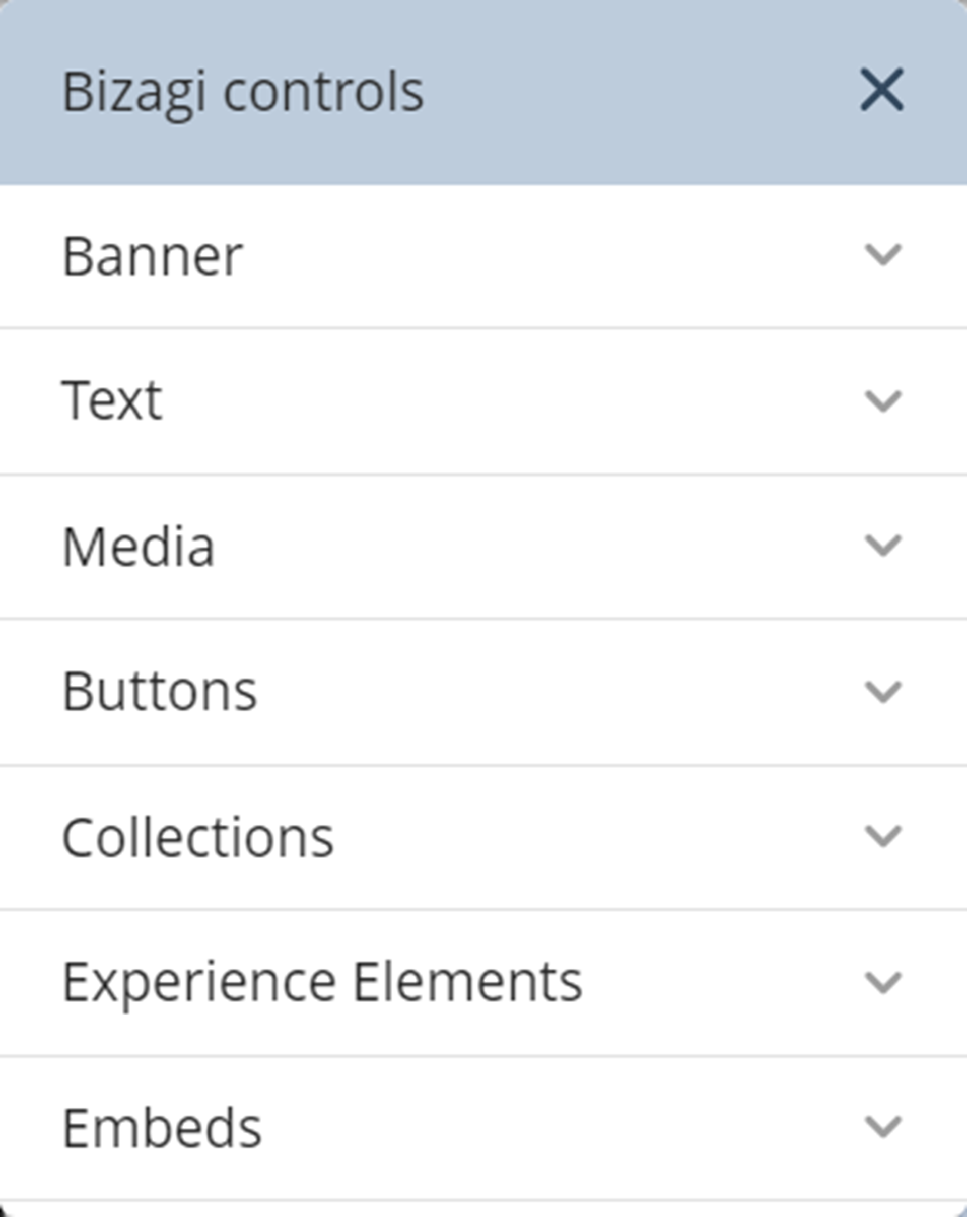
The App Designer editor offers a variety of Controls that help you customize your app. The Controls are located inside the Controls button on the top left side of the App Designer editor. Each Control displays a set of options where you can select which one to implement. To access the options, click the Control, which will display a drop-down menu, and then select an option and drag it into the app. Then, you can manage and customize the Control.

The Controls available for your app are grouped into categories:
•Text
•Media
•Buttons
oLink
•Collections
•Experience Elements
•Embeds
oEmbed a Website and HTML iFrame
Control configuration options
Each Control has different configuration options. Depending on the Control's category and type, some of these options will be visible. Each option has an icon:
![]()
The available options are:
•Manage Content: Define what is displayed inside the Control.
•Convert To: Change the type of a Collection Control.
•Settings: Display properties you can customize for each Control.
•Visible to: Select the Personas that will be able to view the Control once the app is published.
•Layout: Select how the Control displays content.
•Duplicate: Automatically copy and paste the Control below the original in the app's layout, creating a quick duplicate.
•Delete: Permanently remove the Control from the layout. A confirmation message appears when you use this option.
Context menu
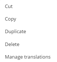
When you right-click a Control, a context menu appears with the following options:

•Cut: Remove the Control from the current layout and store it in the clipboard for pasting elsewhere.
•Copy: Create a copy of the Control while keeping the original in place, storing the copy in the clipboard.
•Duplicate: Automatically copy and paste the Control below the original in the app's layout, creating a quick duplicate.
•Delete: Permanently remove the Control from the layout.
•Manage translations: Open the translation tool for the Control.
Last Updated 10/11/2024 11:57:32 AM