Overview
In the App Designer editor, the text and icon button controls allow you to navigate your app within different options:
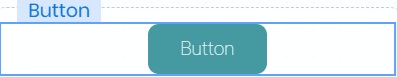
•The Text button displays a labeled button which has the option to enable and customize your own icon.
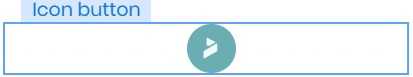
•The Icon button displays a button without text.
These two buttons behave in a similar way; the difference is whether or not a text is displayed.
Add a Text or Icon button control
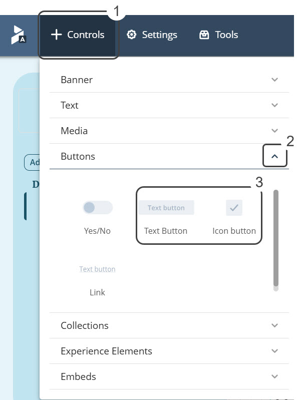
To add a Text/Icon button control, select the Controls option. This option displays a list of different types of controls, open the Buttons section. Inside this section, select and drag the Text or the Icon button into the app layout:
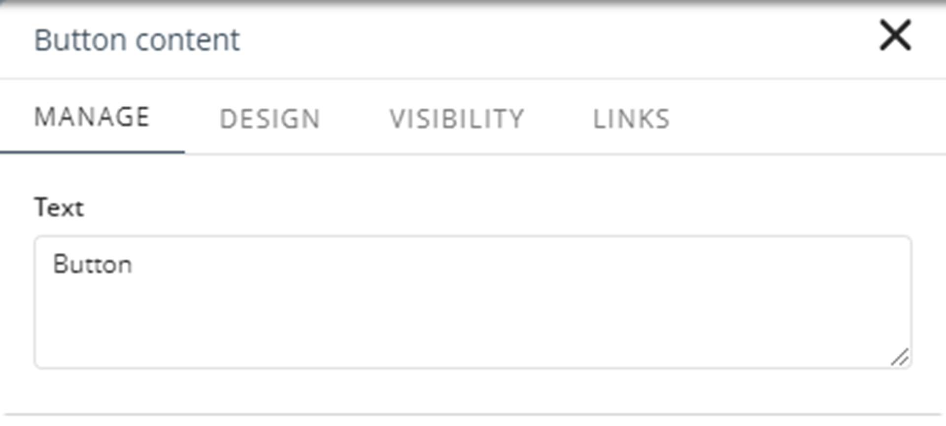
Manage
Only the Text Button has a Manage tab where you can customize the text displayed on the button. If you are on a Detail page, you will find the Visibility tab.
Design of the Text button control
The following properties allow you to customize the text button control:
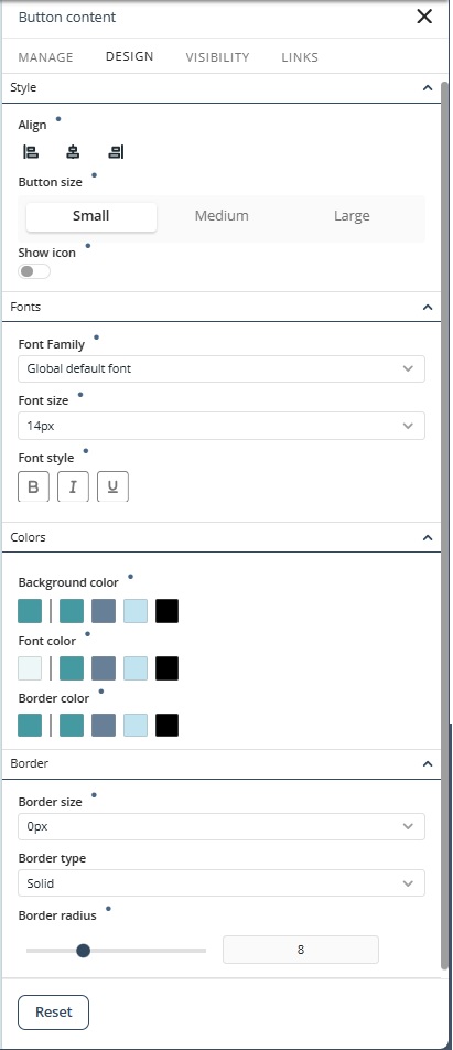
Style
•Align: Sets the text alignment to Left, Right, or Center.
•Button size: Select the size for the button: Small, Medium, or Large.
•Show icon: Select whether the icon is shown or not.
Fonts
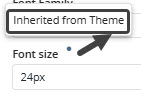
•Font family: Sets the font family for a text element; the font by default is Poppins Regular or the configured Global default font.
•Font size (px): Sets the size of the text in the navigation panel.
•Font style: Apply Bold, Italic, and/or Underline formatting by selecting any combination of these options—or leave them unselected for no styling.
Colors
•Background color: Sets the background color for the control. The default color depends on the selected theme.
•Font color: Sets the color of the text displayed in the navigation pane. The default color depends on the selected theme.
•Border color: Sets the border color of the control.
Border
•Border size: Sets the border size of the image in pixels.
•Border type: Sets the border type for the control.
•Border radius: Sets the roundness of the corners of the button.
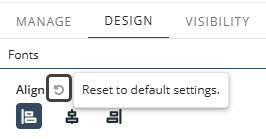
Text Button Control Reset Properties for Individual Configurations
In addition to the Reset button that restores all modified properties in the Design tab, each property also has its own reset option.
•Properties with inherited values display a blue dot next to their title. This indicator allows you to make targeted adjustments without affecting other settings. Hover over the blue dot to see the source of the inherited value, giving you greater control over your text control’s appearance.
•When you modify a property marked with a blue dot, its individual Reset button appears. Clicking this button restores the property to its default inherited configuration.
|
For details on customizing your app’s overall look, refer to the Typography, Themes and Controls style documentation in the App Designer editor. For example, you can set default typography or colors for all text controls by configuring them once. |
Design of the Icon button control
These properties allow you to customize the Icon button.
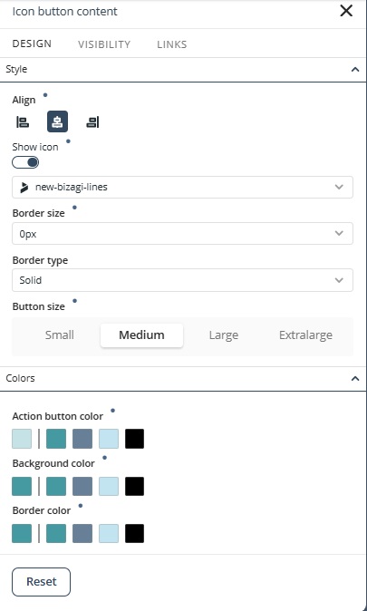
Style
•Align: Sets the icon alignment to Left, Right, or Center.
•Show icon: Selects whether the icon is shown or not.
•Icon list: Select the predefined icons to add to your icon button control.
•Border size: Sets the border size of the icon in pixels.
•Border type: Sets the border type for the control.
•Icon size: Set the icon button size between Small, Medium, Large, and Extra Large.
Colors
•Action button color: Sets the color of the icon button itself, including its interactive state (e.g., when clicked or hovered).
•Background color: Defines the color behind the icon within the button area.
•Border color: Specifies the color of the button’s outline or border.
You can return to default values when you click Reset.
Icon Button Control Reset Properties for Individual Configurations
In addition to the Reset button that restores all modified properties in the Design tab, each property also has its own reset option.
•Properties with inherited values display a blue dot next to their title. This indicator allows you to make targeted adjustments without affecting other settings. Hover over the blue dot to see the source of the inherited value, giving you greater control over your text control’s appearance.
•When you modify a property marked with a blue dot, its individual Reset button appears. Clicking this button restores the property to its default inherited configuration.
|
For details on customizing your app’s overall look, refer to the Typography, Themes and Controls style documentation in the App Designer editor. For example, you can set default typography or colors for all text controls by configuring them once. |
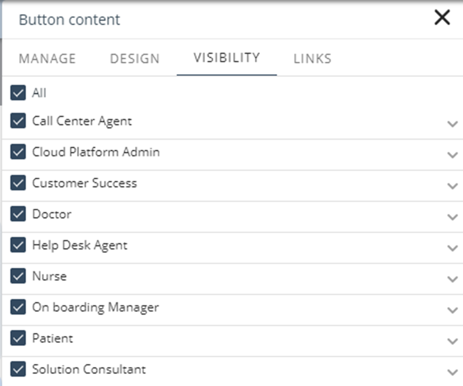
Visibility
The properties under the Visibility tab available on a Detailed page let you choose the Persona allowed to view the button. Under each Persona, you will find the list of contexts defined. You can enable all contexts or select specific contexts from the list.
Links
In the Links tab, you set navigation to when clicked to:
•An external page
•An internal page
•Start a case instance of any process in the project
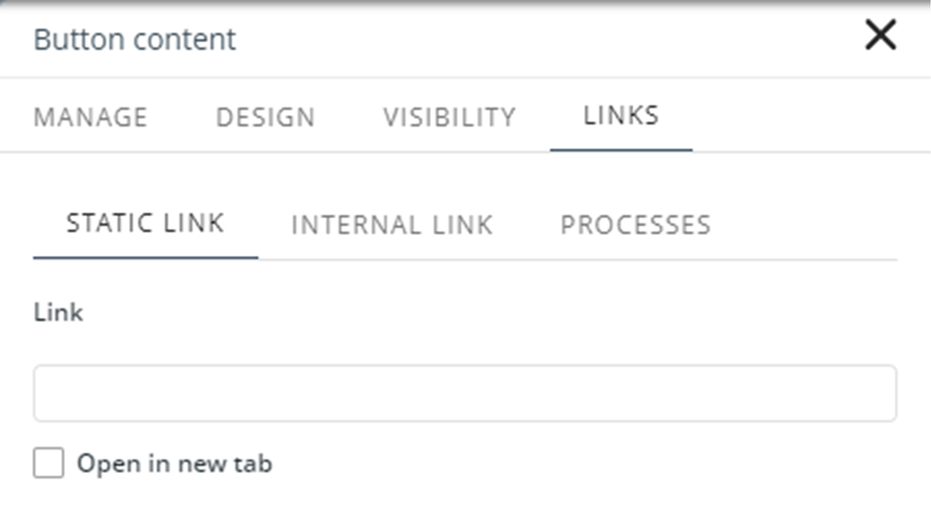
If you are using a button on a Detail page, the following options are available:
•Static link: Links the control to static URL. When you select this option, you can set the following properties:
oLink: The URL to which the user will be redirected.
oOpen in new tab: Define if the target page opens in a new tab. The default value is false.
•Internal link: Links the control to a page of the current app.
oSelect link type: Set the page to which the user will be redirected in the Normal link option, or select an entity in the Contextualized link option.
oOpen in new tab: Define if the page opens in a new tab. The default value is false.
•Processes: Links the control to a process in the project.
oSelect a process: Define the process to be started.
Last Updated 11/19/2025 12:00:37 AM