Overview
In the App Designer editor, the Yes/No button is a boolean control that contains a label and a value, displaying a Yes/No option for the end user to choose from. This control can only be implemented in Detail pages.
Add a Yes/No button control
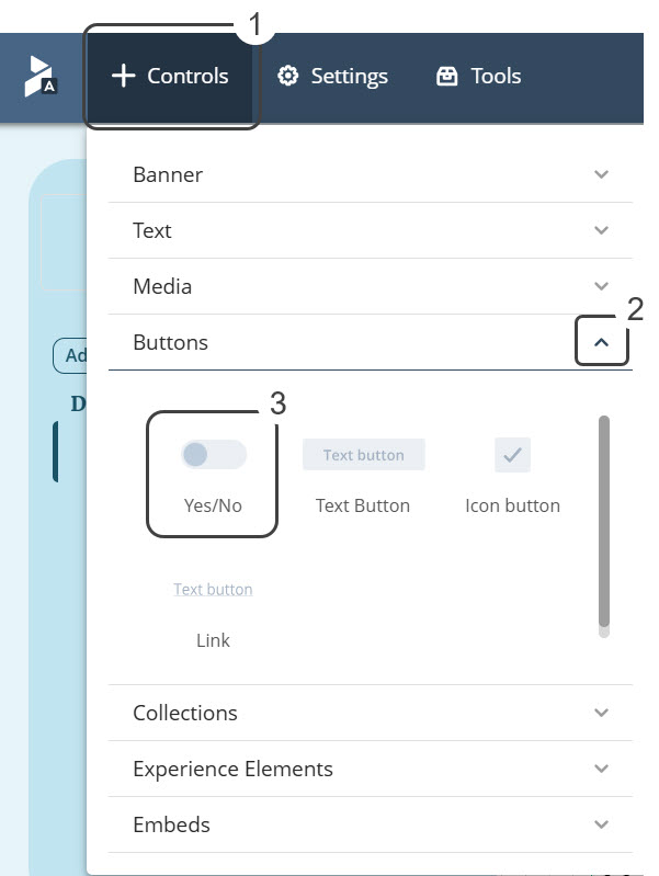
To add a Yes/No button control select the Controls option. This option displays a list of different types of controls, select the Buttons section. Inside this section, select and drag the Yes/No button into the app layout:

Manage
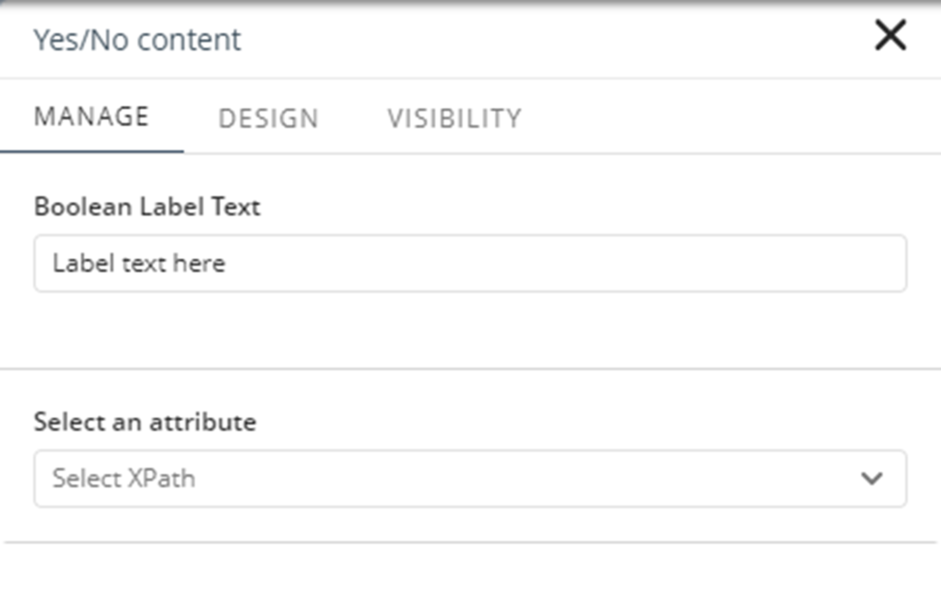
In the Manage tab, you have to configure the control with the following properties:
•Boolean Label Text: Input field that allows you to customize the button's label.
•Select an attribute: Select the XPath of the attribute from the project's data model that will be displayed in the Yes/No control.

Design
These properties let you customize the button. You can return to the default values when you click the Reset button.
Style
•Align: Sets the text alignment to Left, Right, or Center.
•With icon: Check box that defines if the control displays an icon or not.
•With Boolean text: Check box that defines if the control displays True/False or Yes/No values.
Fonts
•Font Family: Sets the font family for a text element. The default font family is Poppins Regular.
•Font size (px): Sets the size of the text in the navigation panel.
Colors
•Font color: Sets the color of the text displayed in the navigation pane. The default color depends on the selected theme.
Visibility
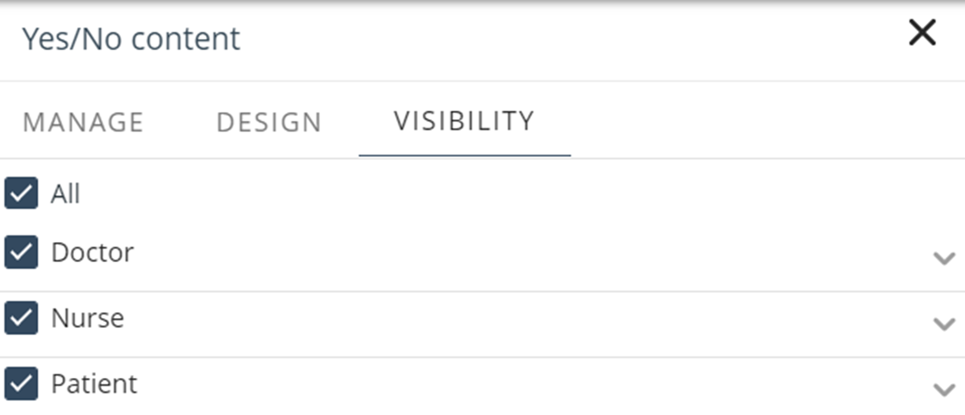
The properties in the Visibility tab let you choose the Persona allowed to view the button. For each Persona, you have the list of contexts defined. You can enable all contexts or select specific contexts from the list.

Last Updated 11/19/2025 12:00:37 AM