Overview
In the App Designer editor, you can add images as both static and dynamic content. This article shows how to add the image control and everything related to its configuration.
Add an Image control
To add an image control, follow these steps:
1.From the top menu select the Controls option. This option displays a list of different types of controls. Open the Media section from the control's options.
2.Select the Image control by dragging it to the app layout.
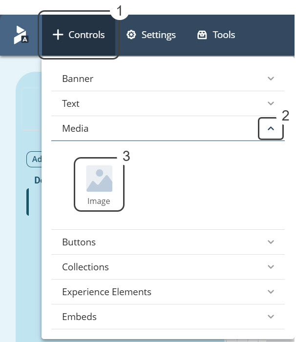
3. The outcome must look similar to the following image:
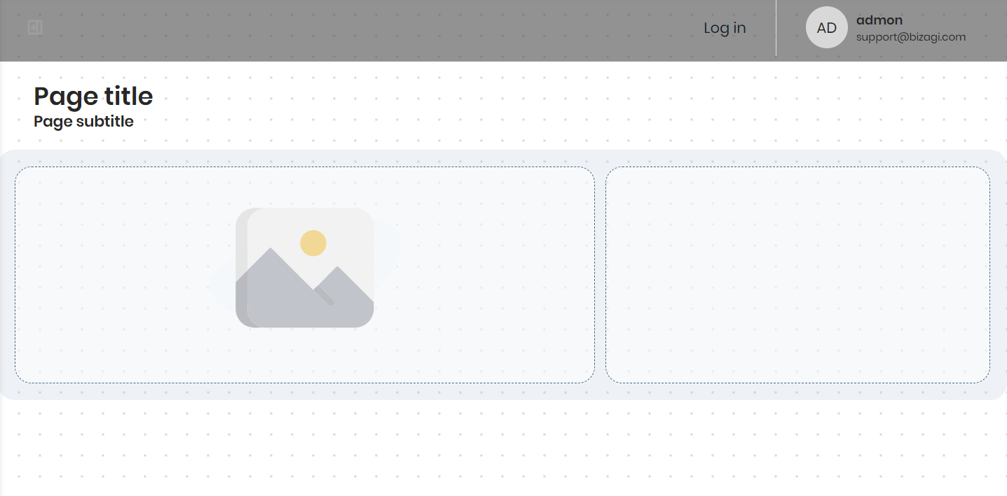
Image content
Inside Image content you can manage, design, configure the visibility, and associate links between pages.
Content Management
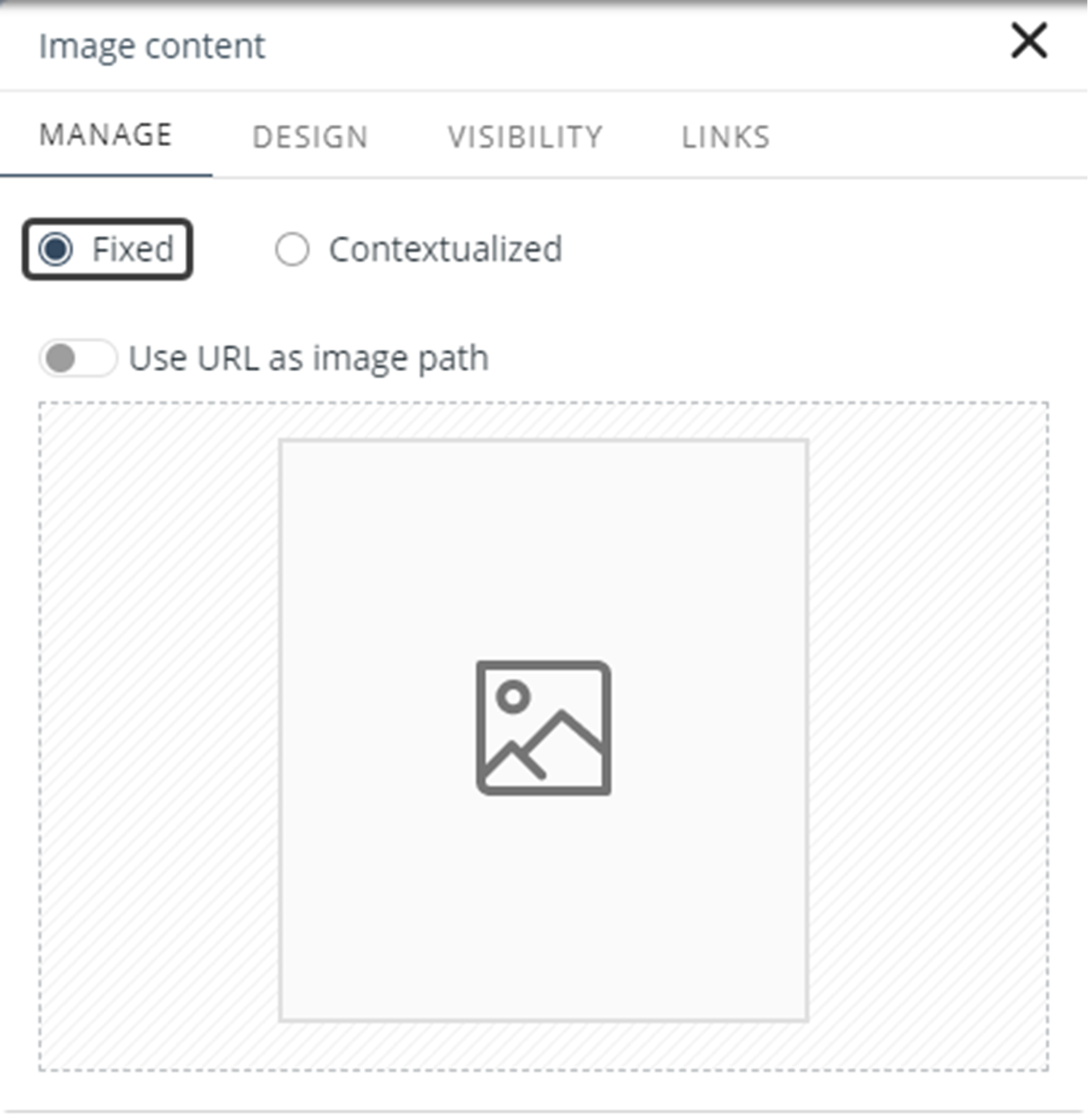
Depending whether the content you want to add to the control is static or dynamic, different settings are required. When a page is Detail and you want to add a static content image, you must select the Fixed content option. You can load a file or obtain an image from a URL (this option must be enabled) that has the following formats: .png, .jpg, and .jpeg.
You can add dynamic content by selecting the Contextualized option and selecting an XPath path for the image control.
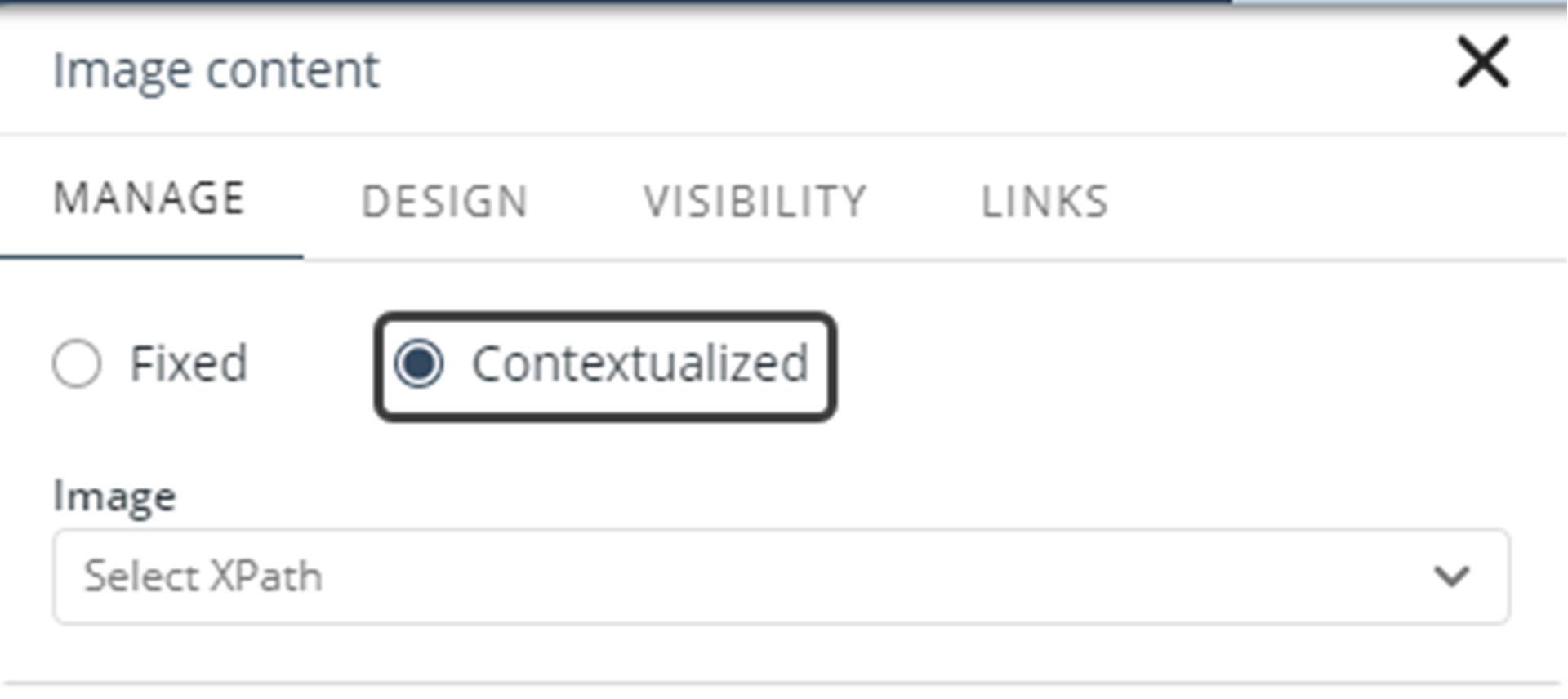
Image Content Design
The properties in the Design tab allow you to customize the image control:
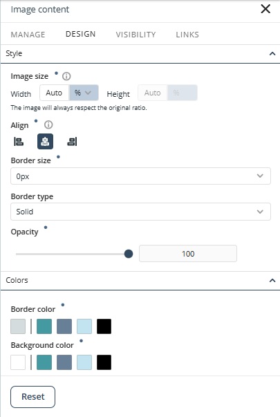
Style
•Image size (px): Display the image at its original size or adjust its dimensions. You can set the height in pixels or as a percentage of the screen, and adjust the width using a percentage scale.
•Align: Aligns the image either to the Left, Center, or Right of the control.
•Border size: Define the border size of the image in pixels.
•Border type: Define the border type between Solid, Dotted, Dashed, Double, or None.
•Opacity: Adjust the image opacity from 0 to 100.
|
Bear in mind that: •The default value for all images is Auto and the unit measure will be configured as a percentage. •The width of the image makes reference to the size of the container, which can be the column or the row in which the image is placed. •You can adjust images in the Design tab of the image control. |
Colors
•Border color: Define the border color of the image.
•Background color: Define the color of the background color of the image. The default color depends on the selected theme.
You can restore default values by clicking the Reset button.
Image Control Reset Properties for Individual Configurations
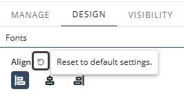
In addition to the Reset button that restores all modified properties in the Design tab, each property also has its own reset option.
•Properties with inherited values display a blue dot next to their title. This indicator allows you to make targeted adjustments without affecting other settings. Hover over the blue dot to see the source of the inherited value, giving you greater control over your text control’s appearance.

•When you modify a property marked with a blue dot, its individual Reset button appears. Clicking this button restores the property to its default inherited configuration.
|
For details on customizing your app’s overall look, refer to the Typography, Themes and Controls style documentation in the App Designer editor. For example, you can set default typography or colors for all text controls by configuring them once. |
Visibility
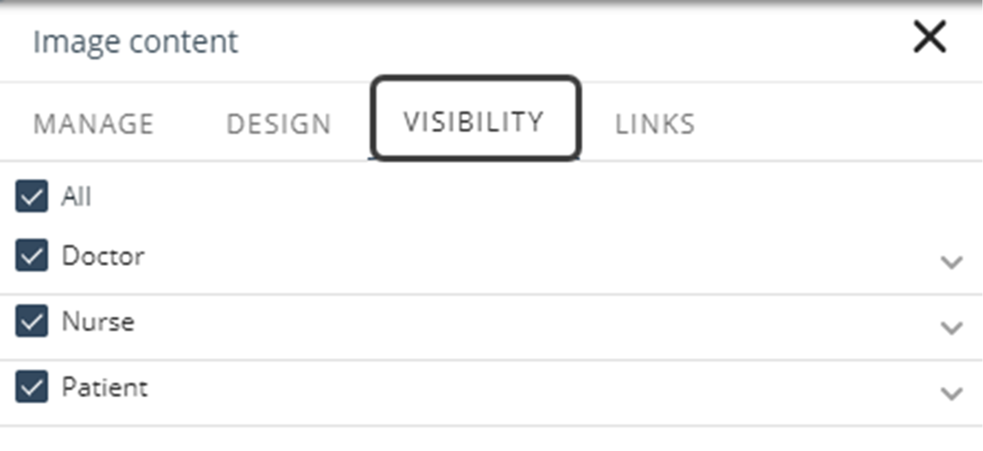
In this tab, you can choose which Personas can have visibility of the image, as shown in the following picture:
Links
Static link
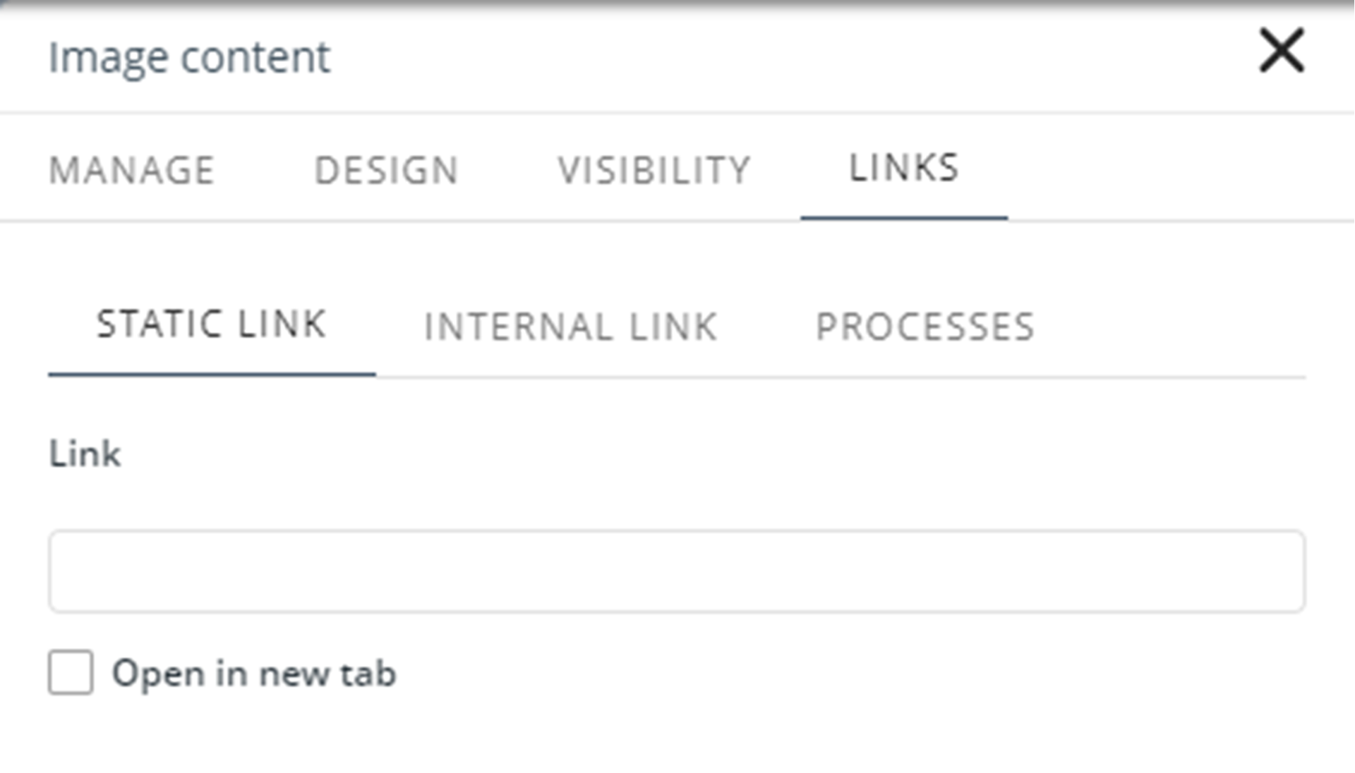
In this option, add the link you want to associate with another page that has been previously published. This link can be enabled in the checkbox to open in a new tab:
Internal Link
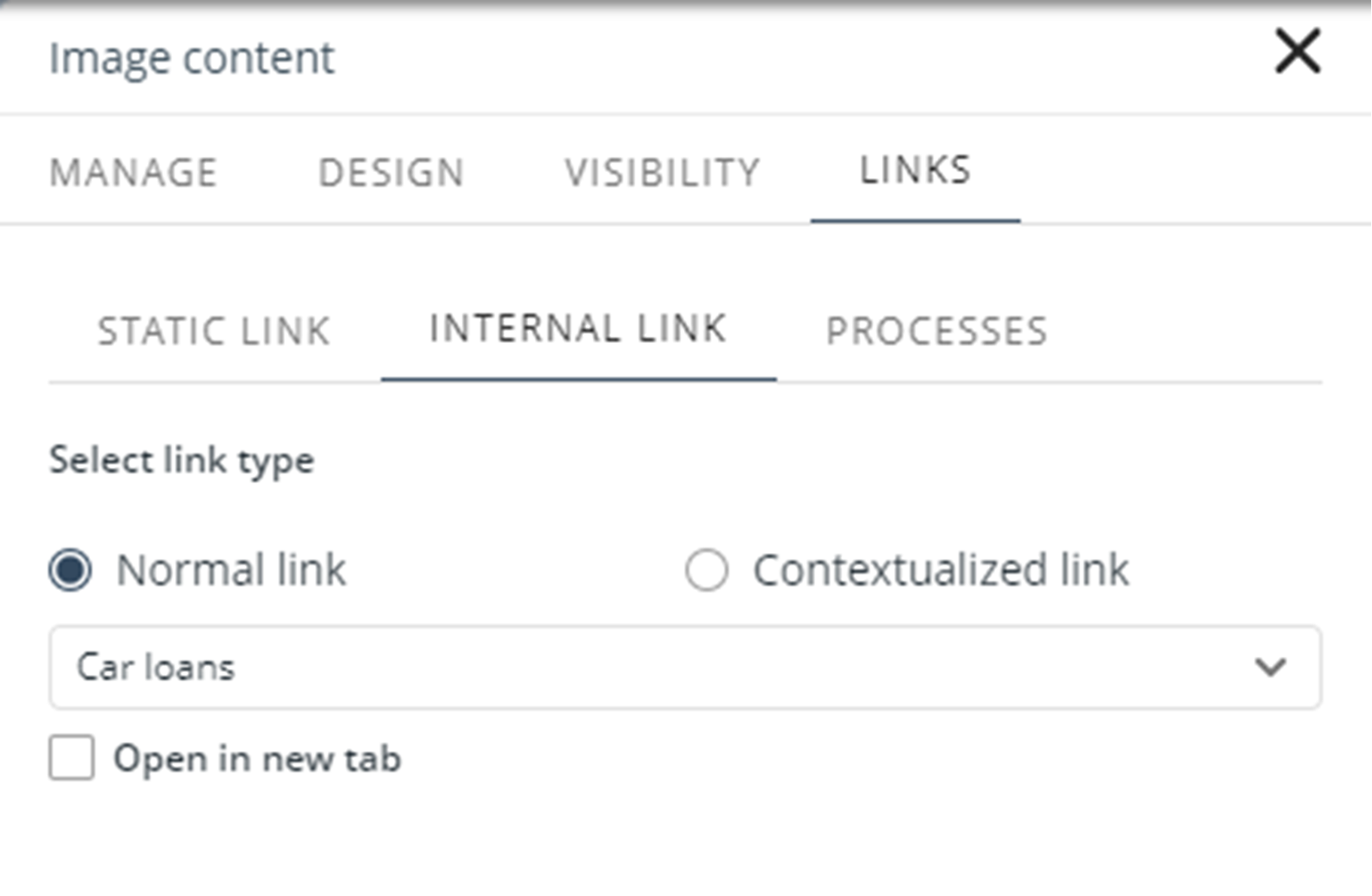
This option allows you to associate the image to the internal pages that it handles within the same app. You must select if the link type navigates to a normal page, or a Detail page.
Processes
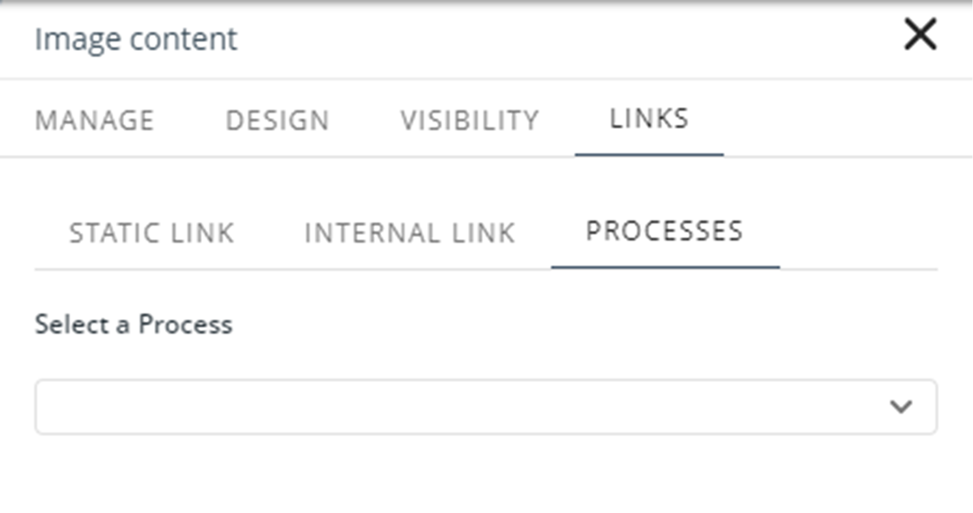
This option allows you to associate the image with a process of the project you previously built:
Last Updated 11/19/2025 12:00:24 AM