Overview
In the App Designer editor, the header is a control that appears at the top of each page and allows you to configure navigation to other pages, and login and logout options for your app. In addition, the Header control shows the information of the currently logged-in user.

Considerations
•The header control is static. This means that you can edit it, but you cannot move or delete it.
Configuration options
When you click the Header control, the following configuration options appear in the top right corner of the control:
This option opens the Manage tab of the Header content panel to the right of your screen. In the tab, you can configure login and logout options for your app.
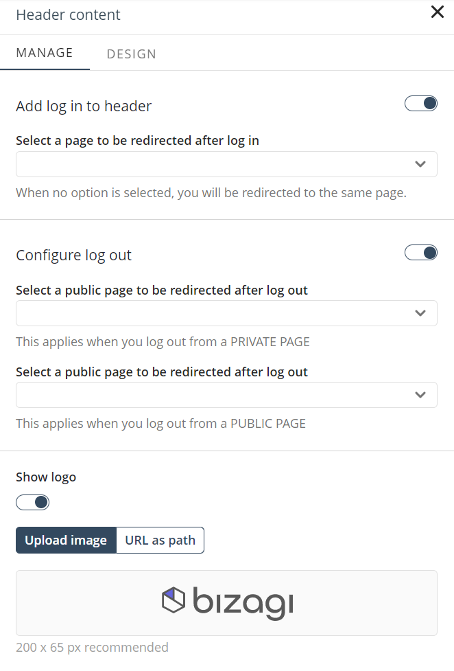
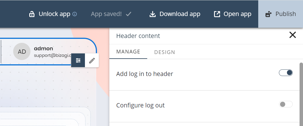
Add log-in to header
When enabled, this option adds a Log in link button to the Header control.
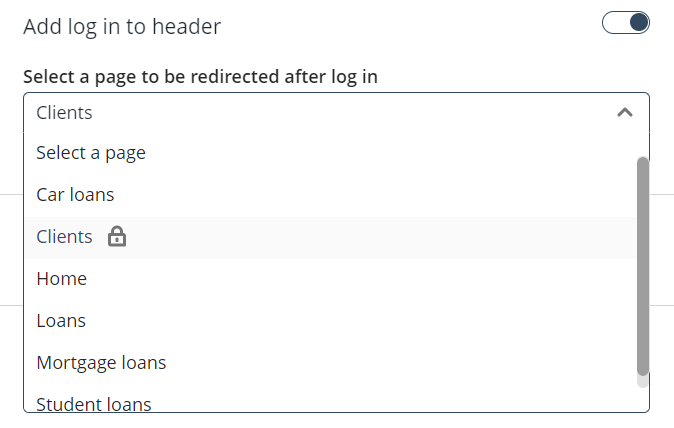
Furthermore, you can configure which of your app's pages you want the user to be redirected to once they log in. You can choose any type of page or subpage, as shown below.
|
If you prefer not to have a login option in your Header control, you can add buttons or links to your Private pages. End users are automatically redirected to the login form. |
Configure log out
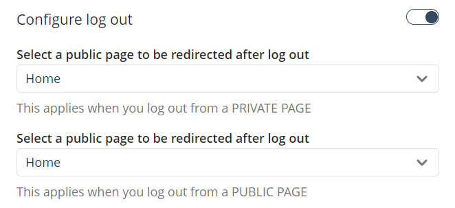
When enabled, this option allows you to configure the Public page where users are redirected once they log out of your app.
Bear in mind that there are two configurations: one for when users log out from a Private page and another for when they log out from a Public page.
|
When the option is disabled, users are redirected to the page they were on once they logged out. Additionally, if the page they were on is Private, the users are redirected to the login form. |
This option opens the Design tab of the Header content panel to the right of your screen.
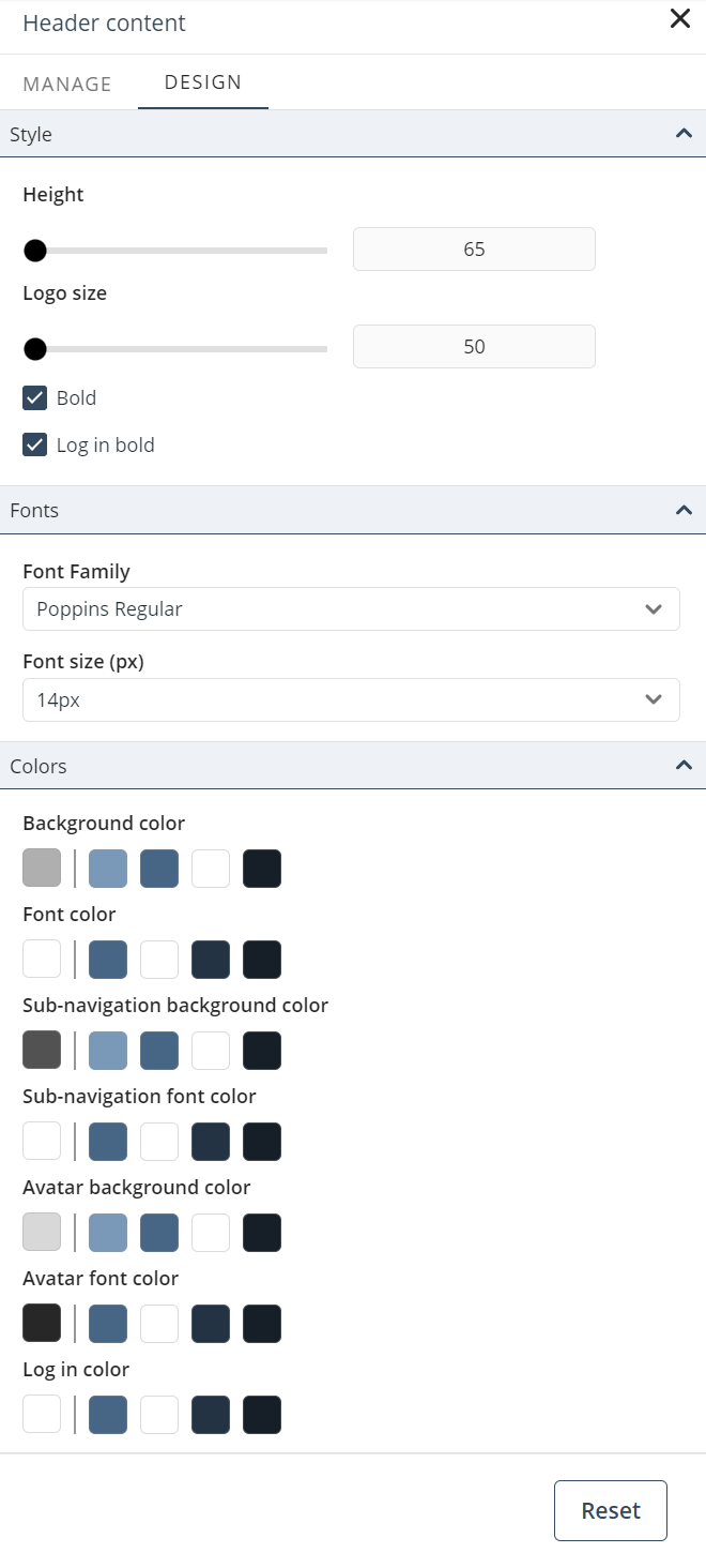
In the tab, you can configure the following properties to customize the Header control:
1. Style
•Height: Set the height of the header in pixels.
•Bold: Set the text on the header in bold letters.
•Log in bold: Set the text of the Log in button in bold letters.
2. Fonts
•Font family: Set the font family. Poppins Regular is defined as the default font.
•Font size (px): Set the size of the text in pixels.
3. Colors
•Background color: Set the background color for the control.
•Font color: Set the color of the text displayed in the navigation pane.
•Sub-navigation background color: Set the background color for menu sub-items in the navigation pane.
•Sub-navigation font color: Set the color of the text displayed for menu sub-items in the navigation pane.
•Avatar background color: Set the background color of the user's avatar circle when the user has no profile picture.
•Avatar font color: Set the font color of the user's avatar circle when the user has no profile picture.
|
When configuring colors, keep in mind that the default color is based on the selected Color palette. |
|
Click the Reset button to restore the default settings. |
Last Updated 11/19/2025 12:00:12 AM