Overview
In the App Designer editor, the Card Link control allows you to customize information by displaying it as a list of cards in an organized and visually appealing way. This article explains how to add the control to your app, as well as the different ways to configure and customize it according to your needs.
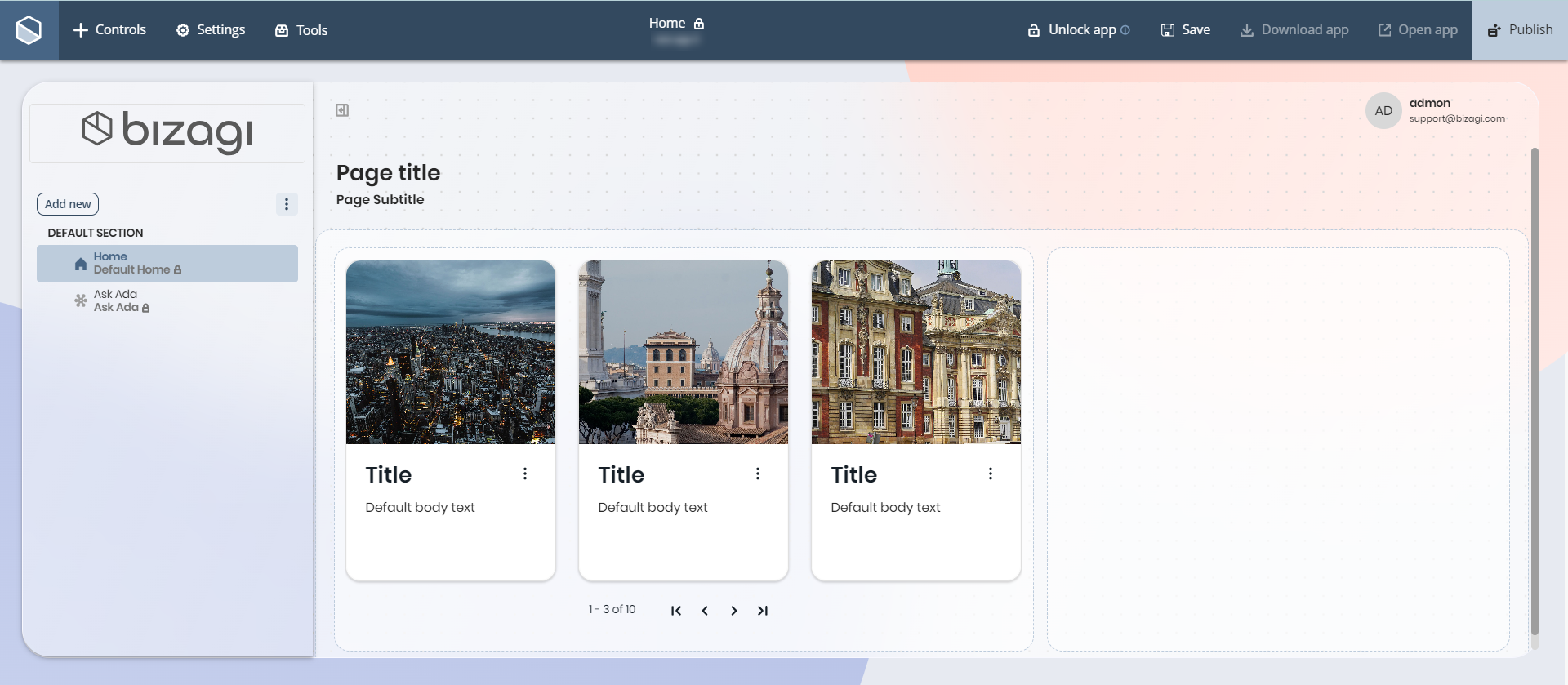
Adding a Card Link control to your page
To add the Card Link control to your app page, open the Controls menu (located at the top left corner of the screen). Then, look for the Collections control and click the arrow icon to display the available options. Scroll down until you find the Card Link control, and drag it to your page.
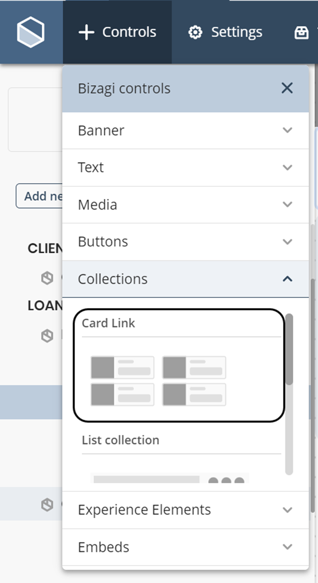
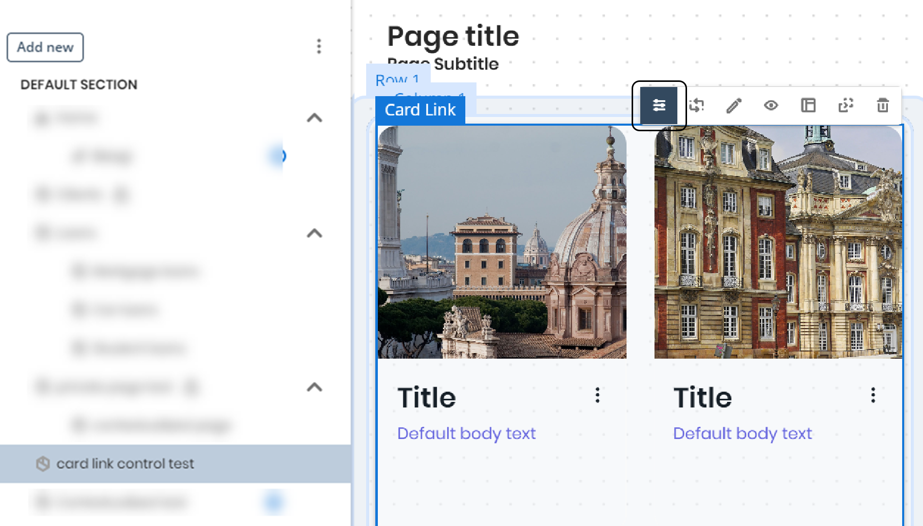
Menu options in Card Link
The options available in the control are as follows:
Manage options
In this section of the menu, you can manage the data that your control will use for display. Depending on the type of content, whether static or dynamic, follow the instructions below:
Static content
If you want to work with static content, select the Fixed tab, where you will find the following options:
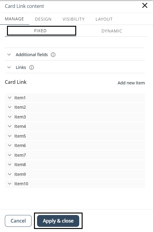
At the top of the interface, you will find the Visible Fields option, where you can define which fields are displayed in each card.
Next, you will find the Additional Fields option. From this section you can include as many fields as needed and assign custom names, used to filter results in the Collections Search control.
Then, you will find the Links option. In this section, you can customize the link that appears in the control elements, such as configuring the icon and defining a tooltip to provide additional information to the user.

Finally, you will find the Item option, where you can configure up to ten items within your control. Each item includes the following fields:
•Image: Allows you to upload an image from your computer.
•Title: Appears below the image and defines the title of the item.
•Text: Allows you to include descriptive text for each item.
•Link: Allows you to redirect users either to a page within the app or to an external URL. If you select an internal page, you must specify the target page. If you select an external link, you must provide the URL. You can also configure the link to open in a new tab.
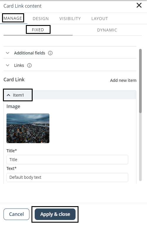
Once you finish configuring the static content, click the Apply and Close button.
Dynamic content
You can add content from the Persona's Views, My Stuff, or Cases using the Connection Wizard (see Dynamic content).
Once configured, the control displays labels indicating the data mapping and the data source at the bottom right corner.
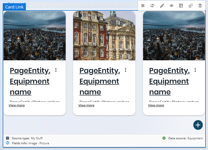
The control also allows you to execute:
•Events as Actions
•Activities as Actions
Events as Actions
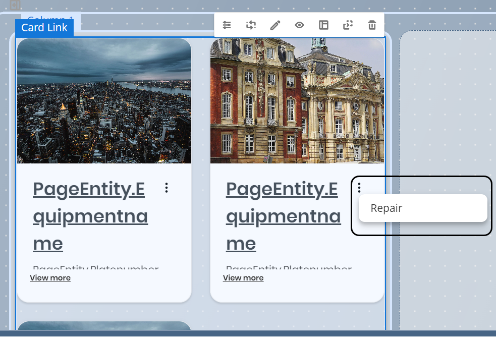
Events as Actions allows you to access the events related to an entity once your app is published from a Collection with dynamic data, in the same way that actions are accessed from a view with dynamic data.
To access events from collections, click the three-dot menu in the collection item. This displays a drop-down menu with all the events related to the entity. Click the option corresponding to the event you want to execute.
Activities as Actions
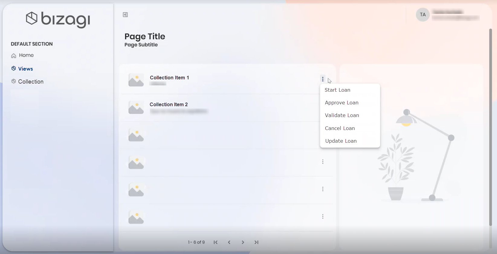
Users can visualize and execute pending activities of a process from the three-dot menu in a collection item or from a Detail page. This allows users to execute them more easily and quickly without any additional configuration.
After publishing your app, there are two ways to visualize pending activities:
1.In the App Designer editor go to a page where a collection has been configured.
a.Select an item from the collection and click the action menu. A list of pending activities will be displayed.
b.To execute one, simply select it, and a case will be generated.
2.In the App Designer editor go to a previously created Detail page.
a.Access the Detail page (e.g., from a Small Card collection). The page displays buttons associated with pending activities.
b.Select an activity to execute it and generate a case.
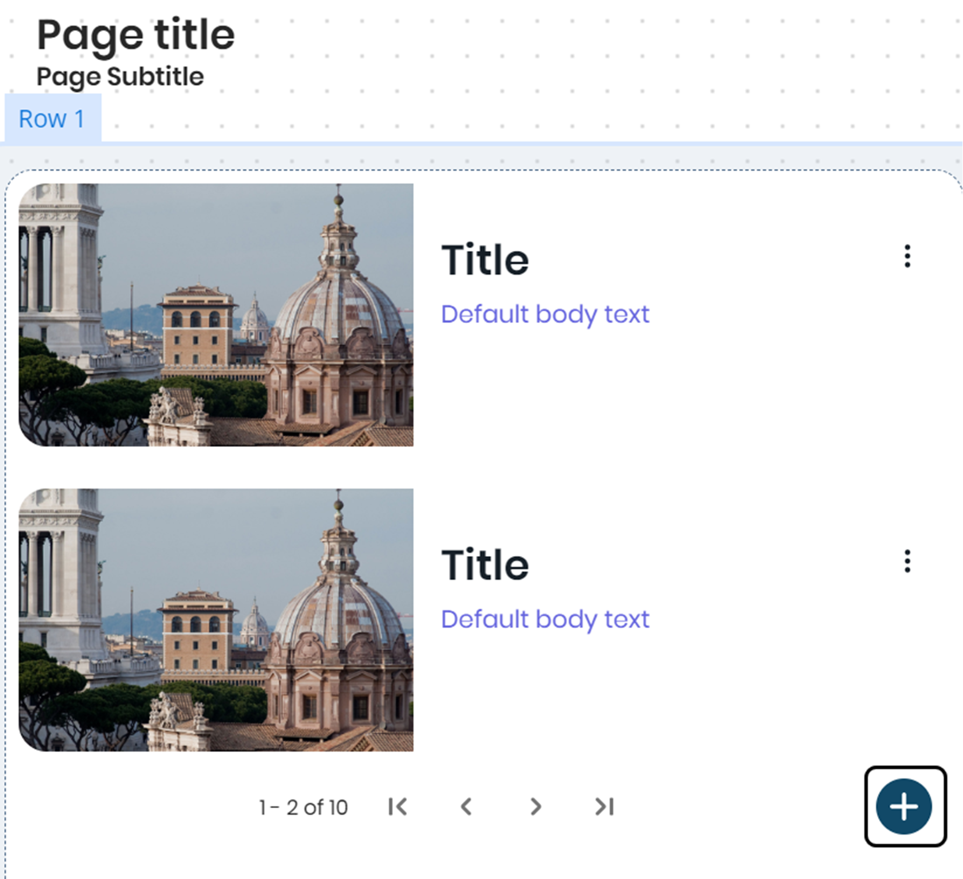
New Record configuration
The Card Link control includes the New Record button. Click the  button to open a form and add a new record.
Design options
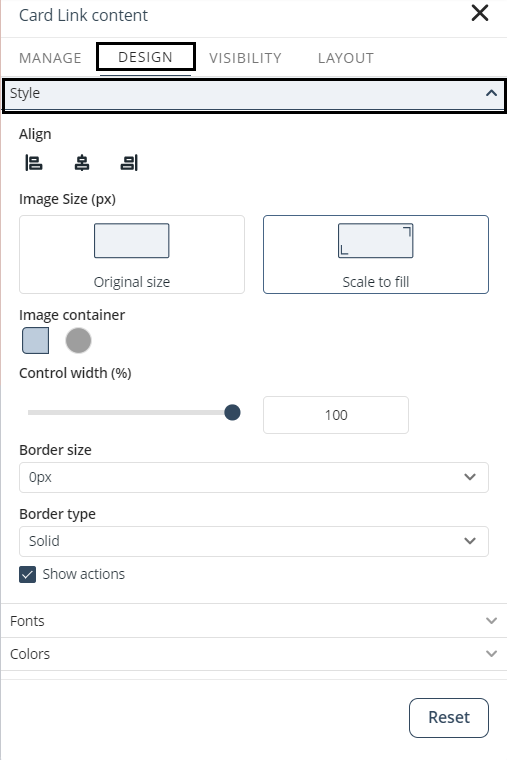
In this section of the menu, you can configure the style, colors, and borders of your control.

In Style options, you can define the following properties:
•Align: Aligns the control to the left, center, or right.
•Image Size (px): Defines whether the image uses its original size or scales to fill the container.
•Image container: Defines whether the image is displayed as a rectangle or a circle.
•Control width (%): Adjusts the width of the control as a percentage.
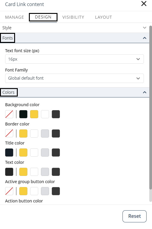
In the Fonts option, you can select the font family and size. The default font is Poppins Regular.
In the Colors option, you can customize the background, border, title, and text colors. When grouping content using the Group by option or configuring actions, you can also define:
•Active group tab color: Background color of the active group button. The active group is the value of the category currently used to filter the dynamic content.
•Action button color: Background color of buttons used to execute Events or Activities configured as Actions in the control.
|
•Click the Reset button to restore default settings. •Properties with inherited values display a blue dot. Hover over it to see the source. When modified, a Reset option appears for that specific property. |

Visibility options
In this section of the menu, you can define the control's visibility from the VISIBILITY tab.
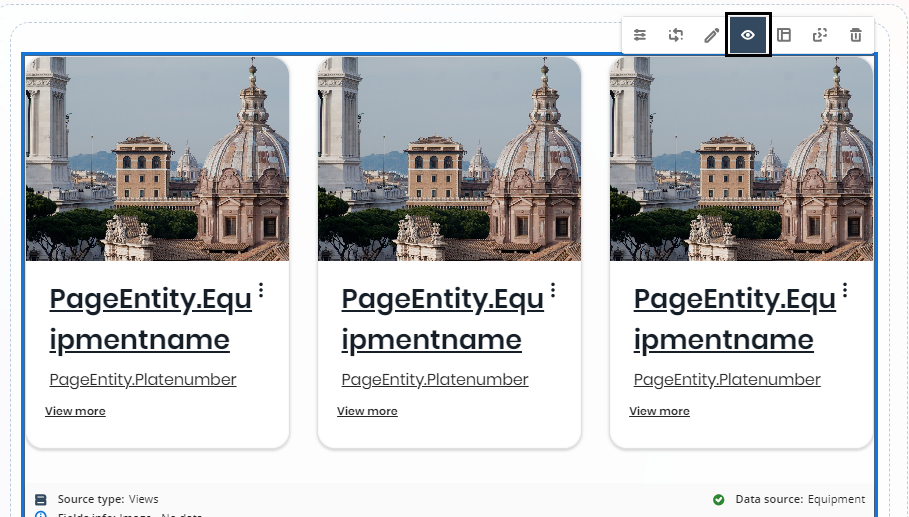
This option contains two sections:
•In the Personas section, you can select the entities or Personas that are allowed to view the control.
•In the Devices section, you can configure the control's visibility by device (Desktop, Tablet or Mobile). For further information, refer to Control visibility by device.
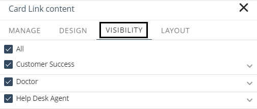
Layout options
In this section of the menu, you can configure the control layout.
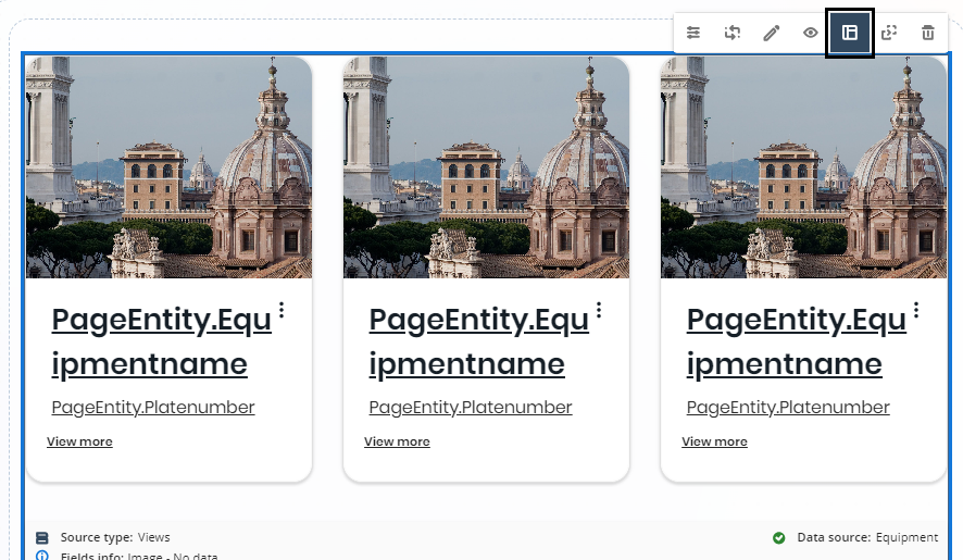
You can define:
•Displayed Items: Sets the number of cards displayed by the control.
•Card Layout: Defines how the image and content are arranged within each card. The available options are:
oLeft
oTop
oRight
When Left or Right is selected, the Auto-adjust option becomes available. When enabled, the layout automatically switches to Top when the screen width is below 830 px, ensuring responsive behavior across devices.
•Content Flow: Defines how cards are displayed within the control. You can choose between:
oList: Displays cards in a single column layout.
oGrid: Displays cards in a grid layout with multiple columns.
•Item spacing: This setting defines the spacing between cards:
oNo space: Displays cards with no visible gap between them, placing them edge to edge and creating a dense layout.
oCompact: Applies minimal spacing between cards, maximizing content density while preserving visual separation.
oNormal: Applies a balanced amount of spacing, improving readability.
oWide: Increases spacing to emphasize separation between cards and create a more open layout.
oCustom: Allows you to define a specific spacing value between 0 px and 80 px.
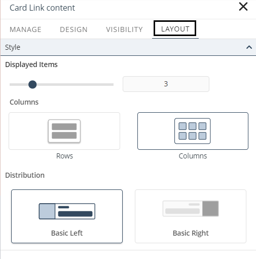
Custom Grid configuration
When Content Flow is set to Grid, additional layout settings are available to control how the cards are displayed and how they adapt across different screen sizes.
•Card width mode: This setting defines how the width of the cards behaves:
oAdjust to screen: The card width automatically adapts to the available space. This allows the layout to adjust dynamically, increasing or reducing the number of columns based on the screen size.
oSet width: The card width is defined manually, between 200 px and 520 px. This ensures that all cards maintain the same size regardless of the available space.
•Alignment and distribution: This setting controls how cards are aligned and distributed within the container:
oLeft: Aligns cards to the left side of the container.
oRight: Aligns cards to the right side of the container.
oCenter: Centers cards within the container.
oUniform: Distributes cards evenly across the available space, ensuring that they fill the container uniformly.
oEven Space: Applies equal spacing between cards while maintaining their size.
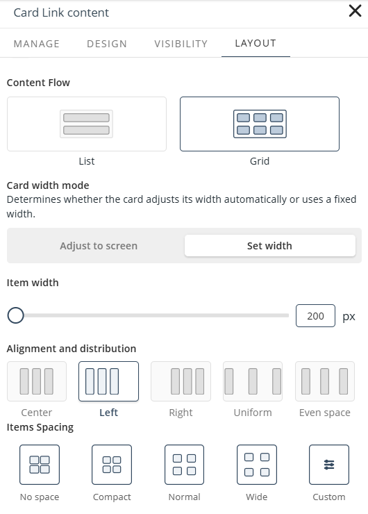
These settings help maintain consistent layouts and optimize space usage across different screen sizes.
Last Updated 7/14/2026 3:47:00 PM