Overview
In the App Designer editor, the Scorecards control allows users to display static content (i.e., fixed information) inside cards, either as a score or as a value.
Adding the control to your page
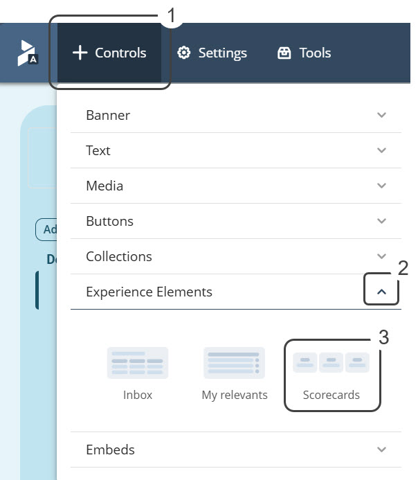
To add the Scorecards control to your app, open the Controls menu (located at the top left corner of the screen) by clicking it. Then, look for the Experience Elements control, and click the arrow icon to open a drop-down list that allows you to visualize the different options like the Scorecards control.
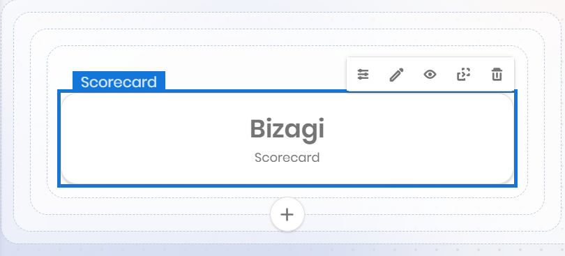
Once you have done this, the control appears on your page as follows:
Managing the control content
With the control already added to your app, you can manage the content that is going to be displayed on it. To do this, hover over the control to display the configuration options. Select the Manage Content option to add data to the control.
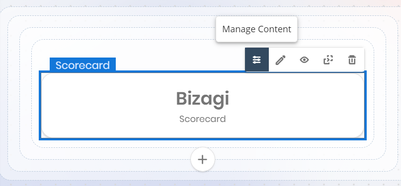
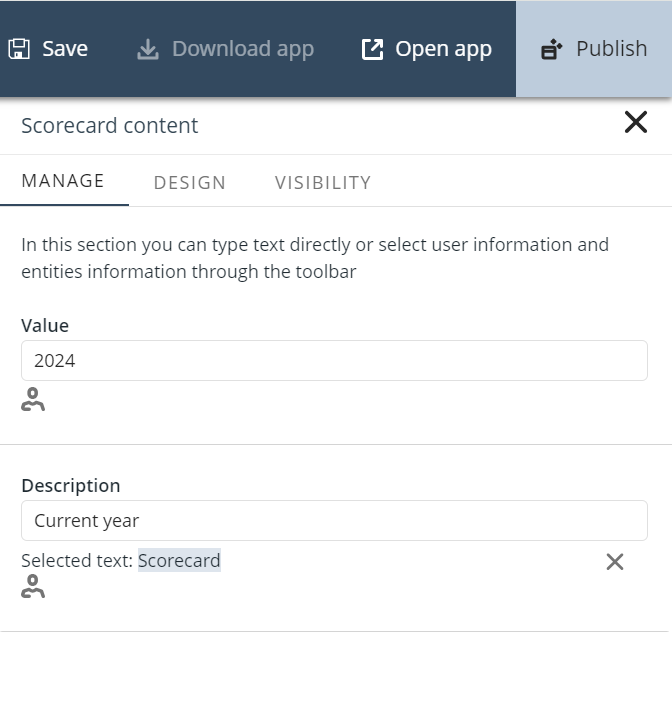
Notice that the Scorecards control has two editable fields to display content inside the card:
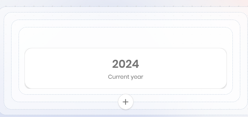
1.Value: The text you define in this field corresponds precisely to the score or value you want to display in the card, and it is always shown on the top of the card. For example, if you specify a year, you can write its value in numbers (i.e., 2022).
2.Description: In this field you must give a brief explanation of the score or value displayed in the Value field. The description you provide in this field is always shown on the bottom of the card. Retaking the example, you can specify that the 2022 value corresponds to the current year.
If you define the Scorecards control fields as in the given example, the control looks like this:
|
Although the Scorecards control is designed primarily to display static content, it is possible to link dynamic data to the control fields when the page you are working on is a Detail page. |
Defining the control design
You can also change the control's look and feel by adjusting its design. To do this, hover over the control to display the configuration options and select the Settings option.
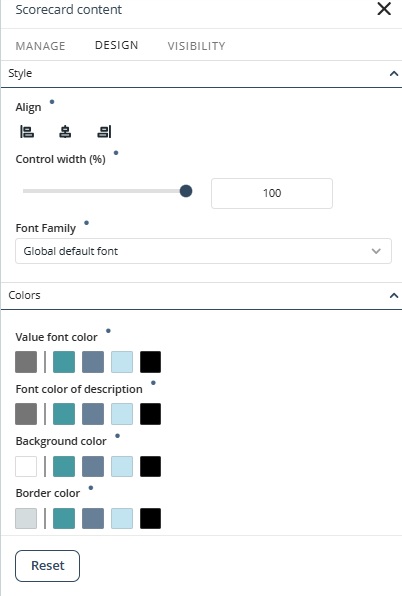
Pointedly, you can modify two control settings:
1. Style
oAlign: In this setting, you can locate the text of the Scorecard control on either the left, center, or to the right side.
oControl Width(%): Define the width proportionally to the total area of the control.
oFont Family: Set the font of the control text. The font by default is Poppins Regular.
2. Colors: Modify the card's colors for the Value font, Font color of description, Background, and Border color.
With the desired color already selected, it is also possible to add it to your Personal color library (My Color Library). To do this, click the Add color label beneath the selected color square and verify that the color has been added to the library. Bear in mind that you can add up to eight colors to the My Color Library.
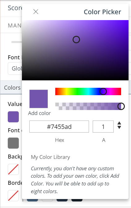
Additionally, four squares with predefined colors are shown next to the custom color square (the first square).
|
•Click the Reset button to restore the default settings. •Properties with inherited values display a blue dot next to their title. This indicator allows you to make targeted adjustments without affecting other settings. Hover over the blue dot to see the source of the inherited value, giving you greater control over your text control’s appearance. When you modify a property marked with a blue dot, its individual Reset button appears. Clicking this button restores the property to its default inherited configuration. |
Modifying the settings of the example's scorecard, you can come up with a design that looks like this:

Last Updated 11/19/2025 12:00:49 AM