Overview
User Filters enables users to add filters to Collection controls (Data table, Card Link, List Collection, and Small Card) and select filter operators both at runtime and through advanced configuration in the App Designer editor. The feature supports advanced operators based on the selected data type, as well as dynamic values.
Implementing User Filters provides greater flexibility when working with Collection controls, allowing users to refine, customize, and manage displayed data more efficiently and accurately.
Enabling User Filters
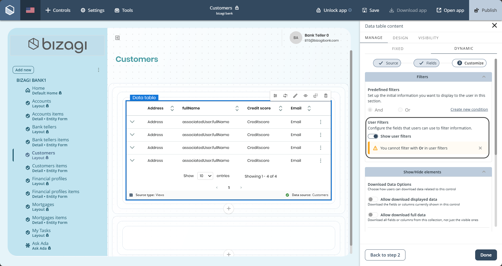
When adding a Collection control to an app, the control can be configured to display specific data. If the control uses dynamic data, a switch in the final step of the wizard determines whether filters can be applied at runtime, allowing the Collection control to support filtering during execution.
|
In the App Designer editor, filter conditions can be combined using either the AND or OR logical operator. Each filter configuration supports only one logical operator, meaning AND and OR cannot be combined within the same filter definition. |

Managing User Filters
In the App Designer editor:
1.Select the Collection control and click Settings.
2.Navigate to Manage>Dynamic>Customize.
3.Open the Filters dropdown and configure:
•Up to three filter conditions.
•A logical operator (AND or OR).
•A variable (XPath), operator, and value.
•Dynamic values such as UserEntity and Context.
•Reset and Delete options.
4.Save the changes.
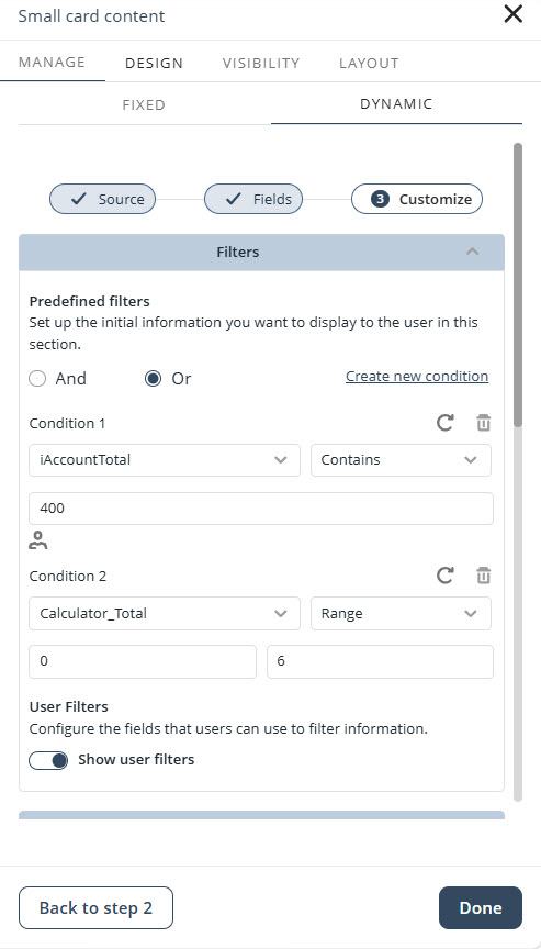
After the app is published, the configured filters are applied to the data displayed in the Collection control.
Advanced operators and behavior
•Available operators are displayed dynamically according to the selected data type.
•The Between operator requires From and To values and includes range validation.
•The Is null and Is not null operators do not require any input value.
•Changing the selected data type may reset the configured operator and value.
•Filter values can be populated from dynamic user attributes or entity attributes.
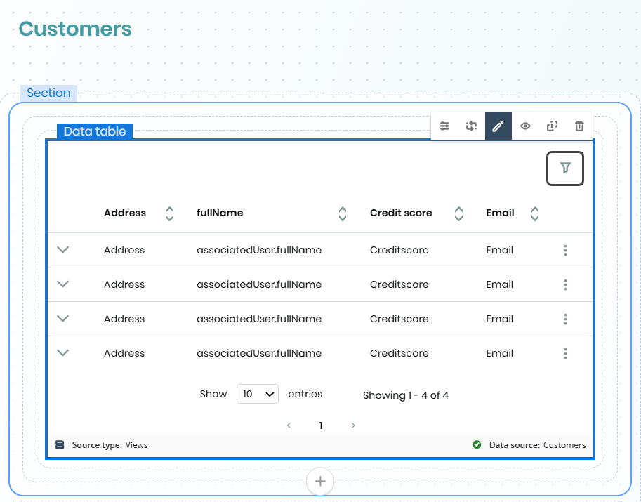
Filter icon when editing
Collection controls with User Filters enabled display a filter icon while editing the app to indicate that runtime filtering is configured for the control. The filter icon is visual and does not provide any filtering functionality.
Runtime filter experience
When User Filters are enabled and the app is published, users can interact with the configured filters directly from Collection controls. The following sections describe the runtime filtering experience available in published apps.
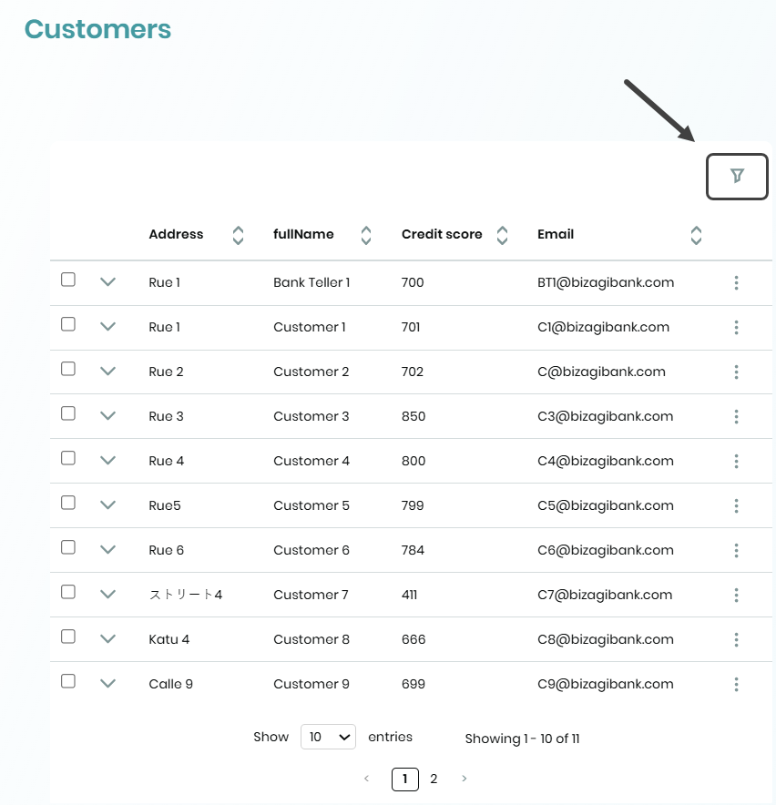
Filter icon
The User Filters icon appears the same as when editing the app but is fully functional.
Selecting the filter button opens a navigation panel on the right side of the screen. The navigation panel displays the filters available for the selected control, allowing users to apply filters and view the filtered results.
Applying a filter to a Collection
Users can select the appropriate filter operator and apply a filter to the displayed data. Depending on the configured data type, the available operators may include both basic and advanced filtering options.
As a result, the Collection control displays the records that match the selected criteria.
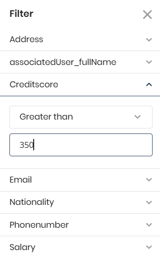
The available operators depend on the data type and include both basic and advanced operators:
•Text: Equal (=), Not equal (≠), Contains, Is null, Is not null.
•Numeric: Equal (=), Not equal (≠), Contains, Greater than (>), Greater than or equal (≥), Less than (<), Less than or equal (≤), Between (From/To), Is null, Is not null.
•Date: Equal (=), Not equal (≠), Contains, Greater than or equal (≥), Less than or equal (≤), Between (From/To), Is null, Is not null.
•Boolean: Equal (=) with options Yes / No / All.
Applying multiple filters to a Collection
Users can apply up to three configured filter conditions. The conditions are combined using the logical operator (AND or OR) defined during configuration.
After the filters are applied, the Collection control refreshes and displays the records that satisfy the configured filtering criteria.
Applied filter pills
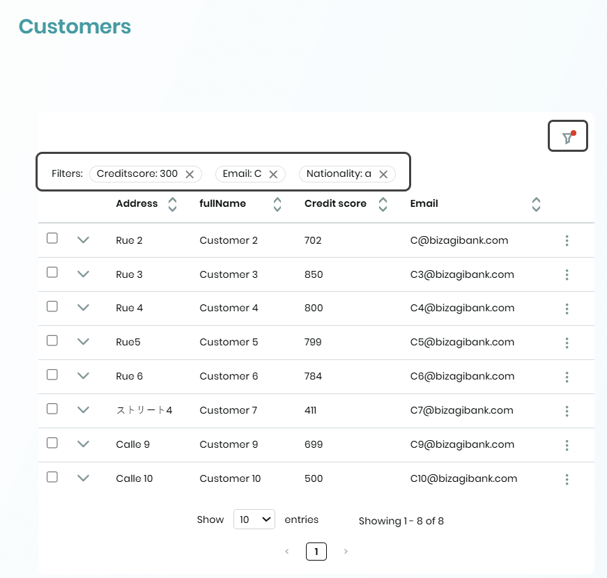
Active filters are displayed as pills at the top of the Collection control.
Selecting the X on a filter pill removes the associated filter, refreshes the Collection control, and removes the pill from the interface.
This allows users to quickly identify active filters and remove individual filters without reopening the filter panel.
Filter counter
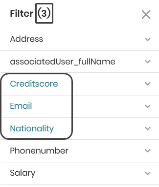
The navigation panel title displays the number of active filters currently applied to the Collection control.
As filters are added or removed, the counter updates automatically to reflect the current filter state.
|
When Group by is configured, a grouping attribute must be selected in the Collection control settings. Additionally, attributes already used in the control's filter configuration are automatically hidden from User Filters to prevent conflicts in service queries. |
Considerations
User Filters provide greater flexibility when customizing data displayed in Collection controls. However, certain limitations and behaviors should be considered to ensure optimal performance, consistent results, and system integrity.
•User Filters are supported for data from Views and My Stuff, but are not supported for Cases.
•Filtering by Files or Images is not supported.
•If no filters are selected, the Clear and Apply buttons remain disabled.
•When User Filters are enabled for a control, only the AND operator can be used in published apps. If User Filters are enabled while the existing filter configuration uses the OR operator, the operator is automatically changed to AND, and the operator selector is disabled.
•Applying filters may remove selected records from a Data table control when Common Actions are displayed at the top of the control because the filtered dataset replaces the existing dataset.
•On iOS devices, numeric fields are not handled correctly by the browser. Because the native app uses a Safari based web view, numeric only input cannot be enforced.
•OData Filters: The Range operator is not supported because it cannot be combined with other filters.
•On mobile devices with a viewport width of 743 pixels or less, filter pills are not displayed. In these scenarios, filters can only be viewed and managed through the navigation panel. As a result, filter management is handled exclusively through the navigation panel on devices with a viewport width smaller than 744 pixels.
Last Updated 7/20/2026 11:34:59 PM