Overview
In Bizagi Apps, there are two types of content that can be configured. The static and dynamic types of content are explained and covered in this article.
Static content
The static type of content is any file that is stored in a server and is the same every time it is delivered to users; hence, data is exactly the same for each and every request. Also, it doesn't require a database to be accessed. Nevertheless, every time that the content needs to be updated, it must be republished. Given this, it can be said that static content is any content that can be delivered to an end user without having to be generated, modified, or processed.
|
Be mindful that for each type of control, the static content configuration might be different. |
Dynamic content
The dynamic type of content comes from your Bizagi project, specifically from My Stuff, Views, or Cases. Hence, every time you decide to add dynamic content to a collection control, you must go through the Connection Wizard, whose steps let you connect to your project and fetch the required data.
Keep in mind that you can use dynamic content within Private and Detail pages.
To add dynamic content to a Collection control, you must click the Dynamic tab in the Manage Content window that appears once you select this control configuration option.
Then, you must follow the steps that appear on the wizard:
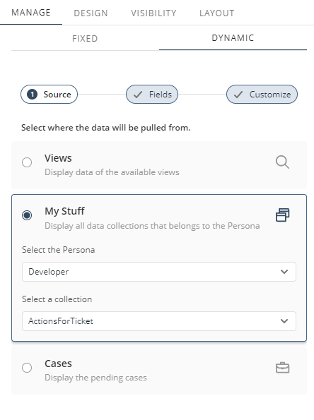
1.Source: You must select the source of the data you are going to pull. There are three data sources:
oMy Stuff: Collections have direct or indirect one-to-many relationships between the Persona and another entity. These relationships are created explicitly in the data model in Bizagi Studio.
oViews: Views allows App Designer users to query and filter information from a Business Object. This means that data views do not require a running process.
oCases: Displays the list of pending cases of a given process that are currently assigned to or available for the logged-in user. For each case, actions can be available if they are configured in Bizagi Studio. Users can work on a case by clicking the View case option. With this option, users can complete their assigned activities.
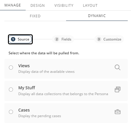
Once you have selected your data source, click Next.
|
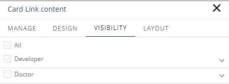
You can create a collection using Views or Cases for all the Personas available in the app; using the Visibility tab can show or hide the control to specific Personas. Creating a control using My Stuff requires to use specific Persona's configuration. For this reason, once the control is saved using this option, the Visibility tab will be restricted.
|
2.Fields: This step allows you to map the data source's attributes with the available fields in the control. You can choose whether a field is displayed or not.
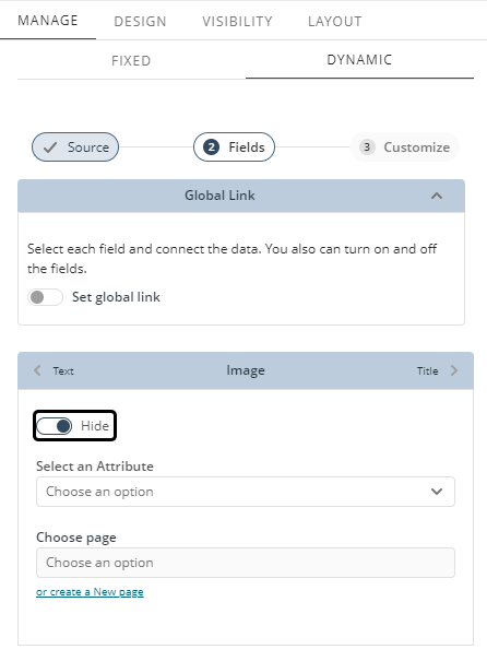
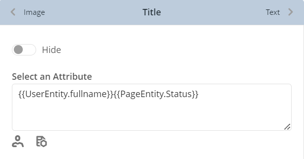
When configuring the fields, you can add contextualized data from the user that is currently logged in or from an entity configured in the data source. To do so, click the ![]() icon or the
icon or the ![]() icon respectively, and select the attribute you want to add. The corresponding data mapping appears in the Select an attribute text box for you to verify.
icon respectively, and select the attribute you want to add. The corresponding data mapping appears in the Select an attribute text box for you to verify.
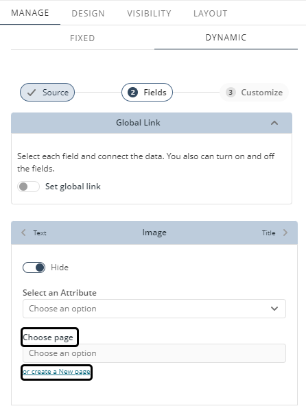
You can also link a Detail page to one of these fields. To do so, select a page from the Choose page drop-down. If no pages are available, you can create a new one by clicking or create a New page.
Select the entity for the page and give the page a name. Click Create to finish setting up your page with context.
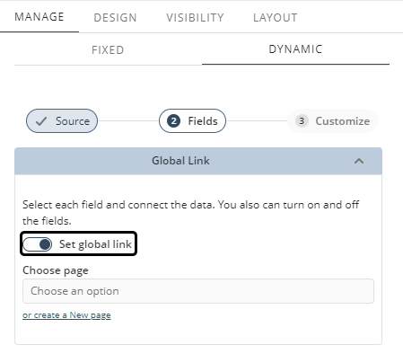
Nevertheless, you also have the option to configure a global link. When enabled, all the elements of the collection redirect to the specified Detail page. Also, the fields of the items no longer have this individual option.
Once you have finished, click Done.
|
Be mindful that for each control, the dynamic content configuration might be different (i.e., Collections Search). |
3.Customize: Finally, this step allows you to modify your collections control by configuring different options:
The Show/Hide elements section enables you to manage the visibility of the common actions checkboxes and the new record button. Once this feature is activated, these elements will no longer be visible in the App. To toggle their visibility, click the switch to show or hide the new record button or the common actions checkboxes.
Since there are various Collection Controls and data sources, the content of this section will vary based on the configurations applied. Below are examples of how this section appears under different conditions:
•Data table with Views as source

•Data table with My Stuff as source

•Small card, Card link or List collection with My Stuff as source

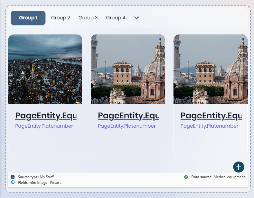
The Group by option allows you to group dynamic content displayed in Collections controls by a specific category (i.e., an attribute of the entity that contains the mapped collection). To do so, click the drop-down list button to display the categories available to group the Collection. Select the category you want to use for grouping by clicking its name.
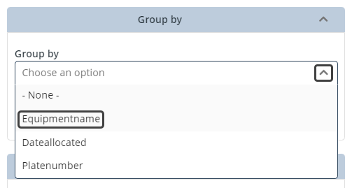
Once you have done this, your Collection control is grouped by the selected category.
Note that your Collection control has now buttons above it. These buttons are named Group followed by a consecutive number starting at 1 (i.e., Group 1, Group 2 and so on), and that the dynamic content shown in the Collections control corresponds to the Collection's attributes mapping.
|
When configuring the Group by option, bear in mind that: •Grouped Collections controls are not available for Collections Search controls. •You cannot add condition filters of type OR when having groups; these can only be of type AND. Consequently, the OR radio button is automatically disabled in the Filter option. •The option is not available for Collections with dynamic content pulled from Cases. •The option is not available for Collections with contextualized data. |
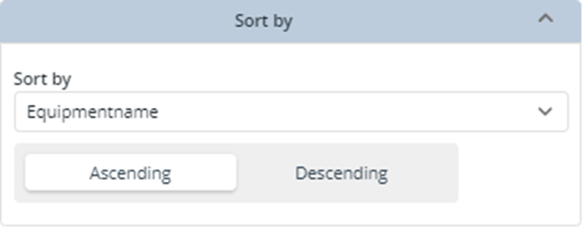
This option allows you to order the collections control's content by a text, numeric, date, or currency field that belongs to the entity selected in the Source step. When sorting the content, you can choose between an Ascending or Descending order. Ascending sorts the content from the field's minimum to the maximum value; Descending sorts it from the maximum to the minimum value.
|
When configuring the Sort by option, bear in mind that: •Ascending is the default sort order. •NULL values are treated as the lowest possible values for every data type. This means that when the sort order is Ascending, NULL values are first. Contrarily, when the sort order is Descending, NULL values are last. |
The Custom message option of the Customize step allows you to define and display a message to the end user when the selected collection has no data. Notice that this option is enabled by default (i.e., the Show message toggle button is already enabled) and that the predefined message "There are no records on the list" is suggested.
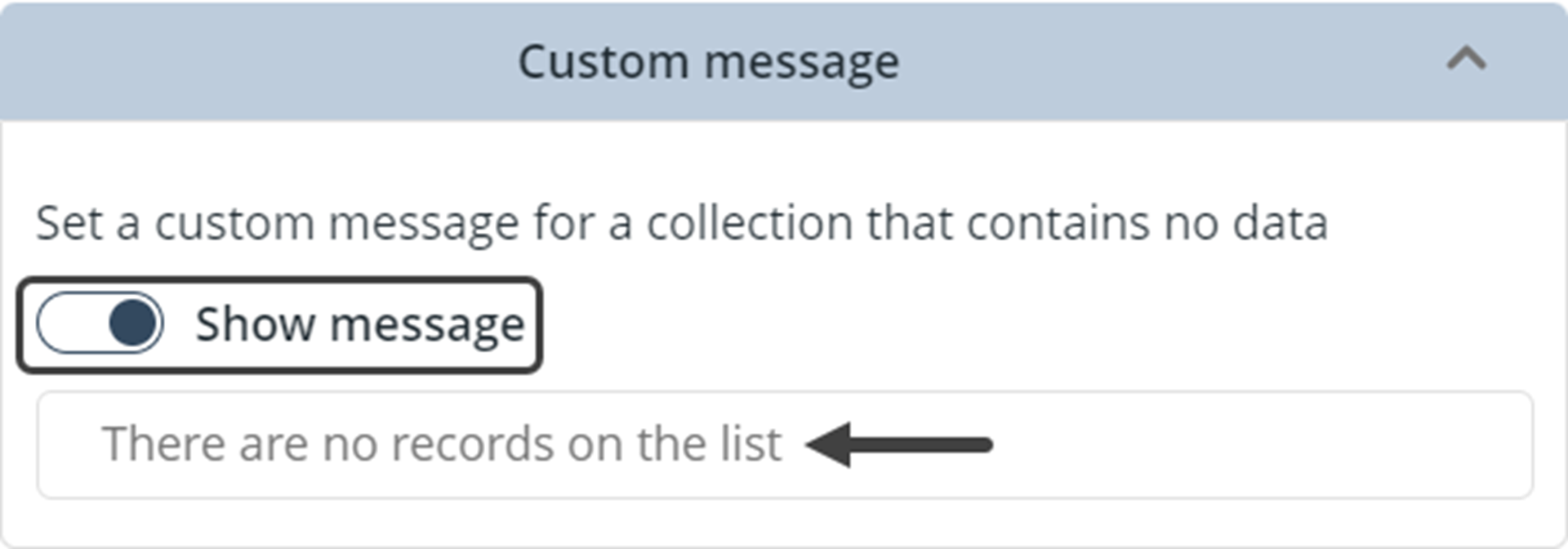
You can modify this message by clicking the predefined message field and then typing your custom message with your keyboard.
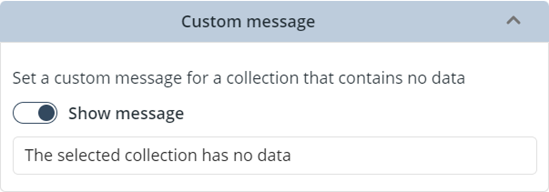
Likewise, you can disable the option by clicking the Show message toggle switch.
Finally, the Filter option of the Customize step allows you to filter the collections control's content based on conditions defined using text, numeric, date, or currency fields that belong to the entity selected in the Source step. The option has two main functionalities:
1.In case there's more than one condition, you can decide to use the AND or the OR operator.
2.The link button Create new condition creates a condition when clicked. You can add a maximum of three conditions.
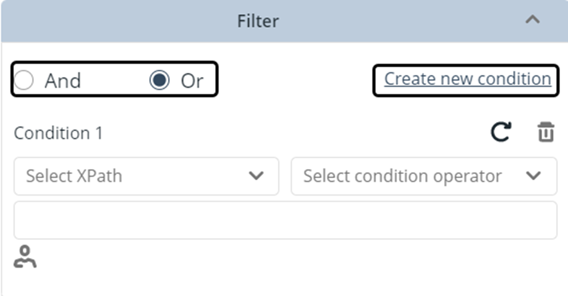
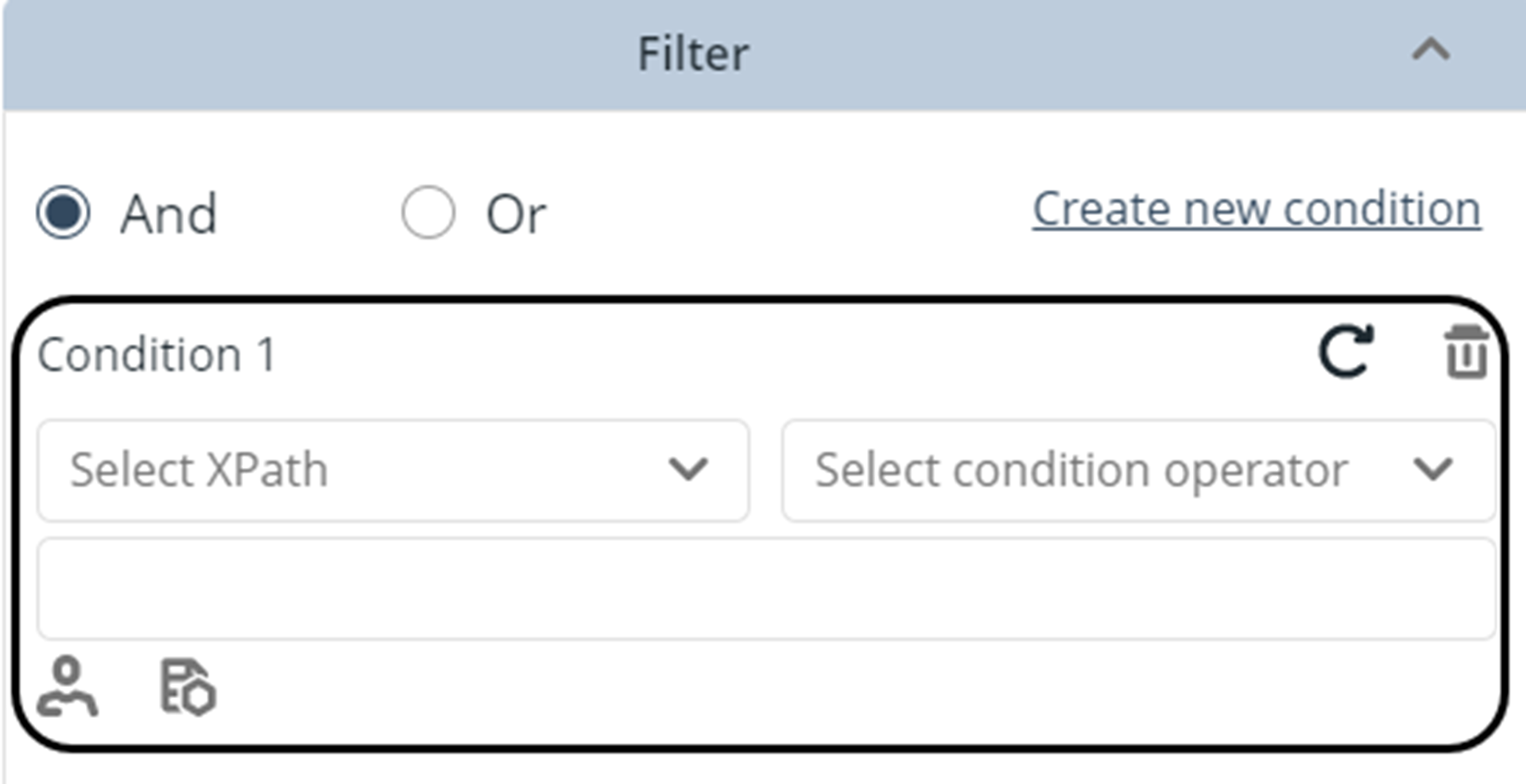
The conditions that you add are listed below these main components. For each condition you have:
•A ![]() button to clear the condition's fields.
button to clear the condition's fields.
•A ![]() button to delete the condition.
button to delete the condition.
•A selector that allows you to filter by text, numeric, date, or currency fields that are within the selected entity.
•A selector for the operators of the condition: Equal, Not equal, and Contains.
•An input for the value to filter on. The ![]() button allows you to define fields associated with the user and, in Detail pages, the
button allows you to define fields associated with the user and, in Detail pages, the ![]() allows you to define entity fields.
allows you to define entity fields.
|
Bear in mind that the Filter option does not support multilingual settings. |
Actions within Dynamic content
The Actions (or buttons) that are displayed within the dynamic content strictly depend on the selected Persona and element (collection, search, or case). Therefore, the actions displayed are the ones previously configured in Bizagi Studio for the Personas associated with the selected element. If a Persona has an Action for that entity, that Action will come up as a selectable option. When a case is selected, the View case action is available by default to work on that case.
Last Updated 11/14/2025 8:22:49 AM
