Overview
In the App Designer editor, the Data table control displays information from collections in a clear, organized table. You can define where the data comes from, how it is displayed, and how it is arranged. In the published app, users can interact with the table by sorting and resizing columns.
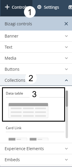
Adding a Data table control to your page
To add the Data table control to your app page, open the Controls menu at the top left of the App Designer editor. Expand the Collections section by clicking the arrow icon to view the available Collection controls. Then, scroll down until you find Data table and drag the control onto your page.
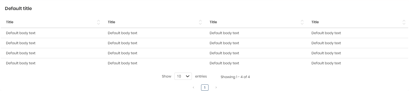
Once added, the control appears as a blank table ready for configuration:
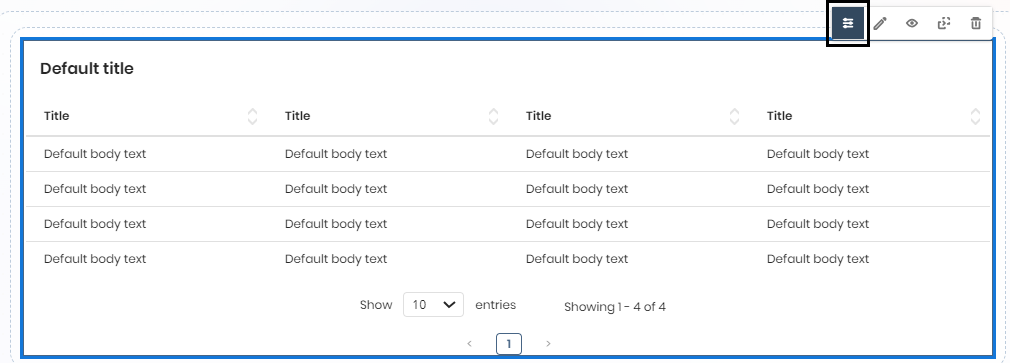
Managing the control content
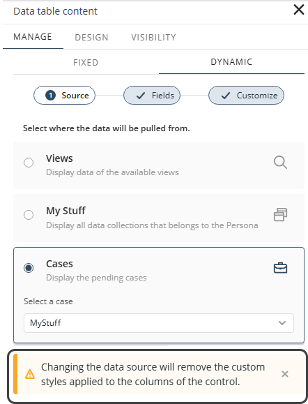
After adding the control, click the Data table to display its configuration options, and select Manage Content to define the data displayed in the table.
You can choose between two types of content:
•Static content: fixed information that does not change over time.
•Dynamic content: data retrieved automatically from a source such as a View, My Stuff, or Cases.
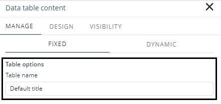
Static content
When configuring Static content (by selecting the Fixed tab in the Manage Content window), you can define the table’s name, columns, and rows.
Table name
In the Table name field, enter the name you want to assign to the table.
Columns
In the Columns section, you can add or modify columns and set their value types.
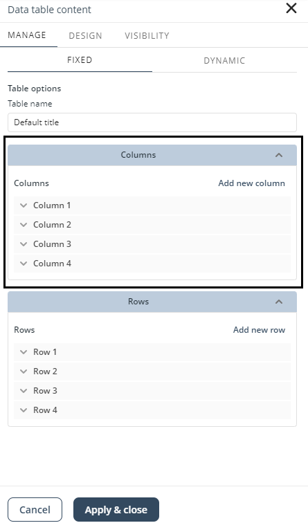
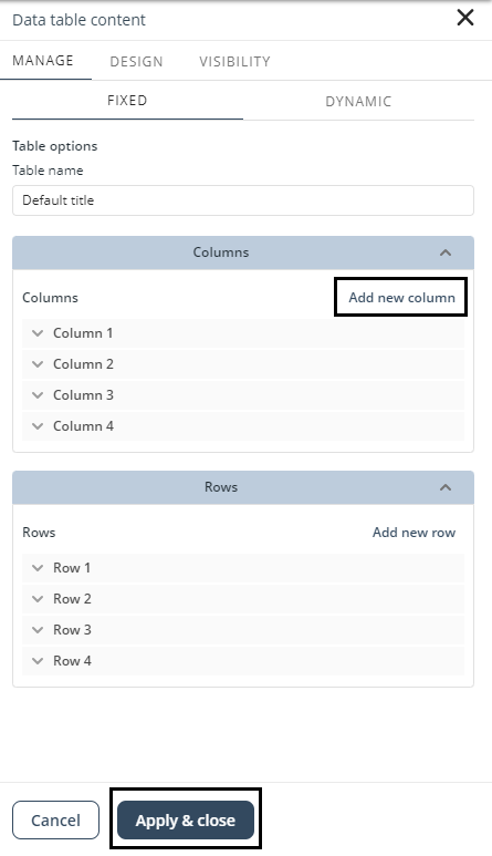
Add a column
To add a new column, click Add new column in the top-right corner of the Columns section. Enter the column name, select the value type (Text or Image), and then click Apply & close.
|
Columns with other data types (such as Number, Currency, or Date) are treated as text when using Static content |
Modify a column
To modify a column, select it from the list under Columns. You can change the column’s name or its value type.
To rename the column, enter the new name in the Column name field. To change its type, open the Type drop-down list and choose Text or Image. When finished, click Apply & close to save your changes.
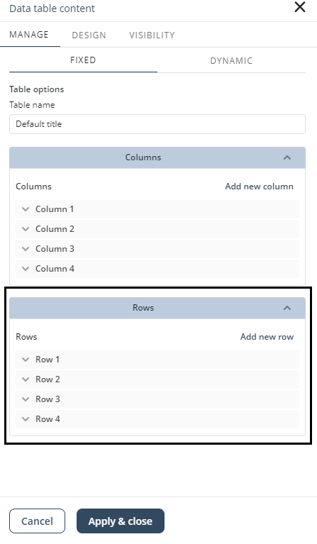
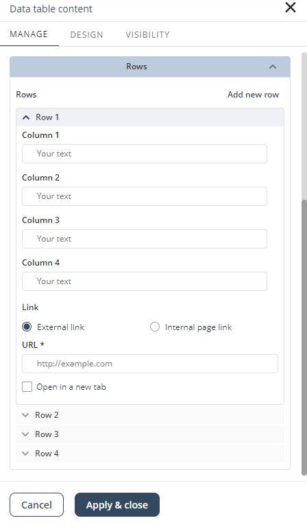
Rows
In the Rows section, you can add rows and define cell values.
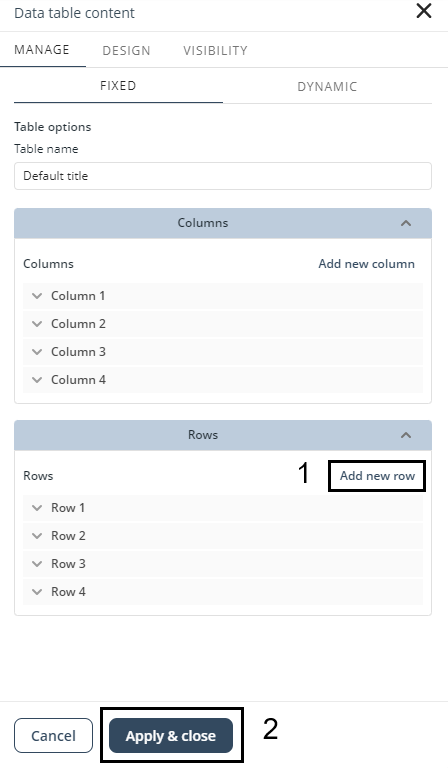
Add a row
To add a new row, click Add new row in the top-right corner of the Rows section, and then click Apply & close.
Set the value of a cell
To set the value of a cell, select the row that contains the target cell from the list under Rows. You can configure the following options for each cell:
•Value: the content of the cell, depending on the column’s value type.
•Link: defines the type of link. Choose External link to direct users to an outside website (e.g., google.com), or Internal link to direct users to a page within your app.
•URL/Page: if you choose External link, enter the destination URL in the URL field. If you choose Internal link, select the page from the available list.
•Open in a new tab: select this option to open the linked website or page in a new browser tab.
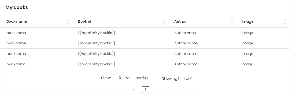
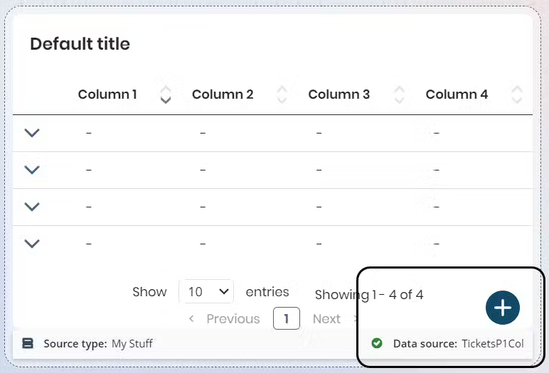
As mentioned earlier, you can use Dynamic content to display data retrieved from a View, My Stuff, or Cases. To configure it, follow the steps in the Connection Wizard (described in the Dynamic content section).
After completing the setup, the Data table displays labels that show the data mapping and the source name (e.g., a View called LoanBooksView) at the bottom right of the control. These labels confirm that dynamic data has been successfully configured.
The following example shows how the Data table appears when dynamic content is used:
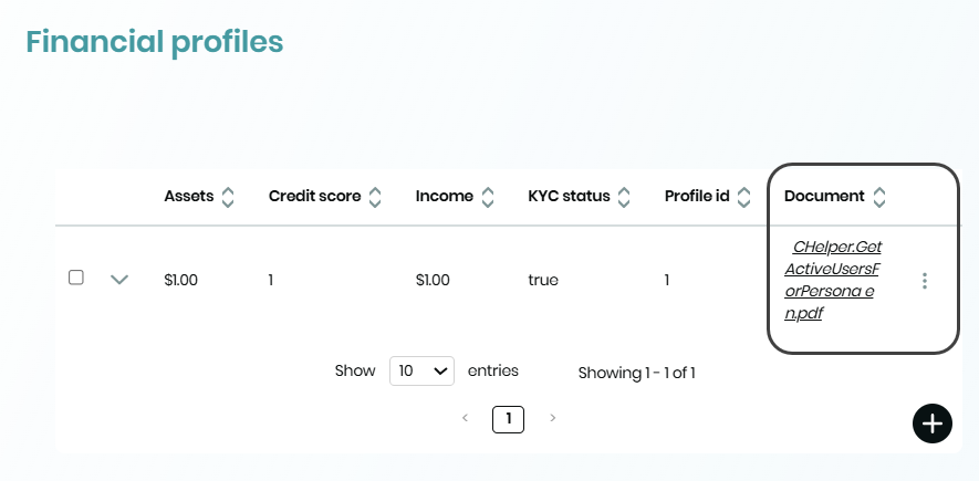
File attributes
When converting a Collection control, attributes of type File are preserved and displayed if supported by the Data table.
To configure them, select Upload in the Type field of the corresponding column.
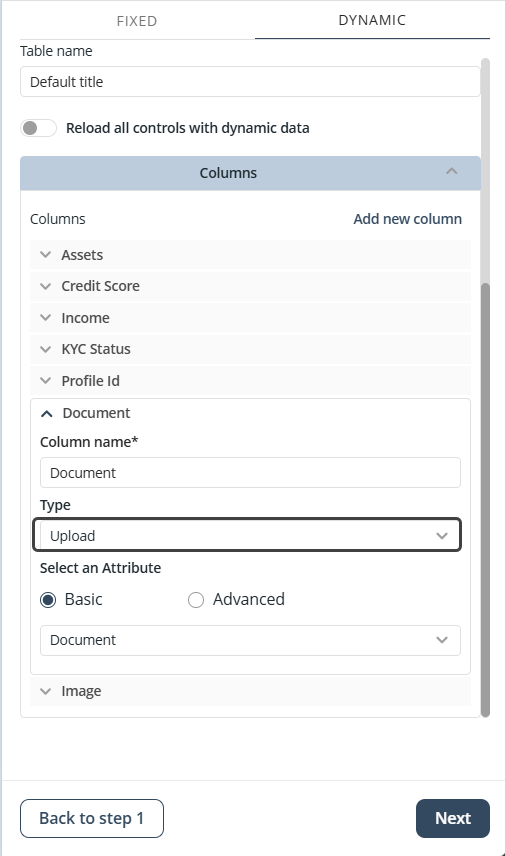
In the published app, users can click the hyperlink in the file name to download the file.
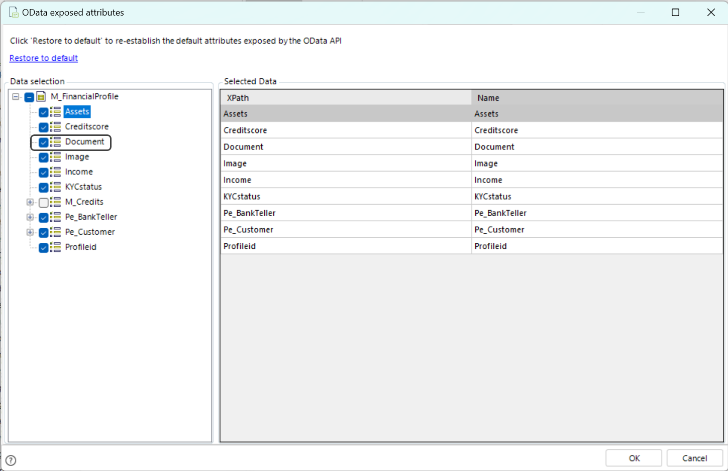
|
For this feature to work correctly, ensure the File attribute is enabled as an exposed attribute in the OData Exposed Attributes section under Entities in the Expert View or through the Experience Matrix.
|
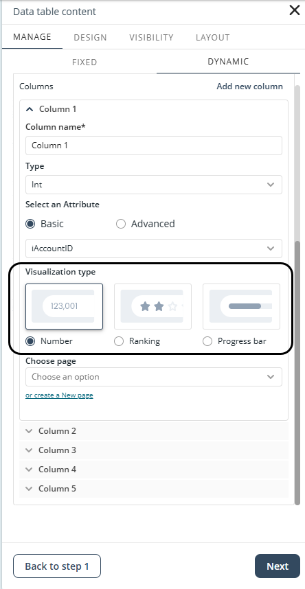
Data visualization options
You can configure how numeric data appears in Data table columns by selecting one of the following visualization formats:
•Star ranking: displays numeric values as star ratings (full, half, or empty stars).
•Progress bar: represents progress levels with a horizontal bar proportional to the value.
•Plain number: shows numeric data without additional formatting.
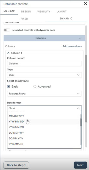
Date formatting
The controls of dynamic Data Table give you flexibility in how dates and times are displayed in Date or DateTime columns. You can choose from multiple date formats, such as DD/MM/YYYY, YYYY-MM-DD, or MMMM D, YYYY, adapted to the language of your app. You can also define how the time is shown, selecting a 24-hour or 12-hour format, including the time zone, or hiding the time entirely. These enhancements are available in the column settings of Data Table, which now include dedicated Date format and Time format selectors.
Adding records
When the Data table is configured with My Stuff as its data source, a + button appears, allowing you to add new records.
This feature is only available in the published app; it does not work in the App Designer editor.
Sorting records
The Data table control supports both default sorting (configured during design) and interactive sorting (performed by app users in the published app).
Configuring default sorting
You can define a default attribute and sorting direction to be applied when the Data table first loads in the published app. This ensures a consistent initial view of the data.
|
Default sorting only applies to tables with dynamic content; it cannot be set for tables with static content or contextualized data. |
To configure default sorting, follow these steps:
1.Select the Data table control and click Manage Content.
2.In the Dynamic tab, complete the data source setup by going through the Source and Fields steps.
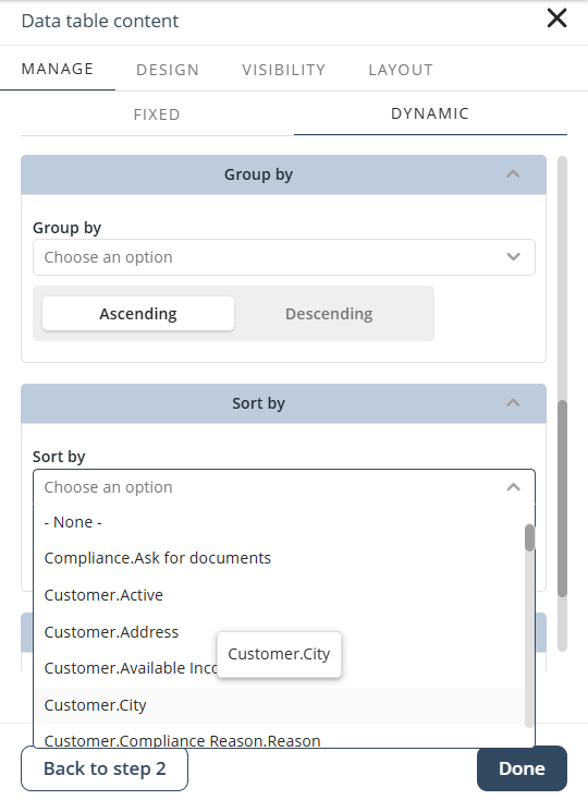
3.In the Customize step, use the Sort by option to select the attribute and define the sorting direction (ascending or descending).
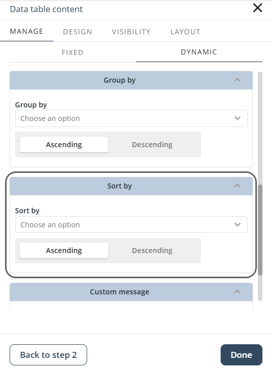
|
A tooltip shows the XPath of the selected attribute to confirm the exact field used for sorting.
Even if the chosen field is not displayed as a column, the sorting is applied in the background. |
4.Click Done and publish your app.
Users in the published app can override this default order.
Sorting in the published app
In the published app, users can sort the Data table by clicking the column headers:
•Click the upward arrow to sort a column in ascending order.
•Click the downward arrow to sort a column in descending order.
By default, sorting icons appear at 50% opacity. The icon for the column currently being sorted is fully visible, making it easy for users to see which column defines the order.
|
Sorting changes made by users apply only while using the app and do not affect the default sorting configured in the App Designer editor. |
Sorting rules
Sorting follows the rules below depending on the column type:
•Number: ascending (lowest to highest), descending (highest to lowest).
•Date: ascending (oldest to newest), descending (newest to oldest).
•Currency: same as numbers.
•Text: alphabetically A–Z (ascending) or Z–A (descending).
|
•If text includes numbers or special characters, sorting prioritizes numbers first, then special characters, and finally letters. •For Static content, sorting is available but applies only to text columns. |
Defining the control appearance
To change the Data table’s look and feel, click the control to display its configuration options, and then select Settings.
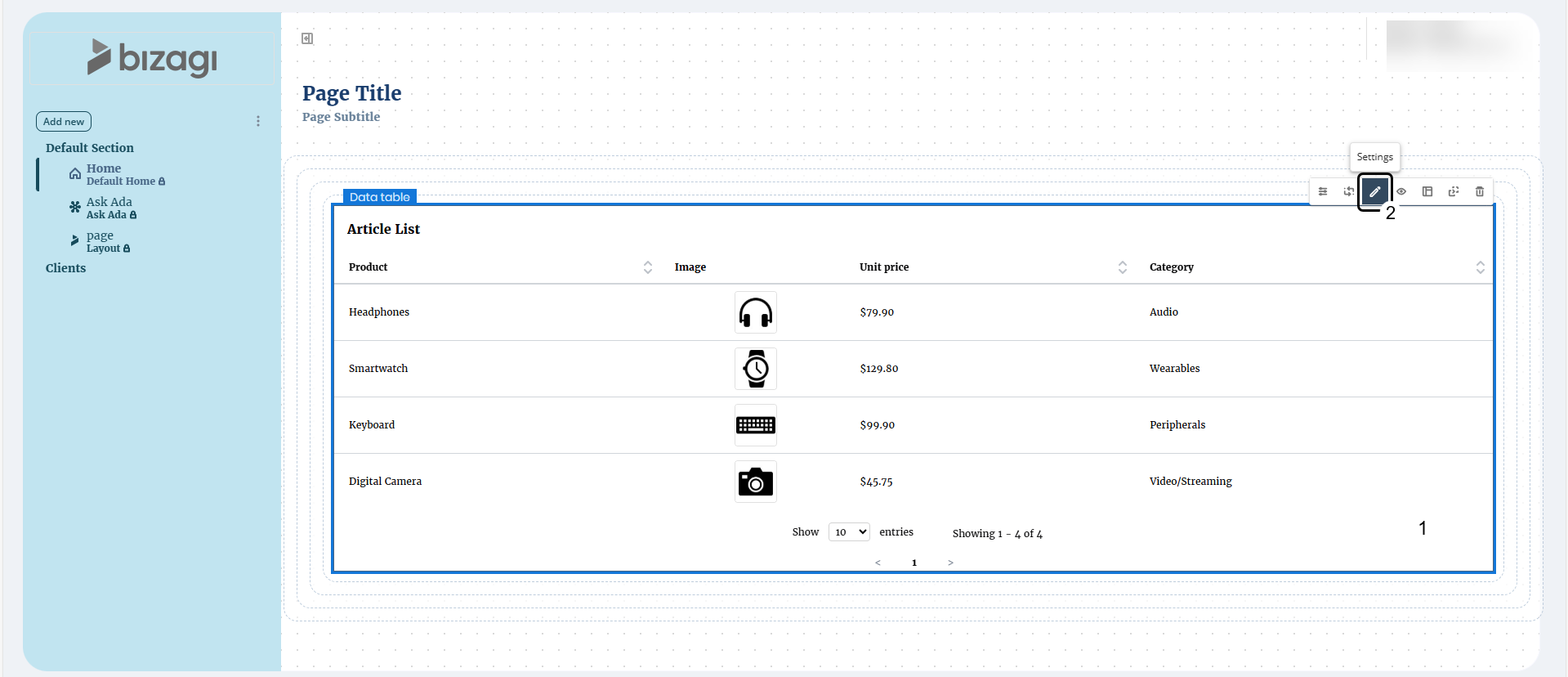
Use the configuration panel to adjust style, fonts, and colors.
|
•Click the Reset button to restore the default settings. •Properties with inherited values display a blue dot next to their title. This indicator allows you to make targeted adjustments without affecting other settings. Hover over the blue dot to see the source of the inherited value, giving you greater control over your text control’s appearance. •When you modify a property marked with a blue dot, its individual Reset button appears. Clicking this button restores the property to its default inherited configuration. |
General settings
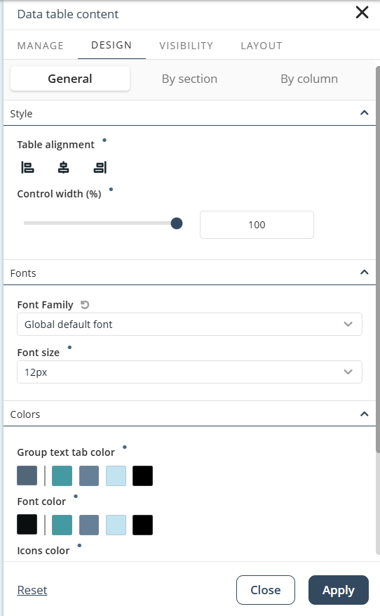
In the configuration panel, you can modify three main settings:
•Style
oAlign: Align text to the left, center, or right within the control.
oControl width: Set the width of the control as a percentage of the column.
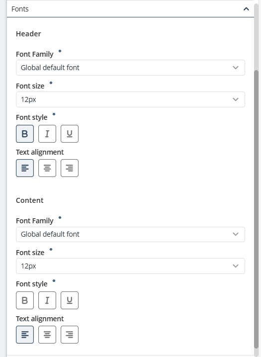
•Fonts
oFont family: Choose the font for table item text. If no font is set, the global default font is used.
oFont size: Lets you set the size (in pixels) of the text for the table items.
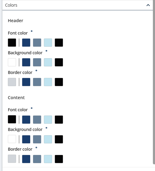
•Colors
oFont color: Lets you set the color of the text for the table items. When you click the first square of the option, a color picker palette opens for you to select the text color you want. Likewise, you can select the color by specifying its hex color code in the Hex field.
oBackground color: Set the background color of the control.
oBorder color: Define the color of borders between collection elements.
If you use the Group by option to organize content, you can define one more color:
oActive group button color: background color of the button for the currently active group. The active group is the value of the category currently used to filter the dynamic content.
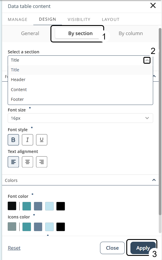
Section settings
You can customize Fonts and Colors for specific sections of the Data table. To do this:
1.In the Design tab, select the By section option.
2.Open the Select a section drop-down list and choose one of the following:
•Title: Displays the name assigned to the Data table, shown at the top.
•Header: Shows the name of each column.
•Content: Refers to the body of the table, including text, numbers, or images in each row (excluding headers).
•Footer: Displays text below the table. Font settings for this section allow changes only to font size.
Column settings
You can select individual columns of the Data table and apply specific style configurations. To access these settings:
1.Click the Data table control and select the Settings button.
2.Go to the Design tab and choose the By column option.
3.Open the Select a column drop-down list and pick the column you want to configure. The table highlights the selected column with a dotted outline to show the editable area.
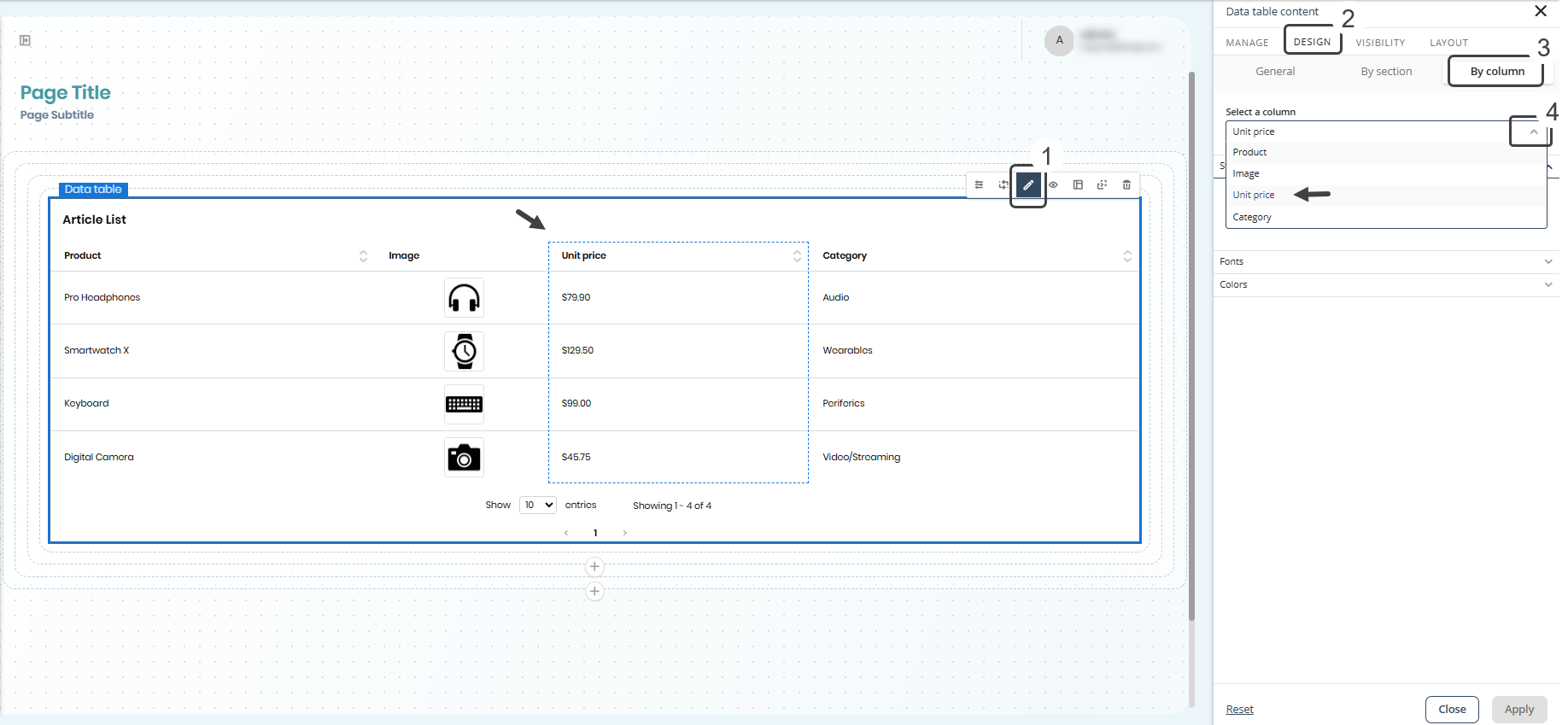
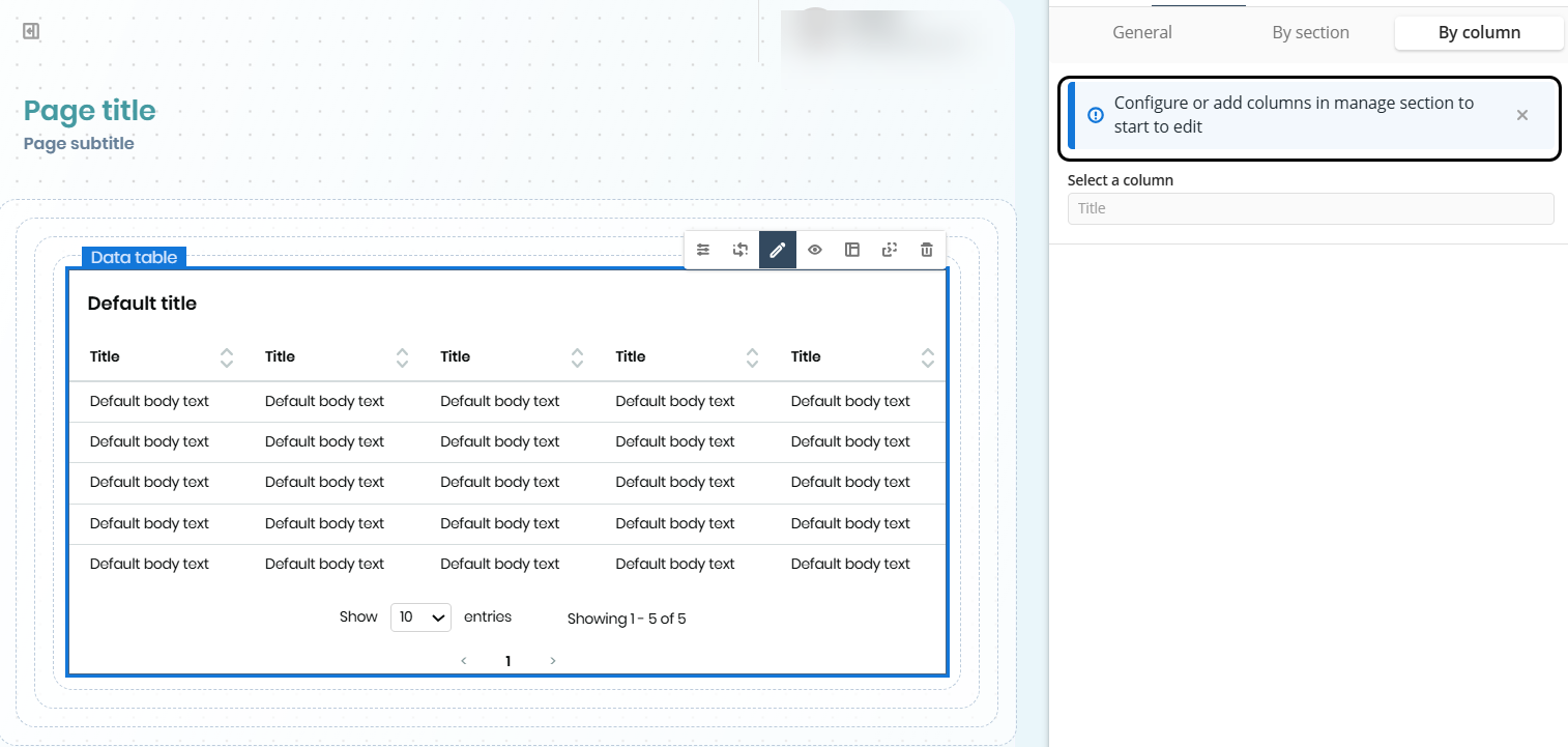
If no columns have been configured, the By column option is disabled and a message prompts you to configure columns first.
|
Column-level style options are only available in the By Column section of the Design tab and cannot be modified from the global Controls Style in the Appearance menu. |
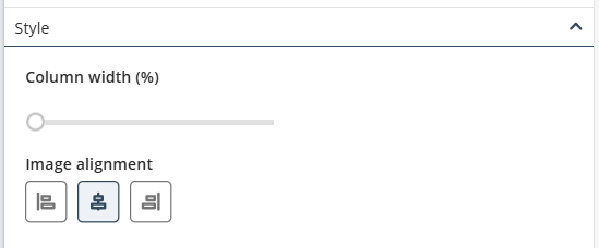
Within By Column, you can configure:
•Style: Set the column width and, for image-type columns, the image alignment (center by default).
•Font: Change font family, size, alignment, and styles (bold, italic, underline). Header and content defaults differ.
|
•For image columns, only header font styles are available. •The initial value for each font setting follows the style inheritance hierarchy: if no other style is applied, a default value is used. •Styles configured at the column level take precedence over section-level, general, or Controls Style settings. |
•Colors: Define font color, background color, and border color (header borders and row dividers).
|
•Header border color applies to the bottom edge of the column header. •Content border color applies to horizontal lines between rows. •Background color cannot be applied to columns with image attributes. •Initial values for all color settings depend on the selected color palette. |
If you switch a Data table control between static and dynamic content, or change the data source of a Data table control with dynamic content, previously configured column styles are not retained. A message will notify you when this happens.
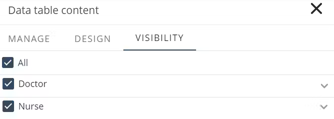
Visibility
You can control who can see the Data table by selecting the Personas. Use the All option to make the table visible to every Persona, or choose specific Personas to restrict access to only those users.
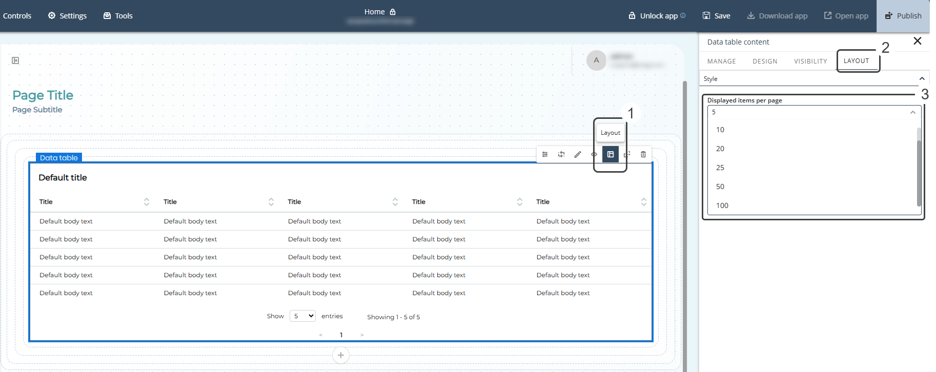
Layout
In the Layout tab, you can define pagination settings and the number of items displayed per page.
The Style section includes a Displayed items per page selector with predefined values: 5, 10, 20, 25, 50, or 100. If no value is selected, the default is 10. Once configured, this setting is preserved whenever the published app reloads, ensuring a consistent display. This applies to Data table controls with both static and dynamic content.
To set the number of items per page, select the Data table control and open the Style options in the Layout tab. Under Displayed items per page, choose the desired value.
Alternatively, you can use the drop-down at the bottom of the Data table control.
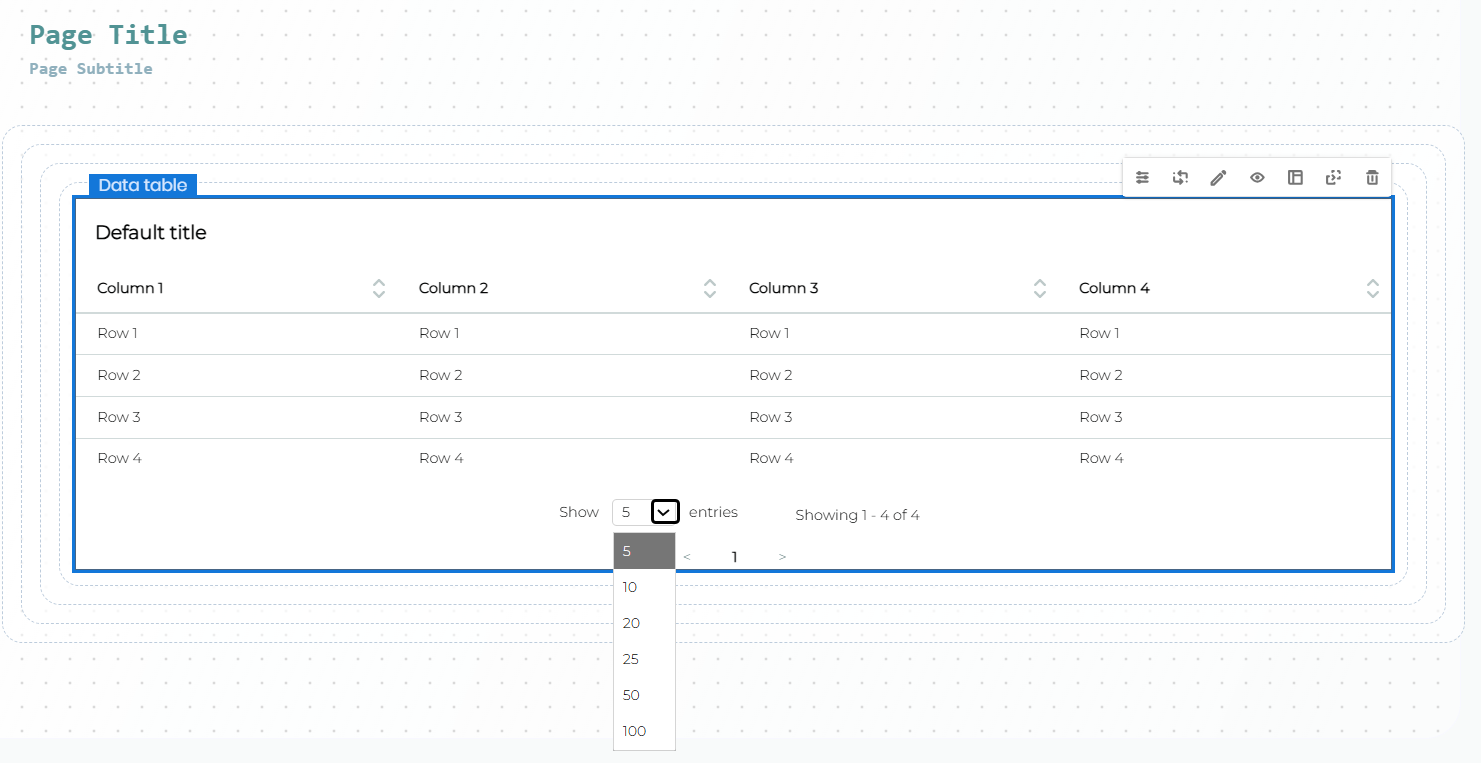
All changes are applied automatically.
Considerations
•Default sorting and visualization features apply only to dynamic data.
•App users can adjust column width, sorting, and pagination in the published app, but these preferences are not saved permanently.
•For an optimal layout, total column widths should sum to 100%.
•For large datasets, use filters and pagination to maintain performance.
•When using File attributes, ensure they are exposed through OData to enable proper downloading.
Last Updated 7/16/2026 9:55:04 AM