Overview
The Collections controls in the App Designer allow you to display and interact with data that belongs to a collection within your app. These controls are designed to present grouped or related records in different visual formats, depending on the user experience you want to achieve.
There are five Collection controls available:
Each one offers a unique way to visualize and manage collection data—ranging from structured tables to more visual, card-based layouts.
This article describes the properties that are shared by the Collection controls that represent data i.e. Data table, Card link, List collection and Small card.
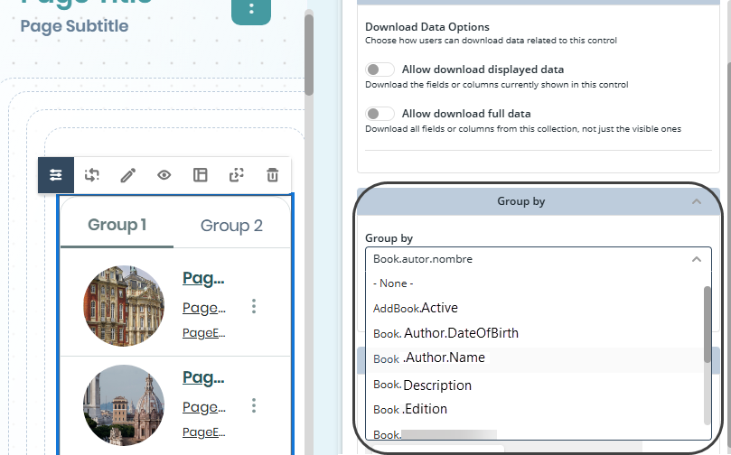
The Group by Cases feature lets you configure the Group by option in Collection controls when using Cases as the data source. This allows you to visualize grouped case information directly in the published app, making it easier to analyze related records.
Filter in Cases Data
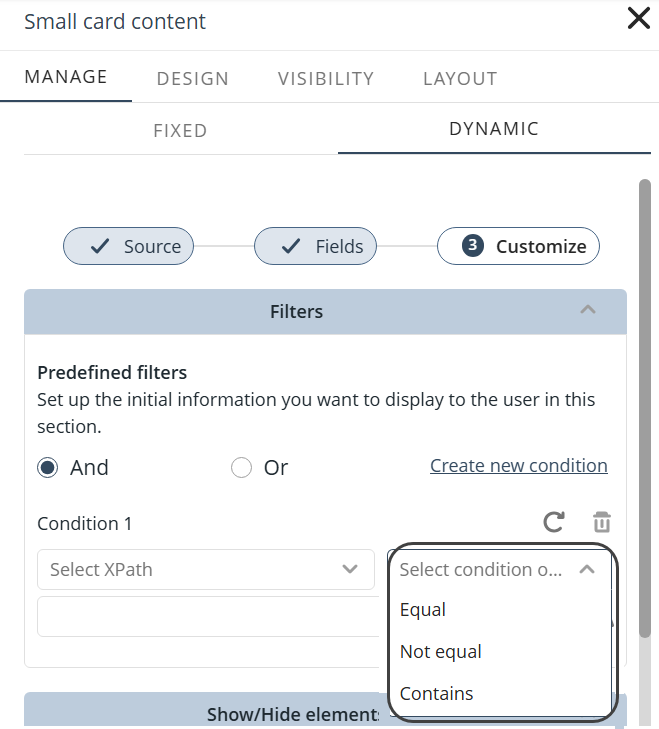
You can now apply filters when loading records from Cases in Collection controls. This functionality includes support for advanced operators based on the data type (text, numeric, date, and Boolean), as well as the ability to define up to three conditions combined using logical operators (AND or OR exclusively) from the editor. Filters can be configured using static or dynamic values (such as user or entity attributes), automatically adapting input types and validation rules according to the selected data type. This allows you to display only the most relevant case data in a more flexible, precise, and consistent way across different data sources.
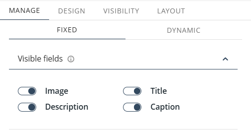
Field Visibility in Static Collections
You can control the visibility of fields in collections configured with static content. The new Visible fields section under Manage content lets you show or hide the following elements: Image, Text, Title, and Caption.
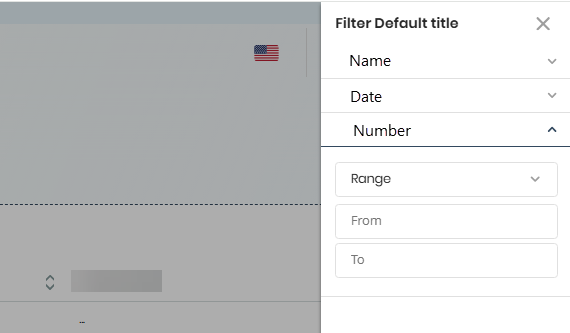
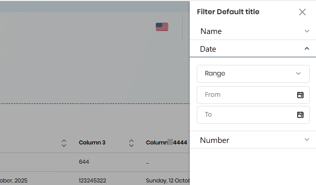
Range Operator in Filters
Collection filters support a range operator for dates and numeric fields. By defining minimum and maximum values, you can perform more precise filtering when working with collection data.
Last Updated 7/20/2026 11:11:40 PM