Overview
This step lets you configure how your app is displayed in the App Launcher once you publish it. You can customize two options, both having several style options. These options are Background settings and Icon settings.
|
Note that you can easily customize your app if you already have a published app and a .css and/or .js file to personalize it. |
Background settings
The first option you can customize is Background settings. This option lets you modify three style properties: Background type, Container style, and Container.
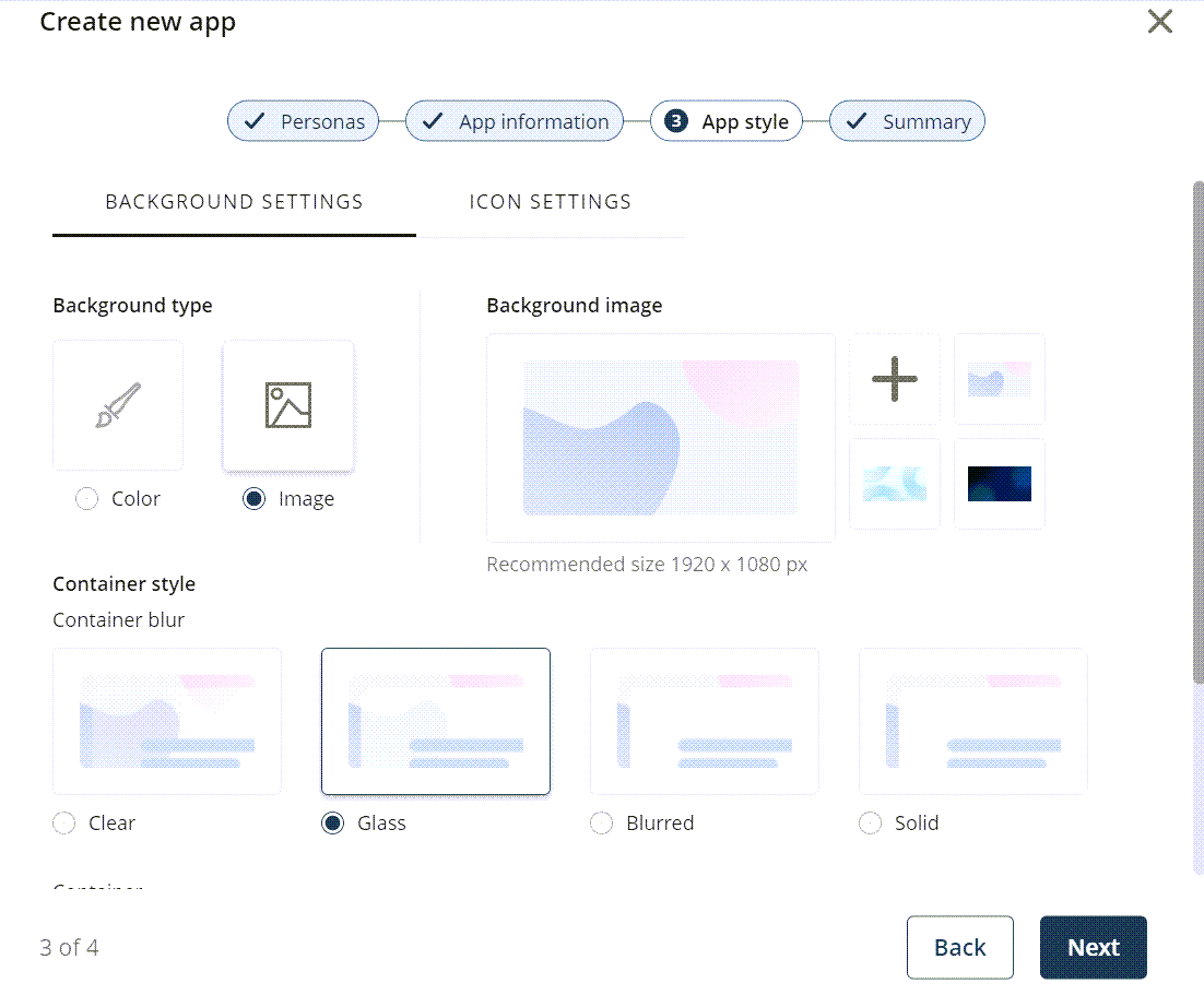
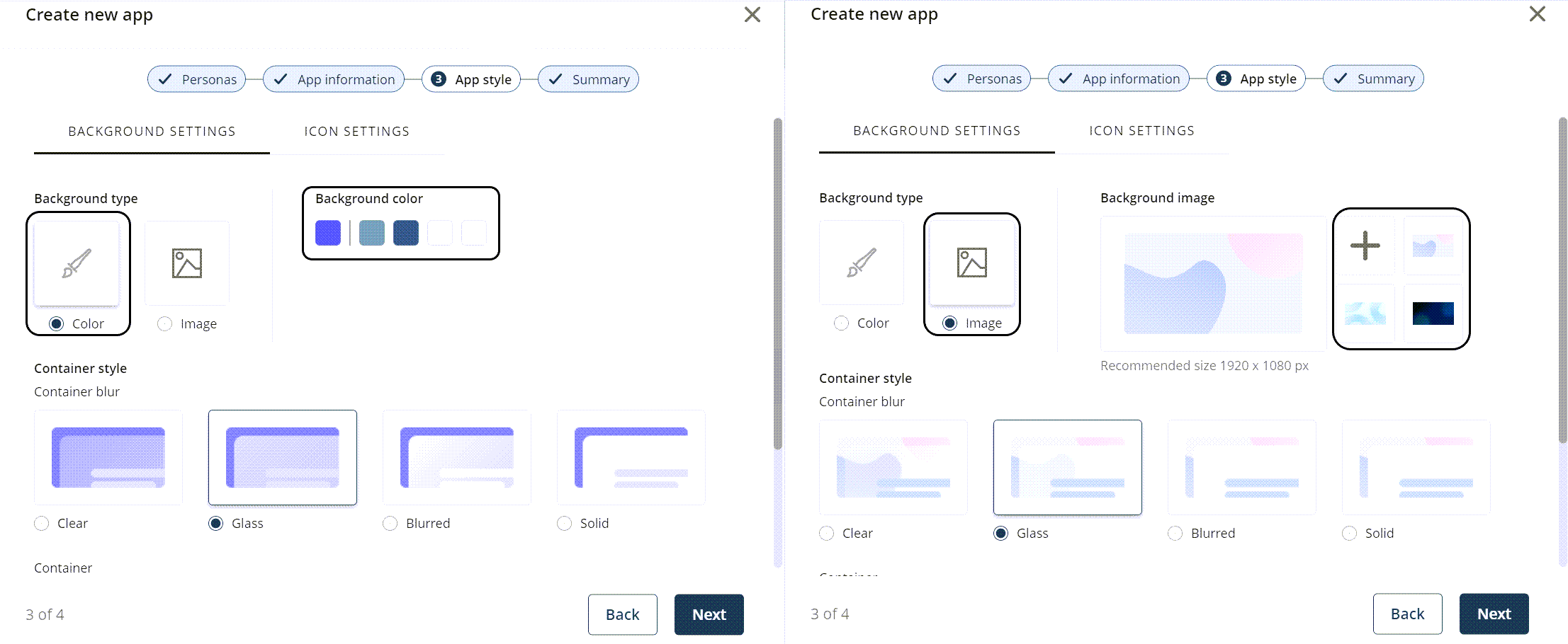
•Background type: determines the type of background your app has. You can choose between two types of background: a color or an image (either a predetermined image from Bizagi or a custom image).
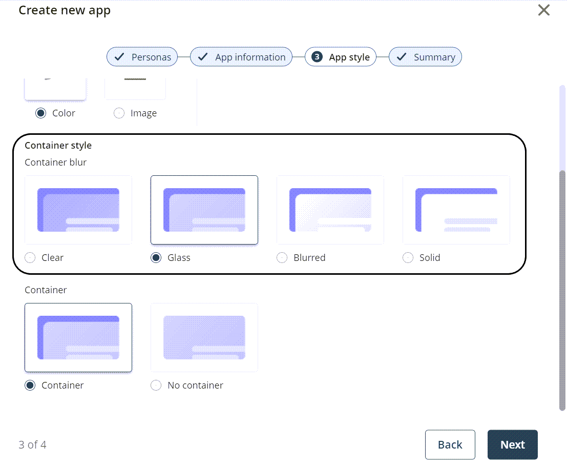
•Container style: determines the way in which the Background type is displayed. You can choose between a Clear, Glass, Blurred, or Solid style.
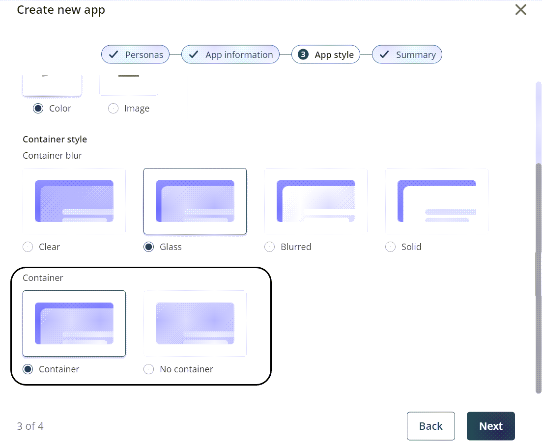
•Container: determines if the Container style you selected for your app is boxed (Container) or occupies the whole screen (No container) to showcase the Container style of your app.
Select the color from the color picker or select an image. The image can either be predetermined from Bizagi or you can upload a personalized image to be the app background by clicking the button located beneath the Background image label.
|
The recommended size for personalized images is 1920 x 1080px. |
Select the transparency you want for the container.
Select the container in which the Container style is displayed.
|
The configurations made in the Background settings can be visualized in your published app and in the App Designer editor.
|
Icon settings
The second option you can customize is Icon Settings. These options let you modify three style properties: Type, Color, and Icon.
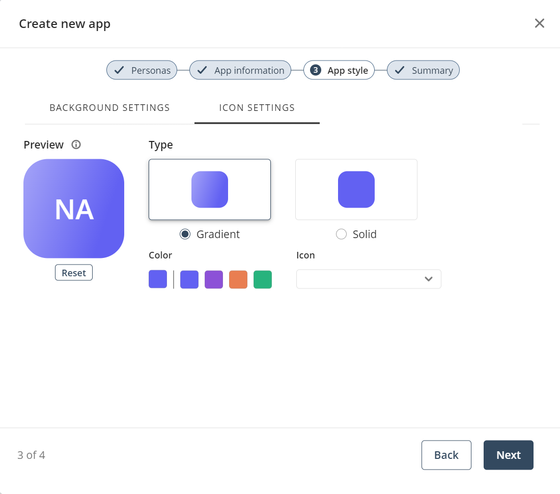
•The Type property determines the way in which the app icon's background color is displayed. You can choose between a Gradient or Solid style.
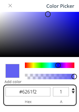
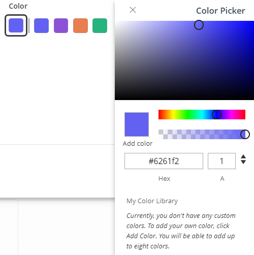
•The Color property defines the app icon's background color. You can pick a color from the palette displayed or open the Color Picker tool to select a specific color. To open the tool, click the palette's first box.
|
In the Color Picker tool, you can also select a color by specifying its code. RGBA, HSLA, and HexA color formats are supported, and you can switch between formats using the navigation arrows.
|
Once you have selected the desired color, you can add it to your color library (My Color Library). To do so, click the Add color label beneath the selected color box and verify that the color has been added to the library.
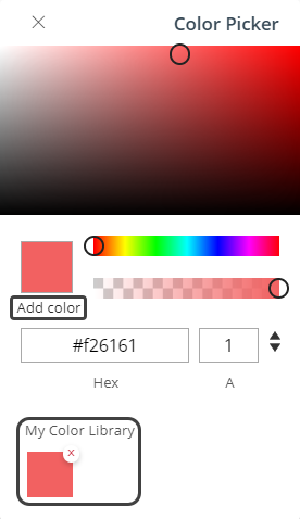
|
Bear in mind that you can add up to eight colors to the My Color Library. Once you reach this limit, the Add color label is disabled. |
In addition, the Color Picker tool automatically changes the app's icon font color to generate a contrast with the selected background color.
•Finally, the Icon property lets you choose an image for your app icon. This image must be selected from the library displayed when you click the property field. A search bar is also available to facilitate the selection.
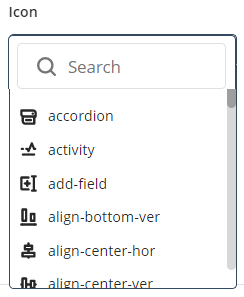
|
If you do not select an image, two letters are shown. These correspond to the initial letter of the first two words of the app's name (e.g., if your app is named New App Sales, the letters NA are shown). |
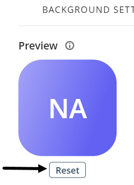
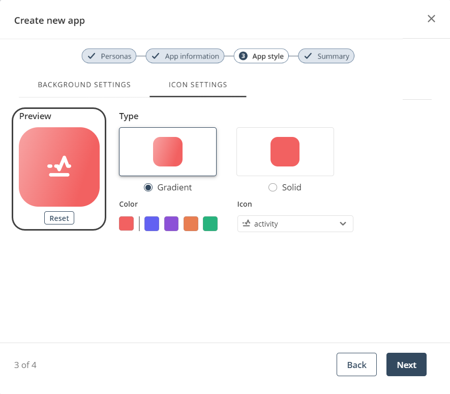
After configuring the properties of your app style, you can see a preview of your app's icon.
|
By default, a new app has no icon image and a blue gradient. To reestablish this app style, click the Reset button.
|
If everything is correct, click the Next button to continue.
Last Updated 11/18/2025 11:59:27 PM

