Overview
You can customize the appearance of Bizagi Apps controls using the Controls styles menu. This menu allows you to globally modify the styles and parameters of all types of controls. You can still make individual style changes to specific controls, which will continue to update in real time. The available customization and reset options are explained in this article.
Using the Controls style menu
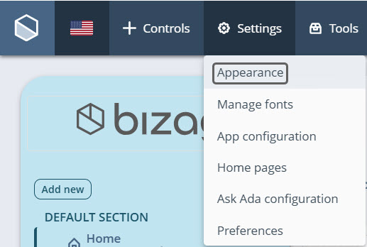
To access the menu, go to Settings > Appearance > Controls style > Edit.
The menu is divided into six sections: Text, Media, Buttons, Collections, Experience Elements, and Embeds.
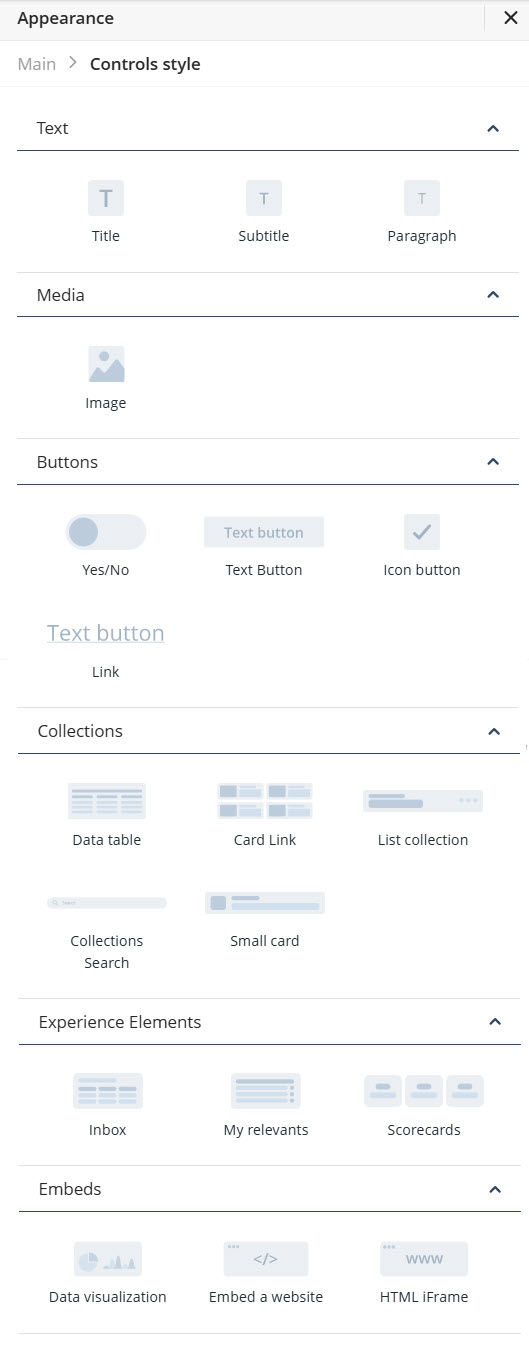
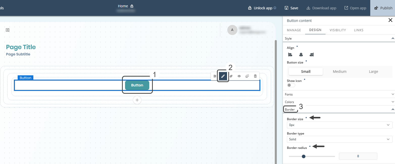
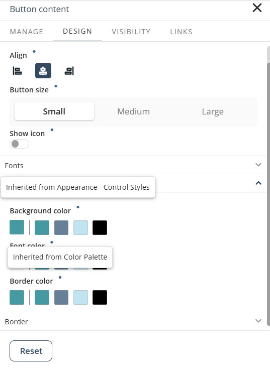
To customize a control—such as a text button—click the corresponding control (Text Button) from the respective section (Buttons).
The following view will open:
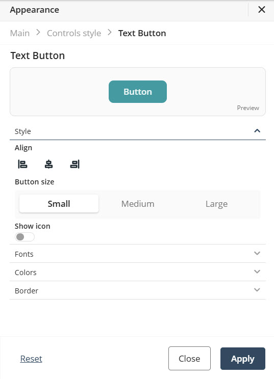
At the top of the screen, you will see a preview of the control with your changes, along with the control's name so you can easily identify which one you are editing.
After making your changes, click Apply to save them.
|
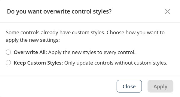
If controls of the selected type already have styles configured in your app, you will be prompted to choose one of the following options: •Overwrite All: Overwrites all styles in the app •Keep Custom Styles: Updates only the controls without custom styles
Select the option that best suits your app’s configuration. |
Reset Properties for Individual Configurations
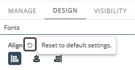
At the bottom of the menu, there is a Reset option. Clicking it reverts all properties of the selected control to its default style. Each property also has its own reset option.
•Properties with inherited values display a blue dot next to their title. This indicator allows you to make targeted adjustments without affecting other settings. Hover over the blue dot to see the source of the inherited value, giving you greater control over your text control’s appearance.
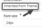
•When you modify a property marked with a blue dot, its individual Reset button appears. Clicking this button restores the property to its default inherited configuration.
|
For details on customizing your app’s overall look, refer to the Typography, and Themes documentation in the App Designer editor. For example, you can set default typography or colors for all text controls by configuring them once. |
Composed Properties
Some properties, known as composite properties, appear as multiple individual settings but are actually managed as a single property. When you click the Reset button for these composite properties, all associated settings within that control will be reset simultaneously.
The mapped composite properties are: Border size, Border radius, Show icon (on buttons), Control height, and Box shadow.
1. For example, when using a Text Button Control whose default properties are Border size : 0px, Border type : solid, and Border radius : 8.
2. Change Border size and define a Border type (from solid to double, for example).
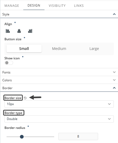
3. When you click the Reset button next to Border size, both the Border size and the Border type will be reset simultaneously. This is because these settings are part of a composite property, meaning they are grouped together and managed as a single entity.
Note: The inherited Reset button includes the Design tab properties for controls with inherited values. It does not include functionality from the Appearance section of the banner nor the features from the Manage section of any other control.
Color palette customization
You can also customize the styles of a control using a Color palette. A tooltip will indicate whether a specific control style is inherited from the Controls style settings or a particular Color palette.
|
If you select Override All option from the Color palette menu, all color settings defined in the Controls style menu will be replaced with the values from the selected palette. A tooltip will confirm that this override has been applied. |
Last Updated 11/19/2025 4:59:09 PM