Overview
The Mobile layout allows you to split your app's content into two Sections when viewed on mobile devices. It allocates 60% of the space to the main content and 40% to the secondary content, which is displayed as a sliding tab known as the Bottom sheet.
In this layout, you can assign a specific number of columns to each Section and add rows as needed to organize content effectively.
Mobile layout is disabled when using more than one Content container.
Add Row
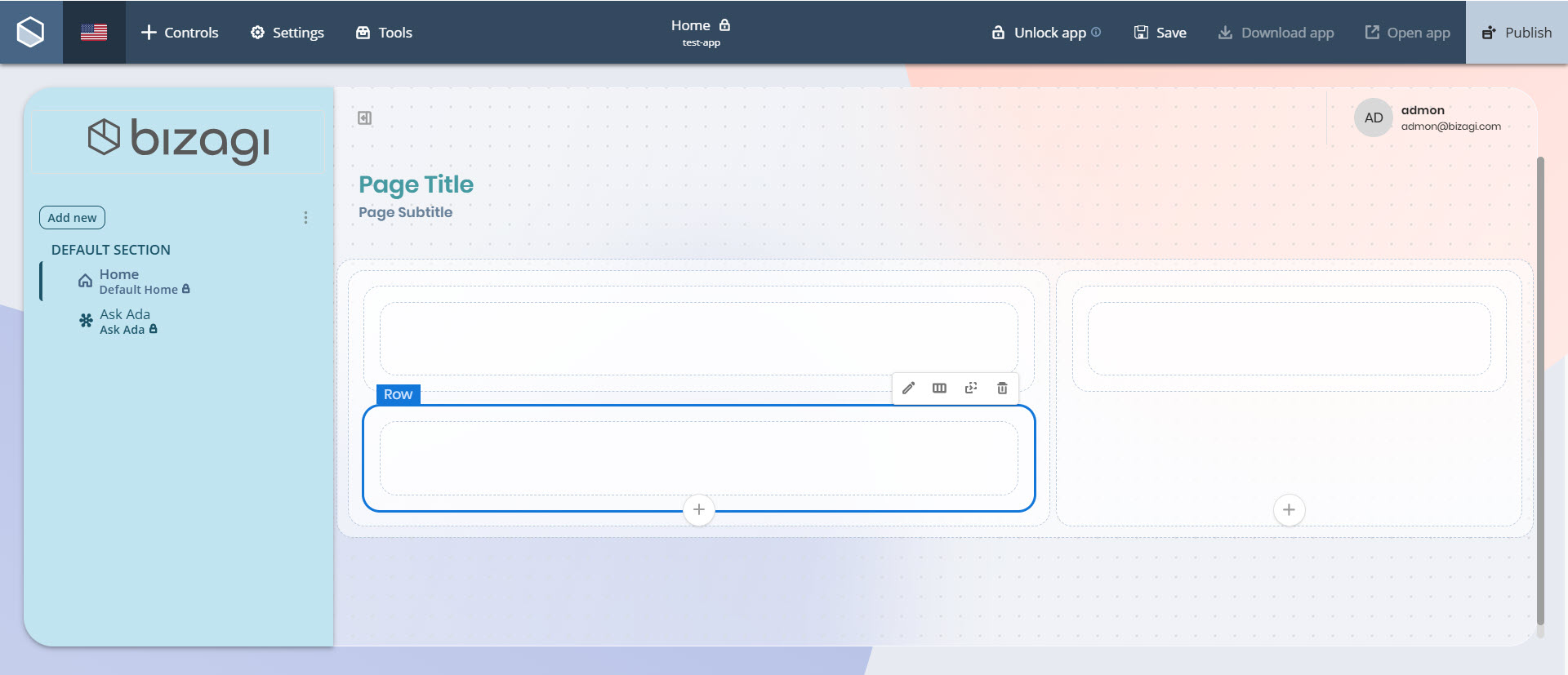
You can add Row containers to the main content Section, the secondary content Section, or both. To add a Row, click the Add Row button located at the bottom of the desired Section container.
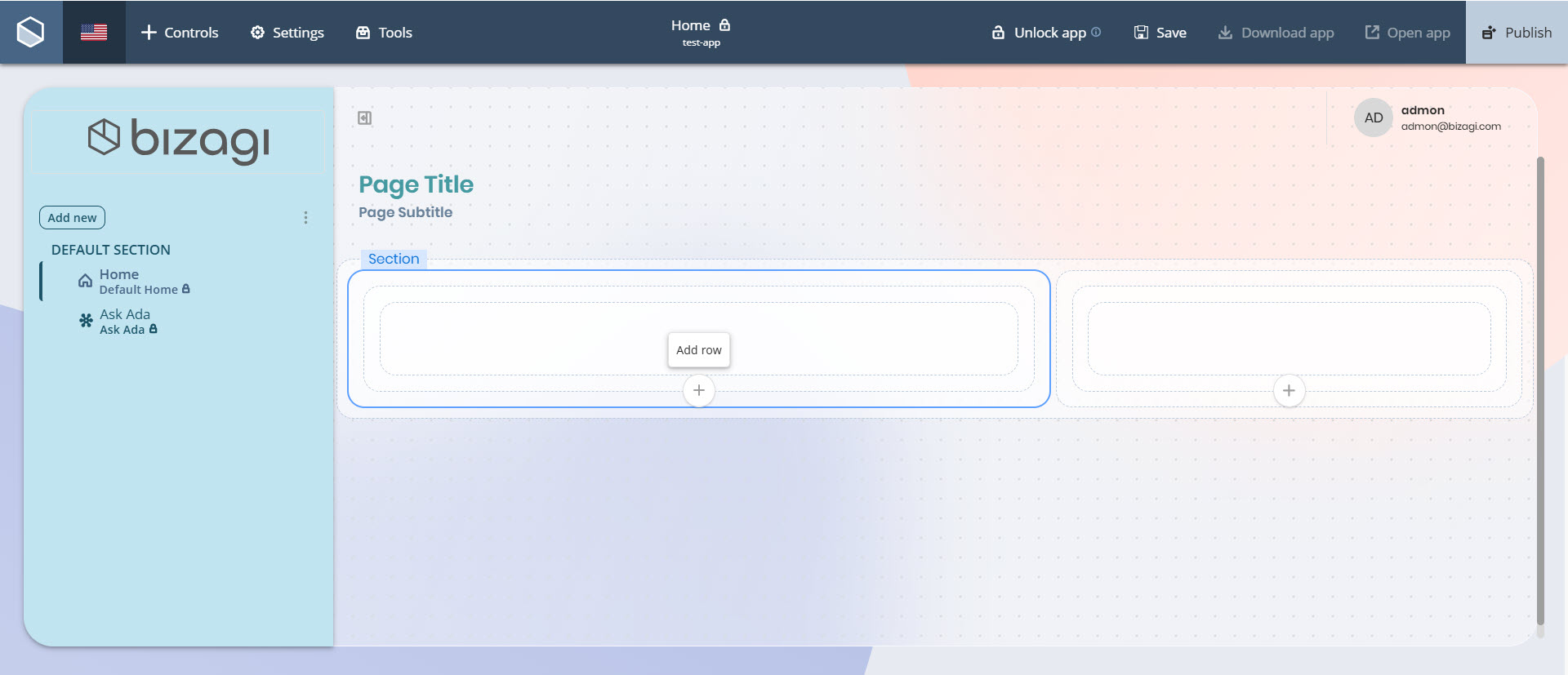
The new Row will appear inside the selected Section, ready to hold Column containers.
Add Column
Main content Section
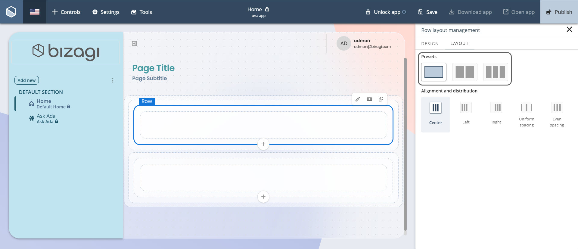
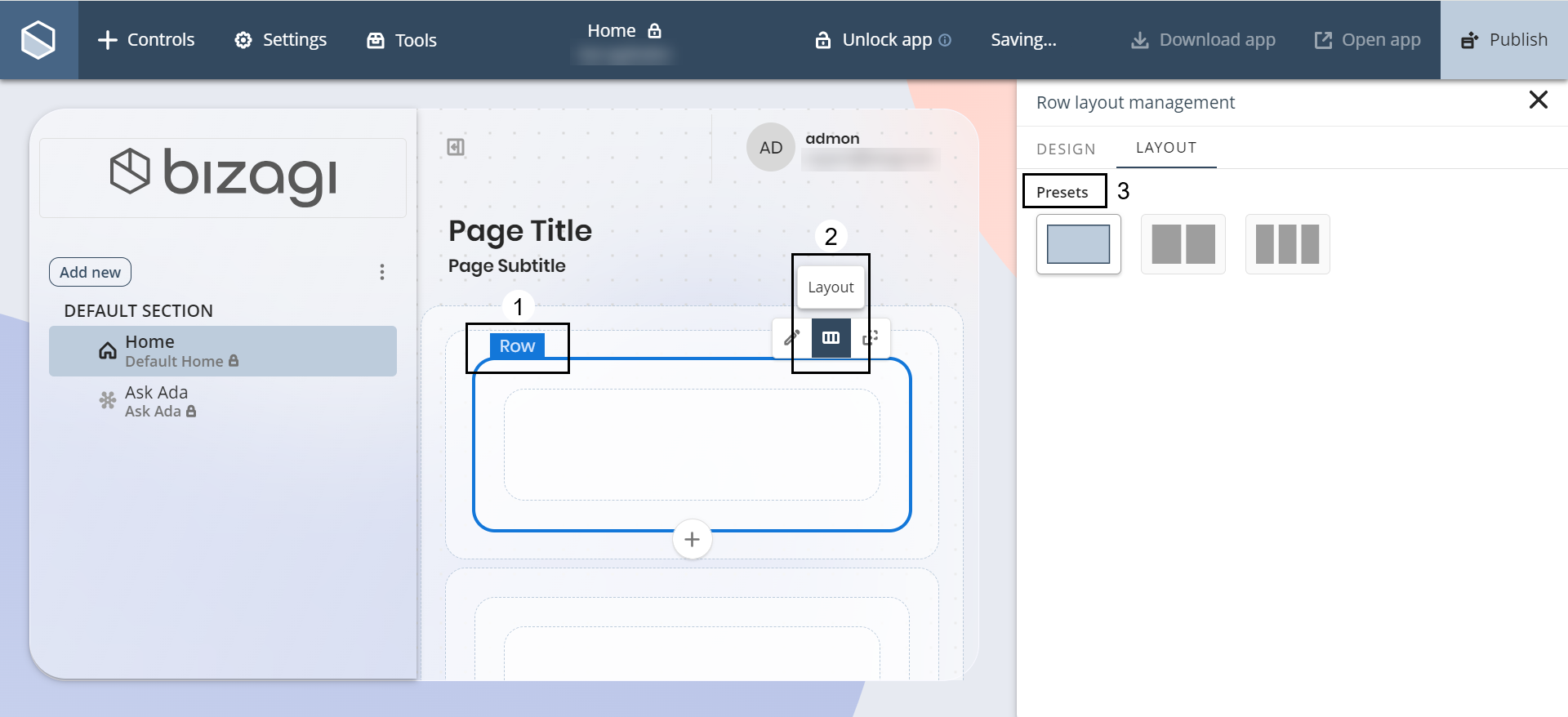
Once you have added a Row to the main content Section, you can insert between 1 and 3 Column containers into it.
To do so, click the Row container, select the Layout option, and choose the desired number of columns under the Presets label.
You can also configure how these columns are aligned and distributed within the row. Under Alignment and distribution, select from the following options:
•Left: Aligns columns to the left side of the row.
•Center: Aligns columns to the center of the row.
•Right: Aligns columns to the right side of the row.
•Uniform spacing: Distributes columns evenly, maintaining equal space between them.
•Even spacing: Distributes both columns and surrounding margins evenly across the row.
Secondary content Section
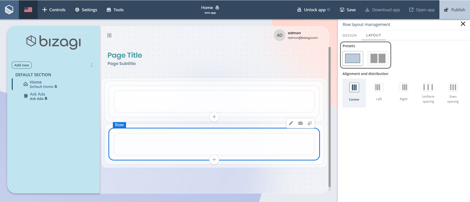
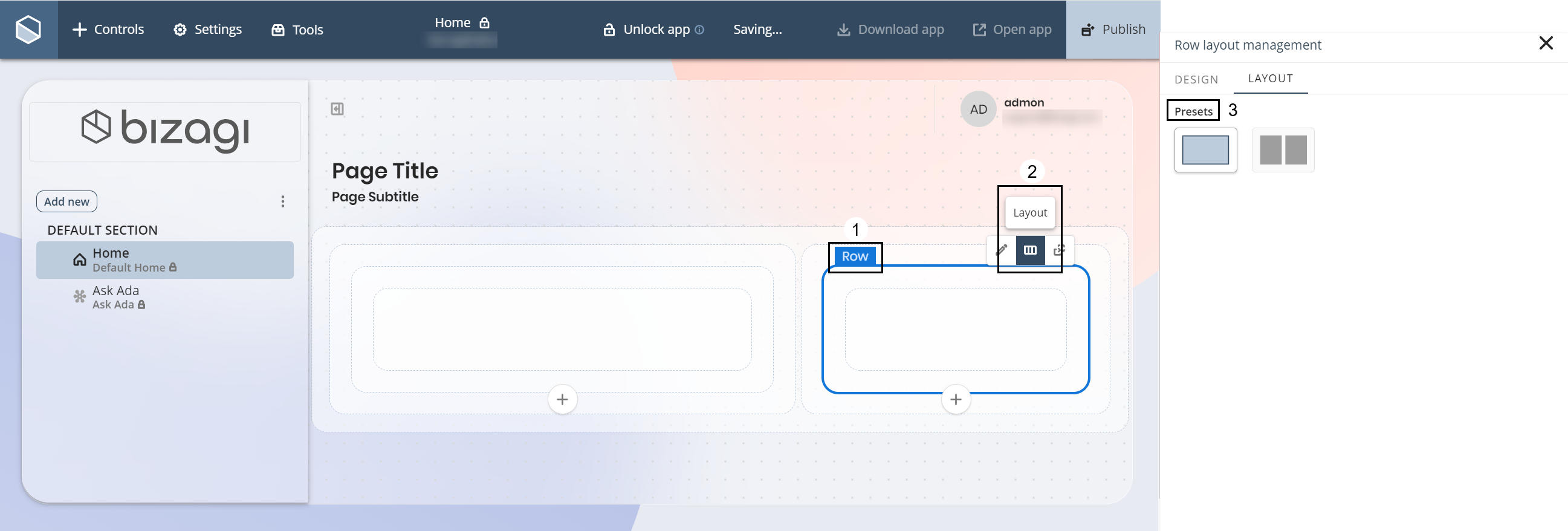
Once you have added a Row to the secondary content Section, you can insert between 1 and 2 Column containers into it.
The configuration steps are the same: click the Row container, go to the Layout option, and select a column preset under the Presets label. The same Alignment and distribution options are available to tailor the layout as needed.
Bottom sheet
In your published app, the secondary content—configured in the 40% Section—appears from the bottom of the screen as a sliding container called the Bottom sheet.
How to use
To open the Bottom sheet, launch your app on a mobile device. When you enter or scroll upward, a small container labeled Expand appears at the bottom of the screen. Tap it to display the Controls configured in the secondary content Section.
Last Updated 11/19/2025 12:00:09 AM