Overview
The Desktop layout is a web-style view that lets you access and interact with app content within a single Section. You can organize the information using configurable columns and rows, ensuring a consistent and structured experience across different screen sizes.
|
The default layout is Side Menu. If you change it to Top Bar, the menu adjusts to the available space on the screen grouping excess options under More items. |

Add Row
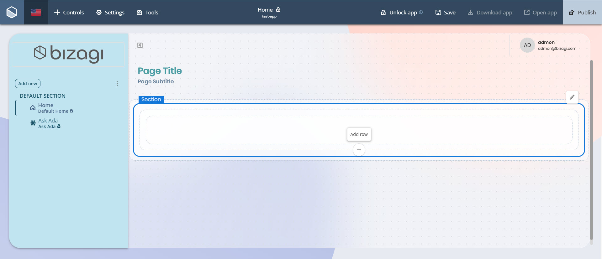
In this layout, you can add Row containers within the Section. To add a Row, click the Add Row button located at the bottom of the Section container.
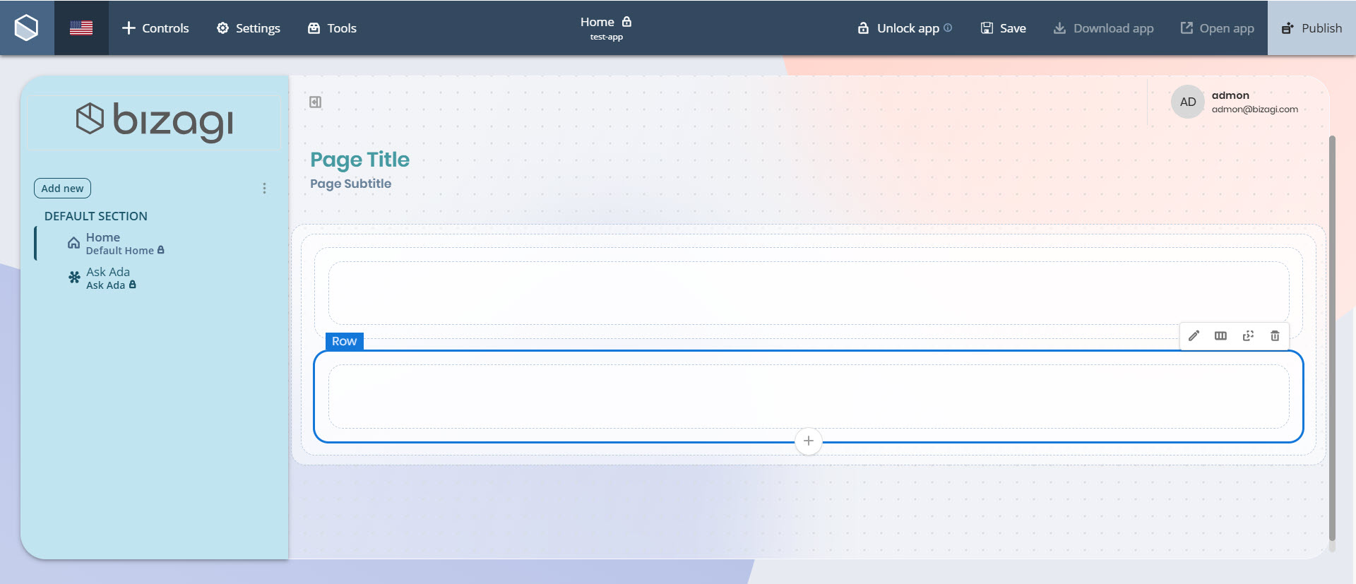
The new Row will appear inside the Section, ready to hold Column containers.
Add Column
Once you have added a Row, you can insert between 1 and 5 Column containers into it.
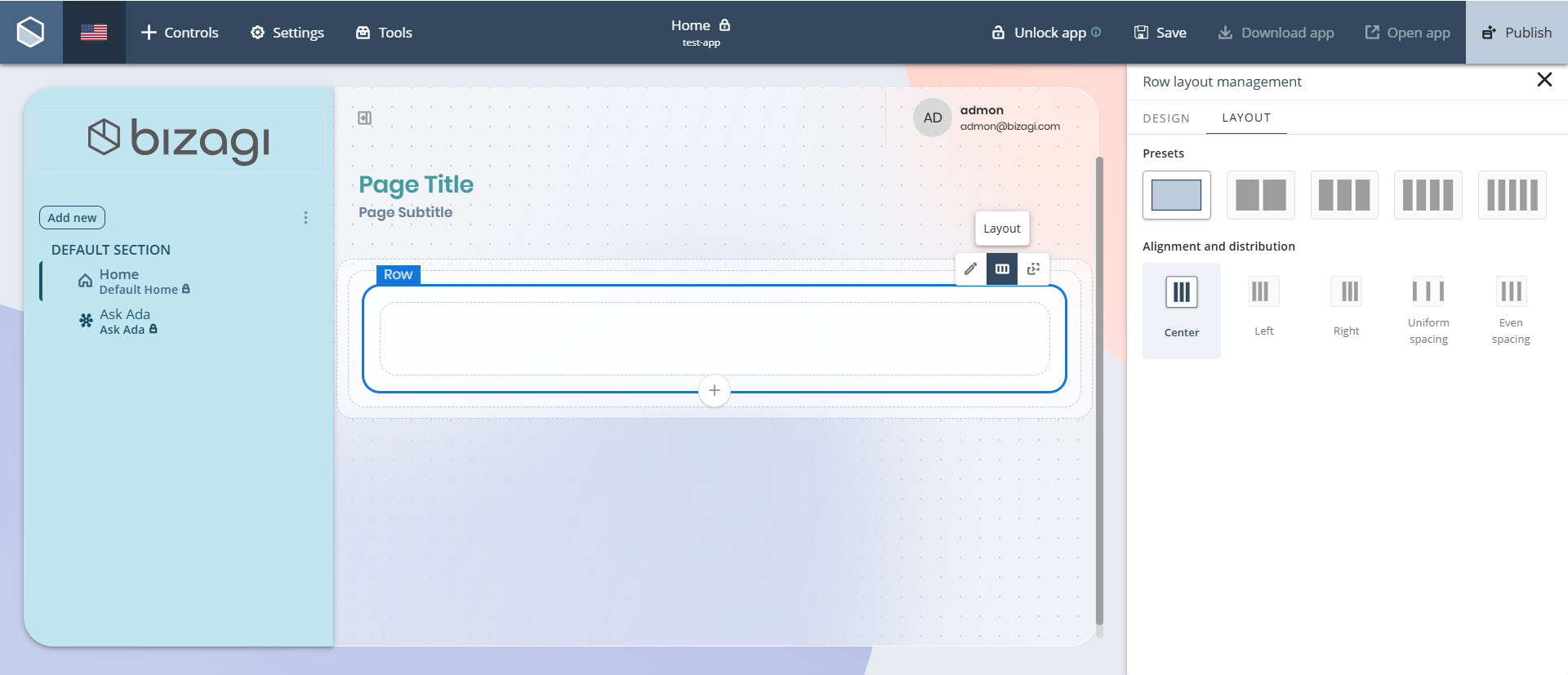
To do so, click the Row container, select the Layout option, and choose the desired number of columns under the Presets label.
You can also configure how these columns are aligned and distributed within the row. Under Alignment and distribution, select from the following options:
•Left: Aligns columns to the left side of the row.
•Center: Aligns columns to the center of the row.
•Right: Aligns columns to the right side of the row.
•Uniform spacing: Distributes columns evenly, maintaining equal space between them.
•Even spacing: Distributes both columns and surrounding margins evenly across the row.
Last Updated 7/16/2026 4:07:17 PM