Overview
In the App Designer editor, you can configure the layout of your app to create flexible and customized designs.
This includes selecting the container type for your app's main section, as well as defining the number of columns and rows within it. These layout options allow you to organize and distribute your Controls in a unique and versatile way.
Types of containers
Content
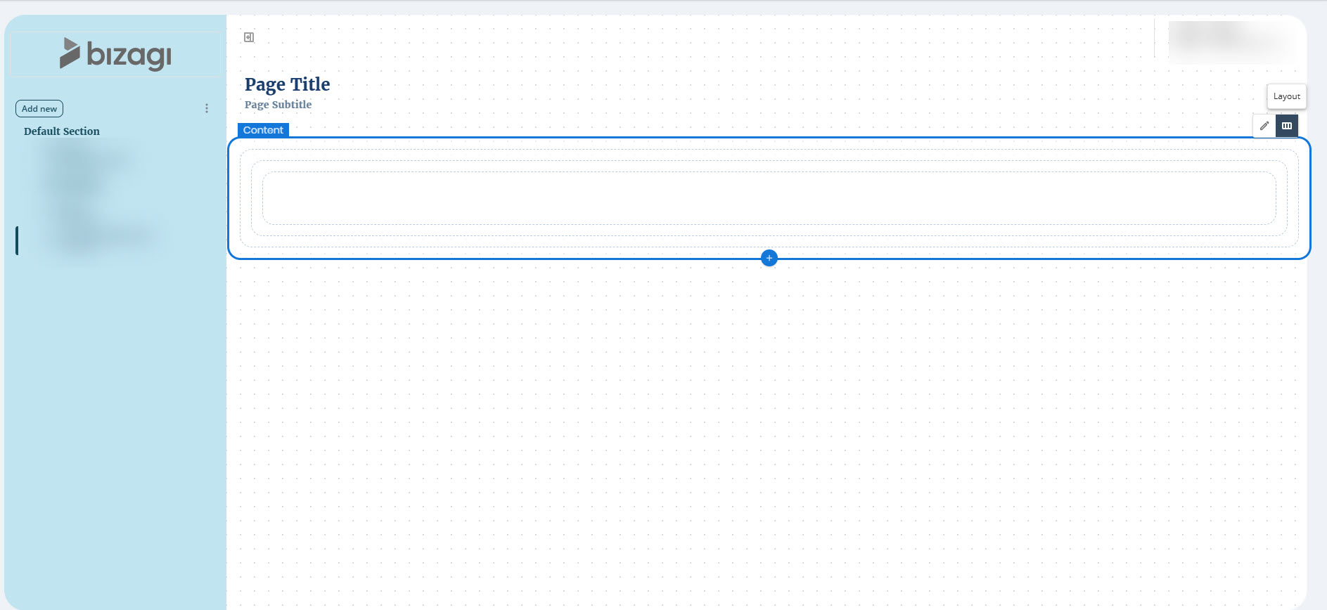
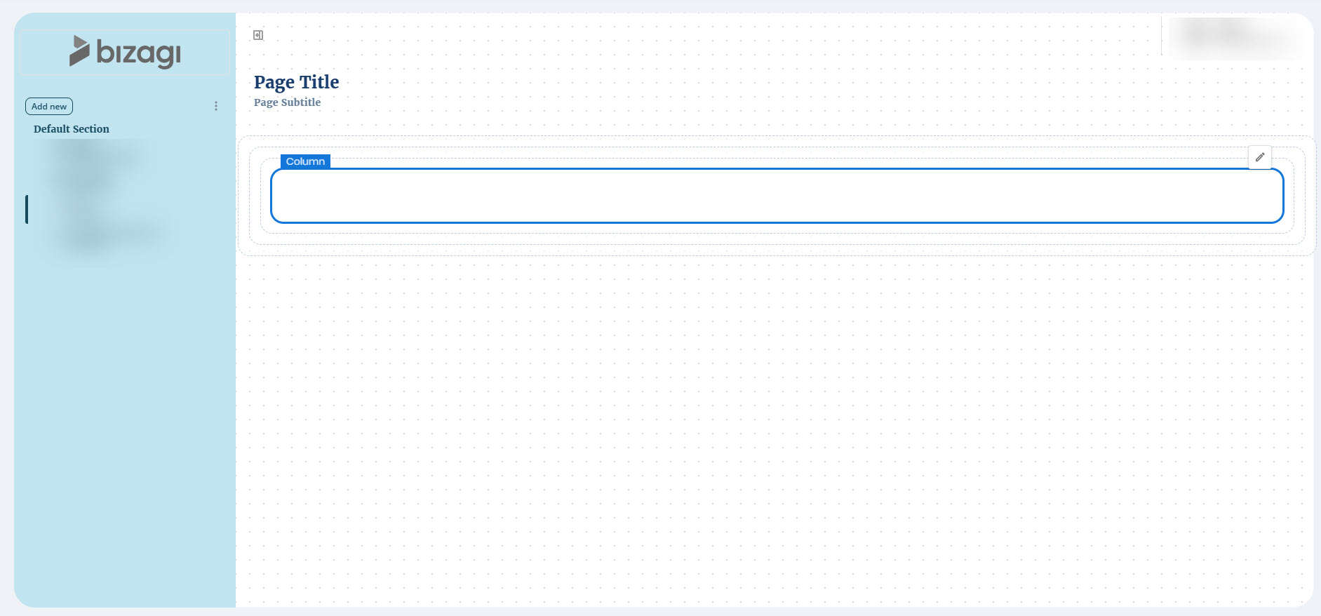
Your app includes a main section called Content, which contains all the rows and columns where your Controls are placed.
To configure its layout, click the Content section, select the Layout option, and choose a layout type for your app under the Presets label.
You can add multiple Content containers to better control the structure and presentation of your app. Content containers can be placed anywhere in the layout at the same hierarchy level. When you select an existing Content container, an Add (+) button appears at the bottom. Click this button to insert a new Content container immediately after the selected one.
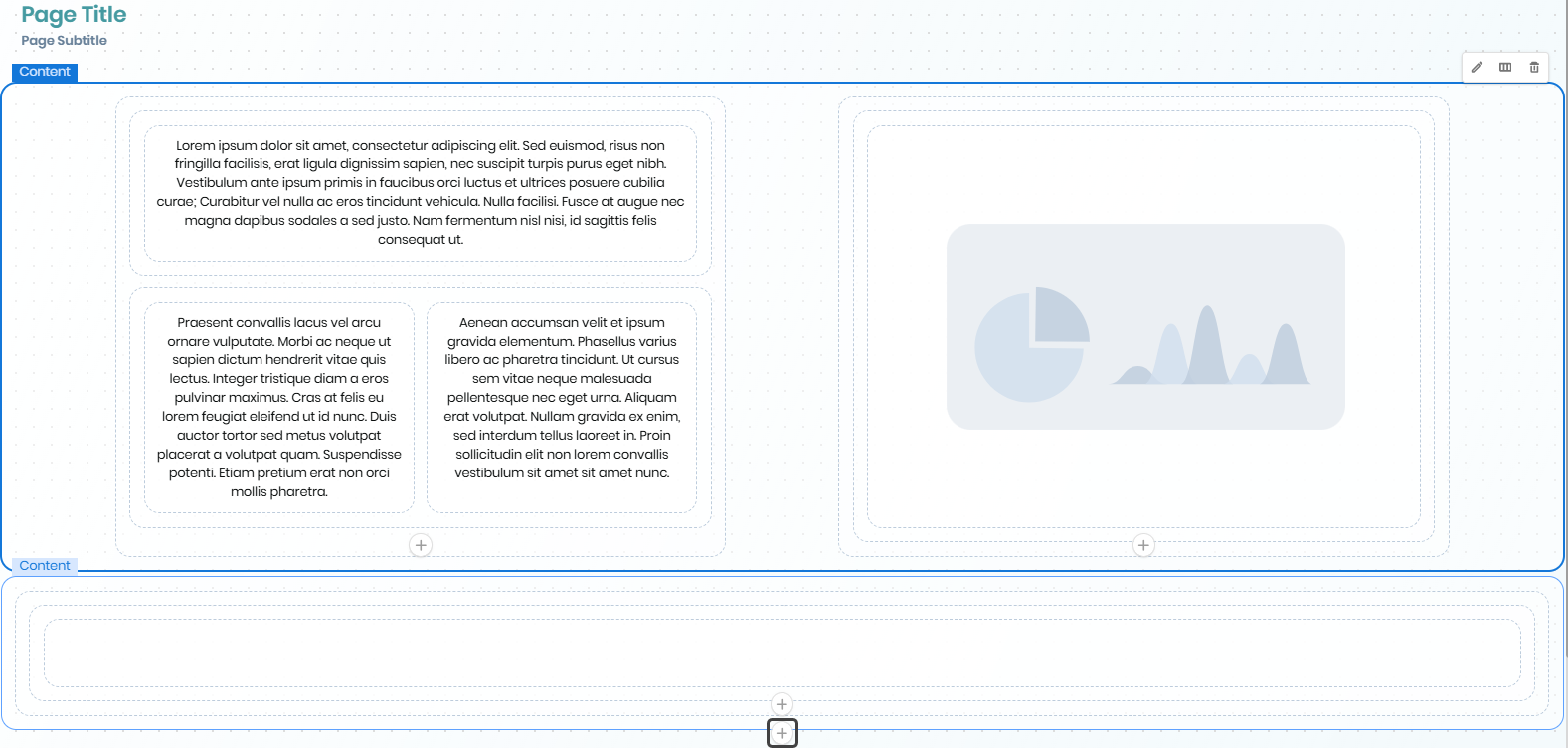
You can reorder Content containers to adjust their position within your app layout. When you select a Content container, arrow buttons appear, allowing you to move it up or down one position at a time. These buttons are only visible when the Content container can be moved, and this feature works as long as there are other containers of the same type within the same parent container.
You can configure the layout of the Content section with the following options:
•Desktop: The Section container remains undivided and spans 100% of the app's width.
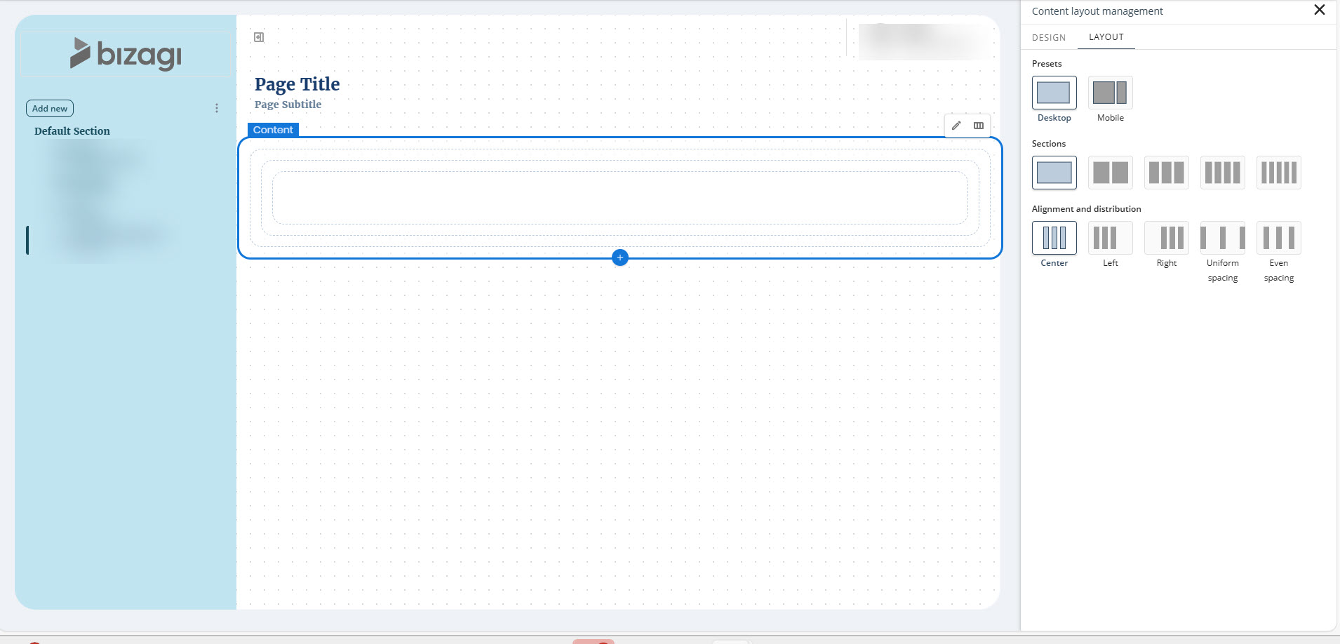
•Mobile: The Section container is divided into two separate containers.
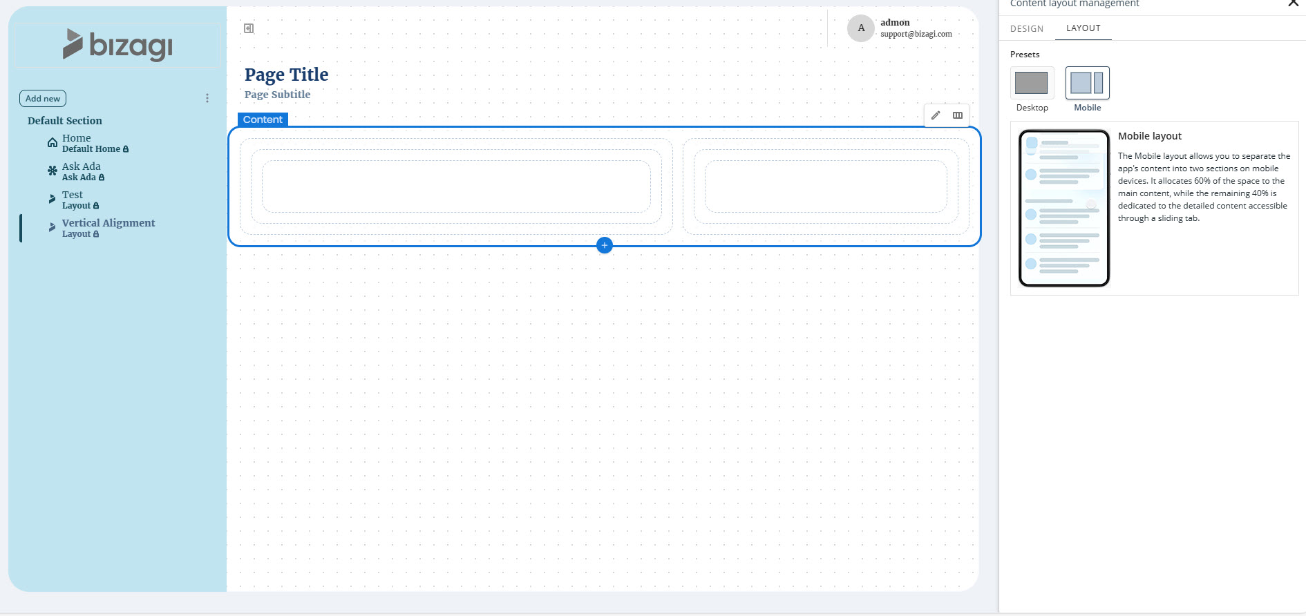
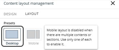
When multiple Content containers exist:
oMobile layouts cannot be assigned.
oNew Content containers follow the same configuration rules, except they cannot be assigned a Mobile layout. A warning message will appear when attempting to set a Mobile layout.
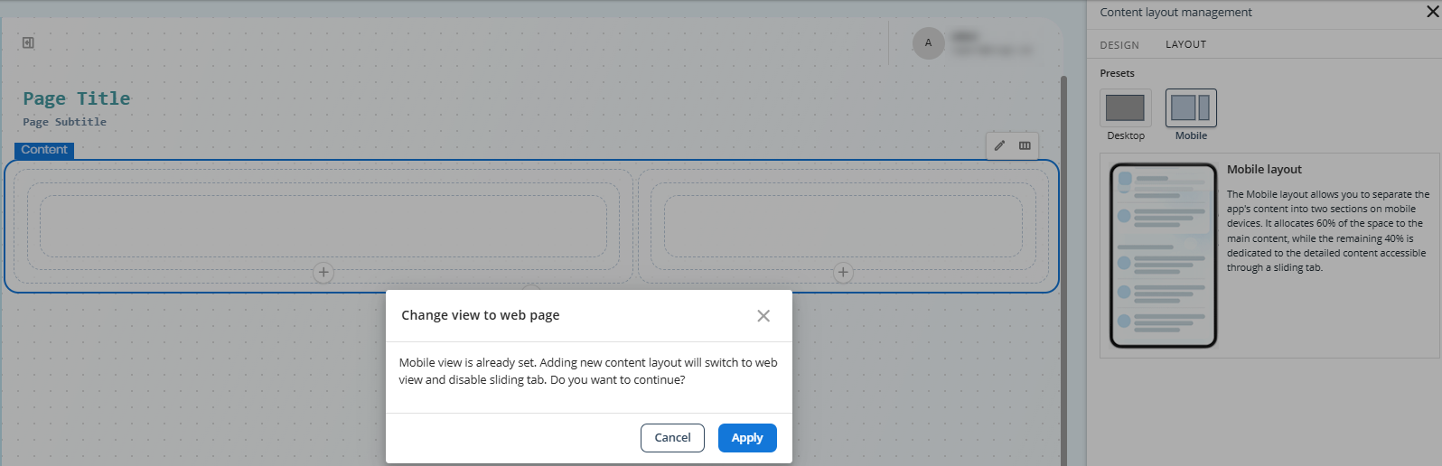
oIf an existing Content container has a Mobile layout and a new Content container is added, upon applying changes, it automatically switches to Desktop layout with two 50% width Sections in addition to the new Content container.
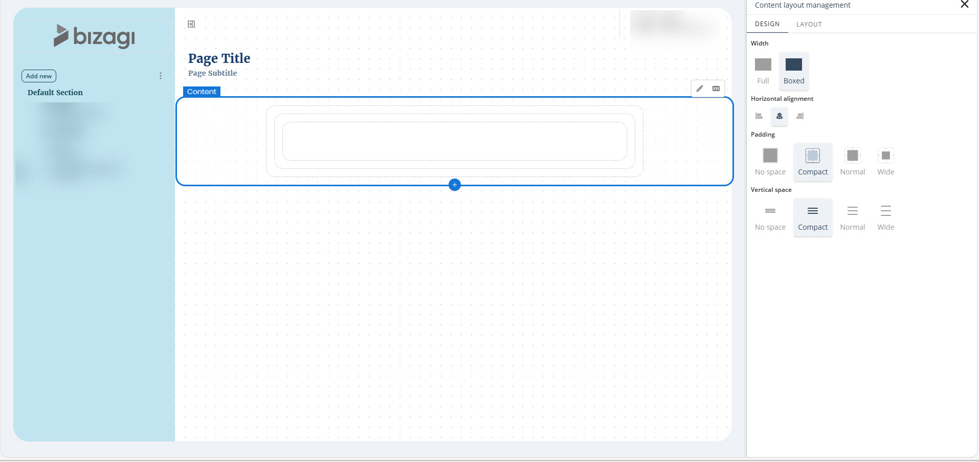
Design
You can also configure the width of the Content container.
To do so, click the Content section, select the Design option, and choose the desired width type for your app under the Width label.
The available width options are:
•Full: The Content container has no padding, allowing Section containers to span the full width.
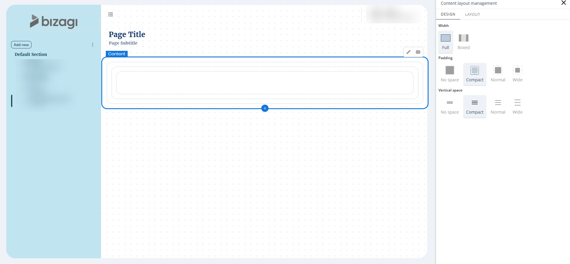
•Boxed: The Content container includes padding, so Section containers do not occupy the full width. You can configure Horizontal alignment when this option is selected.
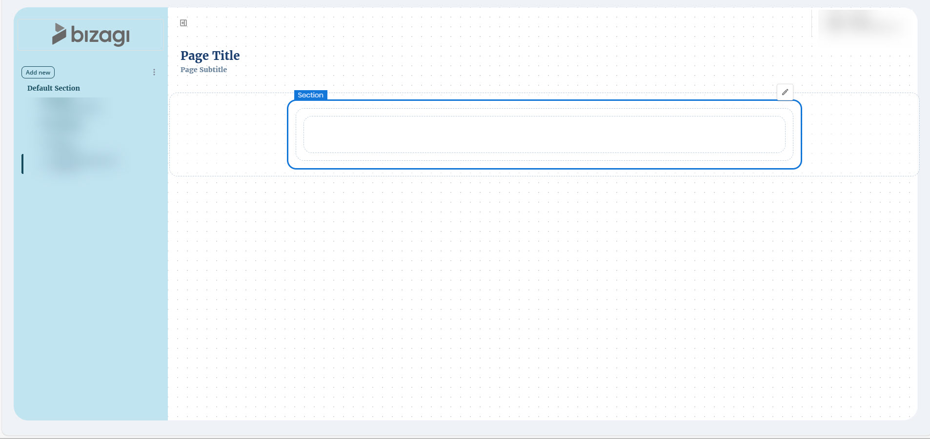
Section
A Section container is placed inside the Content container. It contains one or more Row containers:
•If you select the Desktop layout, the Content container includes 1 Section.
•If you select the Mobile layout, the Content container includes 2 Sections.
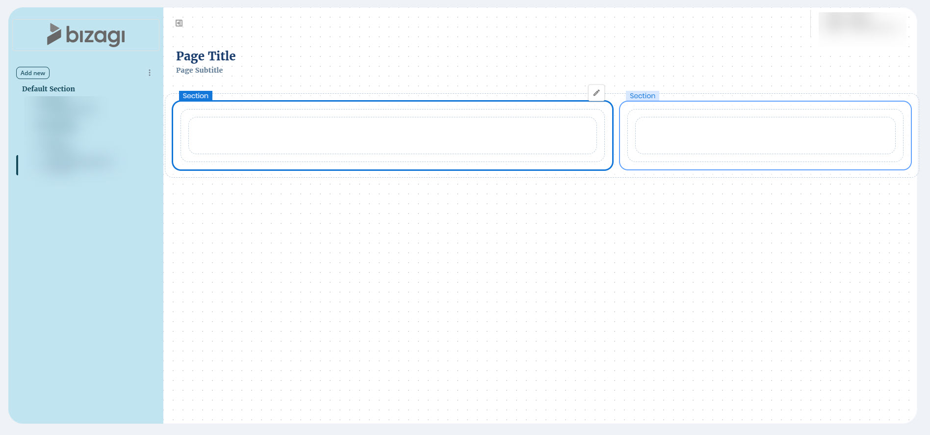
Each Content container can include up to five Sections. Section widths can be set to automatic or fixed values (in px or %), and distribution options allow you to align Sections to the left, right, center, or space them evenly or uniformly within the container.
Distribution settings are applied only when at least one Section has a fixed width. If all Sections are set to automatic, they expand to fill the available space.
Distribution Behavior Examples
All sections automatic: distribution is not applied because all expand to the container's full width.
Mixed automatic and fixed widths: automatic sections take remaining space, unless a fixed width forces a section to move to a new row.
All sections fixed: distribution is applied exactly as configured.
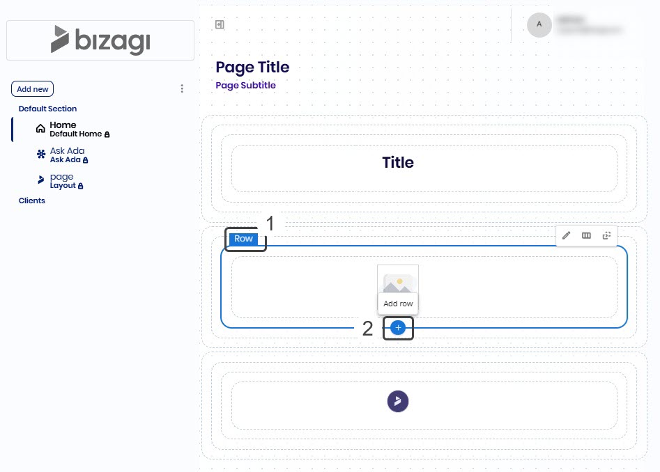
Row
A Row container is nested within a Section container. It contains Column containers. The number of Columns in each Row depends on the layout selected in the Content section.
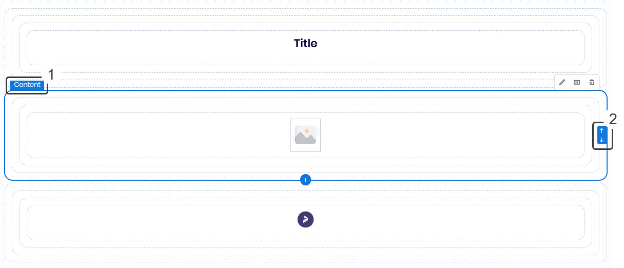
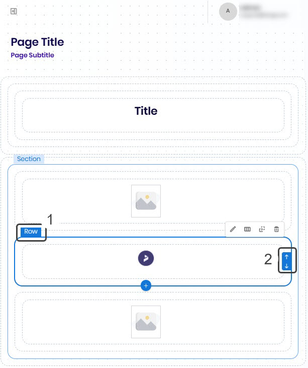
You can add multiple Row containers, within a Section container layout at the same hierarchy level. When you select an existing Row container, an Add (+) button appears at the bottom. Click this button to insert a new Row container immediately after the selected one.
You can reorder Row containers to adjust their position within the Section container layout. When you select a Row container, arrow buttons appear to the right-most part, allowing you to move it up or down one position at a time. These buttons are only visible when the Row container can be moved, and this feature works as long as there are other containers of the same type within the same parent container.
Column containers are placed within Row containers. They hold the Controls used in your app.
Design options
The Section, Row, and Column containers share the same design settings, which you can configure in each container's Design tab:
Size & Spacing
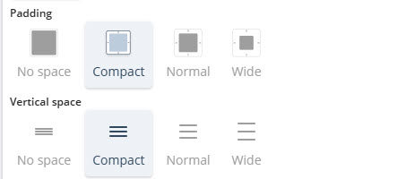
•Padding: Choose the spacing inside the container. Options: No-space, Compact, Normal, Wide. (Content containers also include this spacing property.)
•Vertical space: Defines the space between rows. Options: No-space, Compact, Normal, Wide. (Content containers also include this spacing property.)
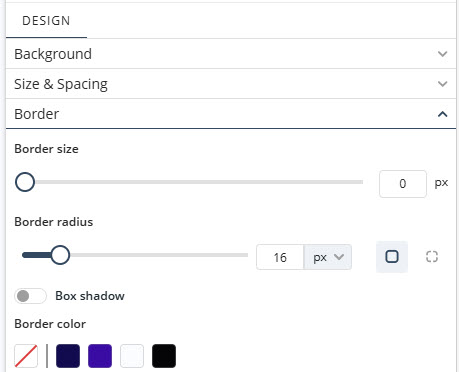
Border
•Border size: Set the border width between 0 and 5.
•Border radius: Set rounded corners using values in pixels (px) or percentages (%). You can configure each corner individually.
•Box shadow: Toggle the box shadow on or off and configure its color, direction, blur, and spread.
•Border color: Select a border color for the section from the preset palette, or define your own using the Color Picker tool. Click the first color box beneath the Border color label to open the picker.
All containers include background configuration options available in the Design tab. You can define the background using:
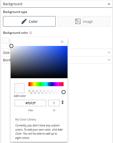
Color
Select a color from the palette or define a custom value using the color selector or hex code. You can also adjust opacity.
Image
Upload an image as background.
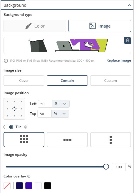
If you use this background setting, you can configure:
•Size: Cover (fills container), Contain (fully visible), or Custom (px or %).
•Position: Use the position grid or define custom values (px or %).
•Tiles: Enable repetition (horizontal, vertical, or both).
•Opacity: control the transparency of your image.
•Color overlay: Apply a color layer over the image.
Unique Row Design options
The Row container includes the same design settings mentioned above, along with the following additional options:
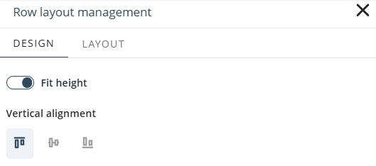
•Fit height: Enables the row to adjust its height automatically based on its content.
•Vertical alignment: Defines the vertical positioning of the content within the row.
Unique Column Design option
The Column container also includes all standard design settings, with the following additional options:
•Horizontal alignment: Defines how the content inside the column is aligned horizontally.
•Vertical alignment: allows you to define how control elements are arranged within a Column when additional space is available. You have five options from the Vertical alignment section to choose from: Top, Bottom, Center, Spaced-between (even gaps, none at the edges) or Spaced-around (even gaps, with space at the edges). If the Column has free space, the controls are visually rearranged according to the selected layout option.
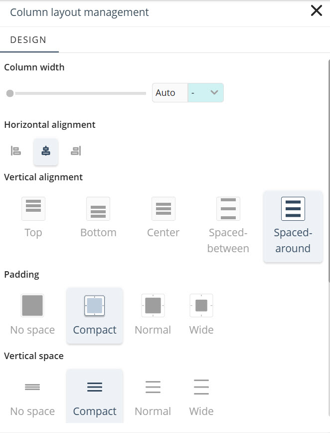
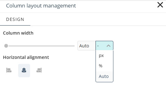
•Column width: Determines how much space a column occupies within a row. You can set the width using the slider or enter a specific value. Available unit options include:
oPixels (px): Sets a fixed width between 230 and 2000 pixels, keeping the column size consistent across screen sizes.
oPercentage (%): Allocates a proportional width of the row, from 1% to 100%, allowing the layout to respond to different screen sizes.
oAuto: Lets the system automatically assign the column’s width based on its content and layout.
|
The minimum supported width is 230px, regardless of the selected unit or manually entered value. |
Last Updated 7/14/2026 4:29:16 PM