Overview
In the App Designer editor, the menu lets you navigate the app by accessing its sections, pages, and links, displayed as tabs to organize the content.
Layout
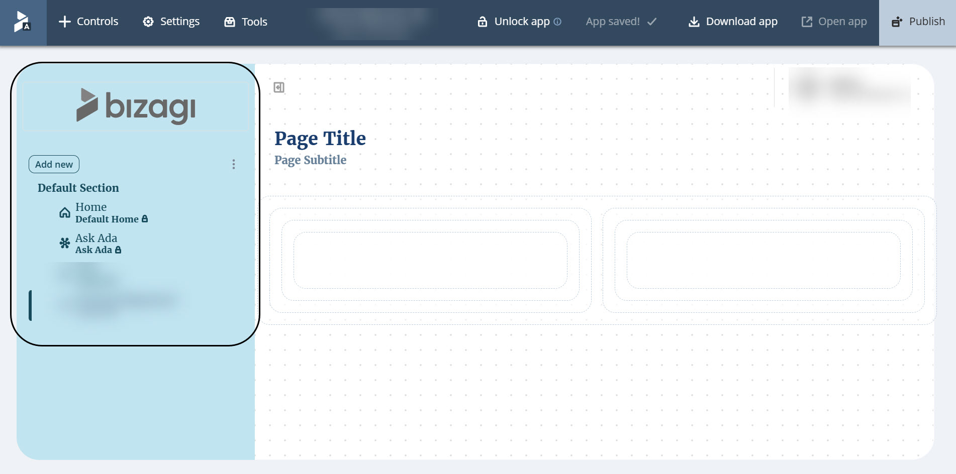
The menu uses the Side menu navigation by default.
Side menu
Displays navigation in a vertical panel on the left side of the editor.
Shows sections and pages, and links together as tabs, allowing you to organize and access them directly from the menu.
Top bar
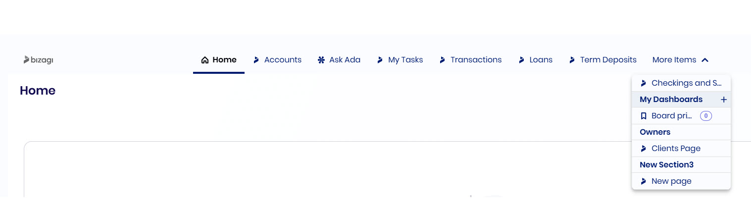
Displays navigation in a horizontal bar at the top of the editor.
Provides a centralized space to manage sections and pages. You can also use the main title area to list, filter, and access pages while designing.
Onboarding window
When you enter the App Designer editor, an onboarding window is displayed unless you have previously dismissed it.
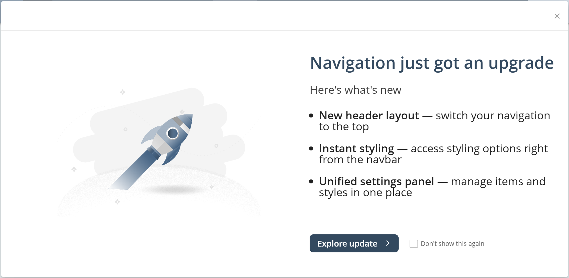
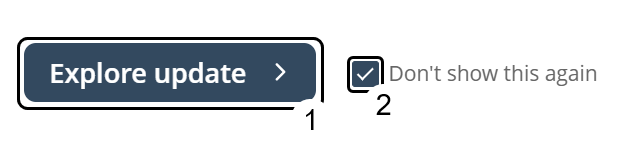
Use the button in the lower‑right corner to navigate the window. Select Don’t show this again before exploring or closing the window to prevent the window from reappearing.
The window provides step‑by‑step instructions on how to use top bar navigation.
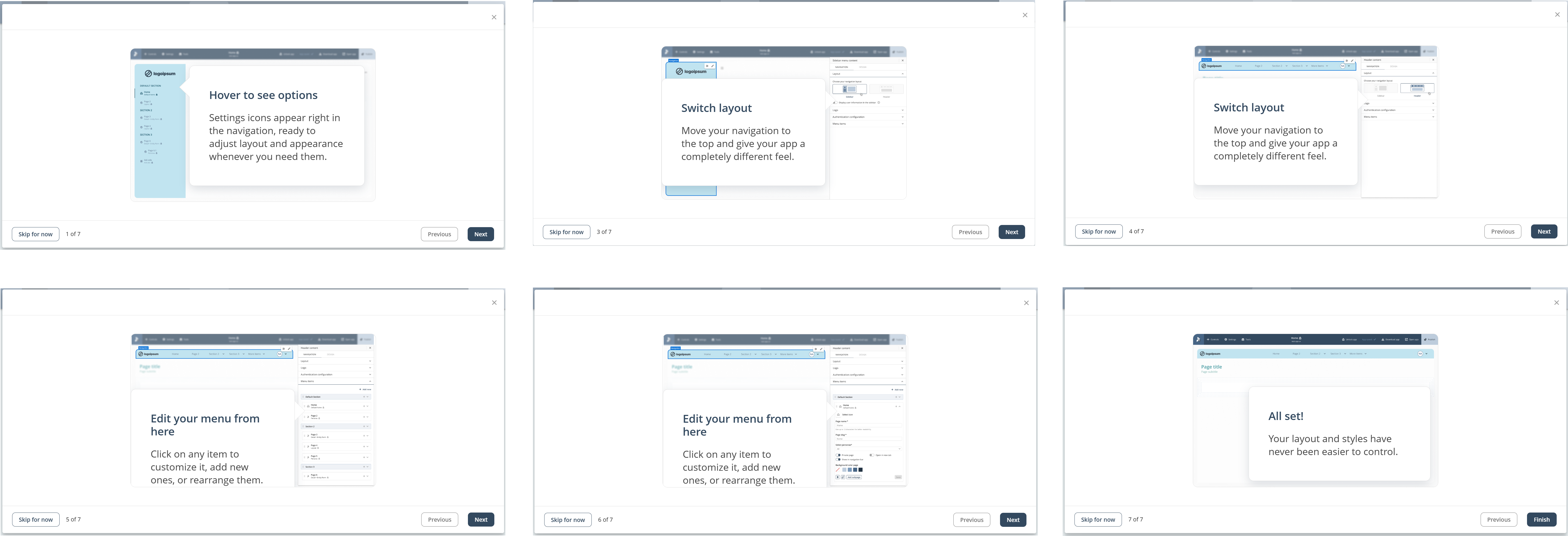
At any step, you can skip the window return to the previous step, or continue to the next one.

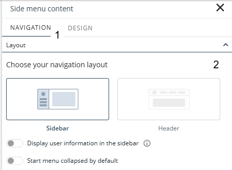
Changing the layout
You can select your desired navigation layout. Open the Manage options, in the Navigation tab, select Sidebar or Header under Layout.
Navigating the menu
In the App Designer editor, the behavior of the menu depends on the selected layout.
With the Side menu, you can navigate between pages directly by selecting them from the menu.
With Top bar, you instead use the title area to list, filter, and access pages. The title area is available in both layouts for navigation during editing.

In published apps, both layouts behave as standard navigation menus.
Logo
The Menu options allow you to customize different logos for expanded and collapsed states, adding flexibility and personalization options to better suit various workflows and branding needs.
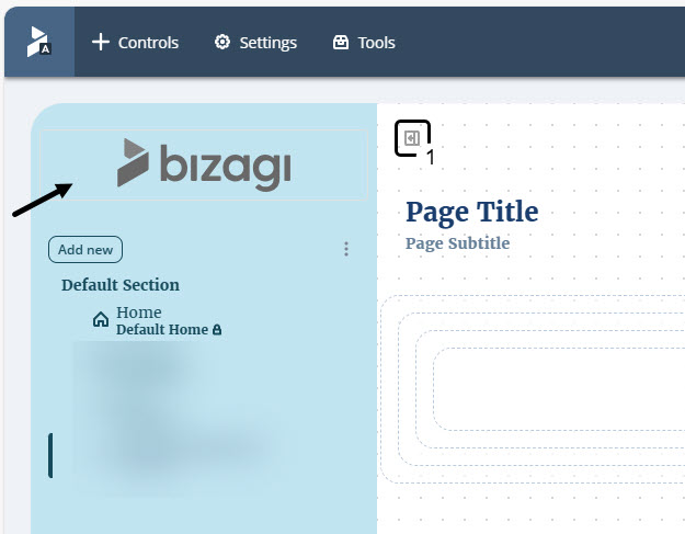
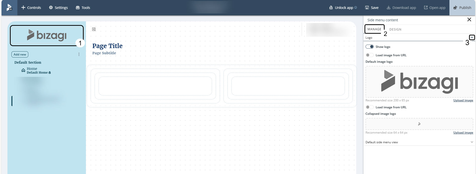
To open the Logo settings:
1.Click the Menu box.
2.Go to the Manage tab.
3.Open the Logo dropdown menu to view the settings.
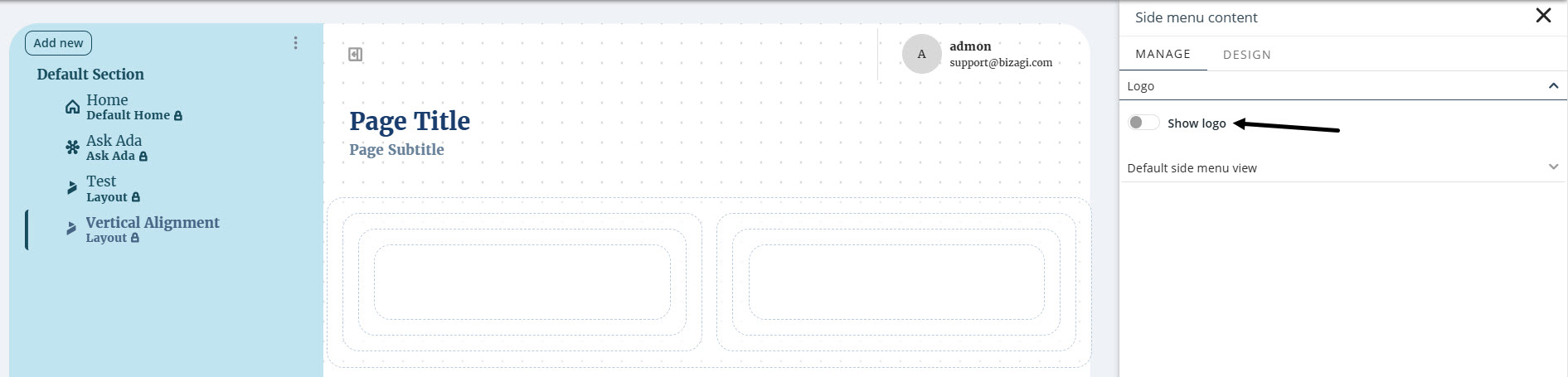
To hide the logo from the Menu, click the Show logo toggle button to disable it.
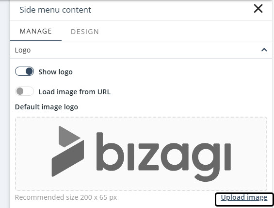
When enabled, this option lets you set the logo to display in the menu. To do so, you can either upload an image or specify a URL that contains the image to display as the logo.
To upload an image, click Upload image to open the File Explorer and select the image to display as the logo.
|
The following formats are supported for images: .png, .jpg and .jpeg. |

If you prefer to specify a URL that contains your logo:
1.Enable the Load image from URL toggle button.
2.Enter the URL of the image you want to use as your logo.
3.Confirm the uploaded image in the field directly below.
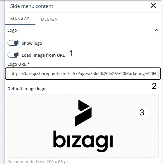
The entered URL must point directly to the image file and use a supported format.
If you enter the URL of an entire web page or the image has an unsupported file extension, a warning will appear preventing you from saving the configuration.
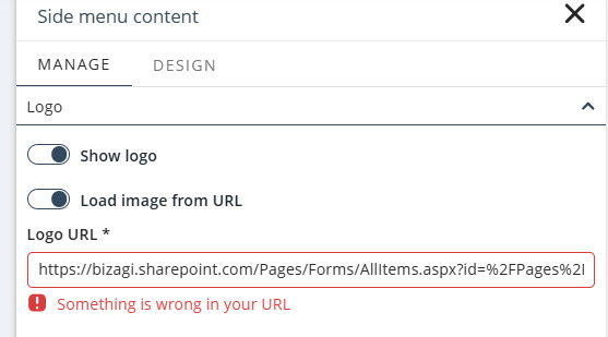
You can configure the logo image for the collapsible Menu either by providing a URL or by uploading a file.
Follow the instructions above to complete this configuration.
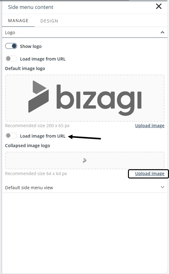
You can set the default view of the Menu to either Expanded or Collapsed for Side menu layout.
Managing menu items
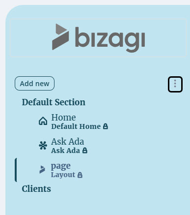
You can add, edit, duplicate, delete, and rearrange the items in your menu using the Manage options.
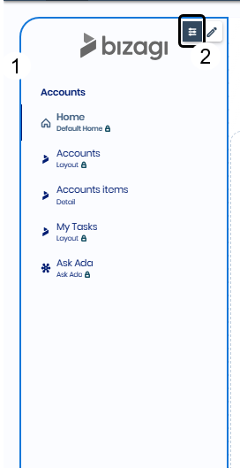
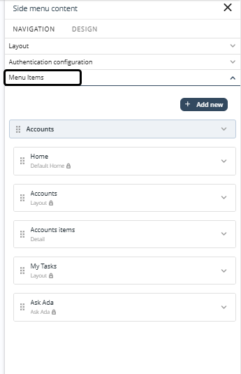
Under Menu Items, your app’s Sections and Pages are listed.
Adding items
Click Add new in the upper‑right corner of Menu Items settings and choose the type of item you want to add.
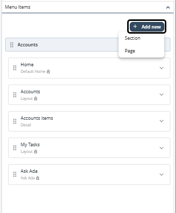
Select Section to add a new section under your menu items.
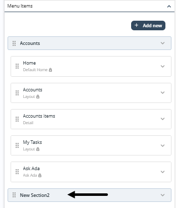
|
Note that Bizagi assigns the name New SectionN by default, where N reflects the number of sections created. |
Click a section to display the configuration options: Delete and Add new page. Click Save to apply any changes.
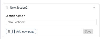
To add a new page to the selected section, click Page in Add new. Select the page type and complete the required information based on the selected type. For more information, see Types of Pages.
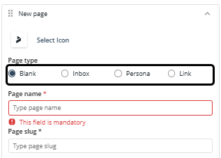
|
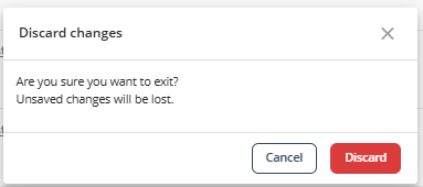
Save every change before leaving. If you try to exit without saving, a confirmation window appears.
|
Removing items
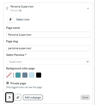
You can delete Persona and Details Pages from the Menu Items settings.
Select the delete icon in the Page menu.
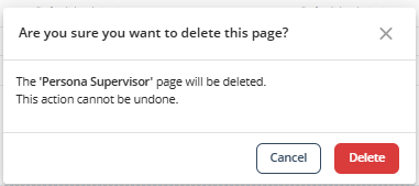
Then, confirm the action in the confirmation window.
Behavior options
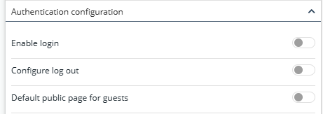
Control your menu access settings by enabling or disabling login, configuring logout, and a default public page for guests.
Design options
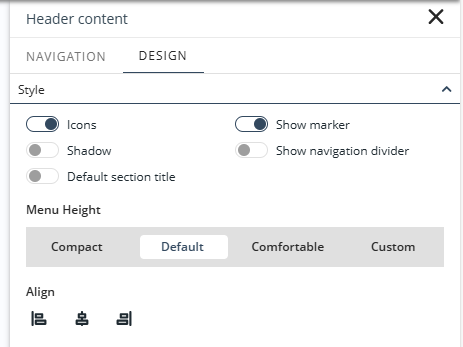
In the Design tab, you can configure the following properties to customize the menu:
•Style: Enable or disable icons, shadows, markers, navigation dividers, and the default section title. Configure menu height and alignment.
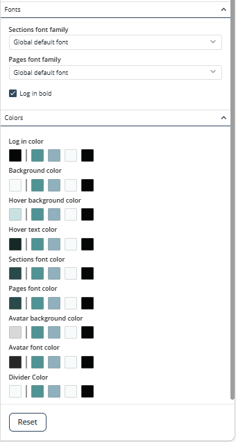
•Fonts: Select the font family and size for the menu's sections and pages.
•Colors: Set the color of the menu's background, login, section and pages, icons, and dividers. In addition, you can set the Hover color, for both the text and the background.
Last Updated 7/16/2026 4:23:04 PM