Overview
Control visibility by device allows you to define whether a control in a page of your app is shown on Desktop, Tablet, or Mobile.
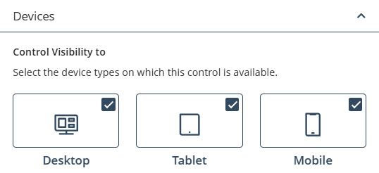
This feature helps you design responsive apps that adapt to the dimensions of the user's device by selectively displaying controls that are appropriate for each screen size. By configuring visibility at the control level, you can present detailed controls on larger screens, simplify layouts for mobile users, and organize pages without relying on additional styling or external configuration.
Bizagi Apps automatically identifies the device category based on screen width. The following table summarizes the breakpoints used for each device:
Device |
Screen width |
|---|---|
Desktop |
Greater or equal than 1024px |
Tablet |
Greater or equal than 710px and less than 1024px |
Mobile |
Less than 710px |
This configuration is evaluated during the rendering of the published app and applies to both Public and Private pages.
Accessing Control visibility by device
You can configure Control visibility by device from each control’s settings within the App Designer editor. To locate the configuration, follow the steps below:
1.Click the control you want to configure.
2.Select the Visible to option to open the control’s configuration panel on the right side of the screen with the VISIBILITY tab selected.
3.In this tab, you will find two sections:
•Personas: manages visibility for specific Personas.
•Devices: manages visibility for Desktop, Tablet, and Mobile.
|
Both sections apply simultaneously; a control is displayed only if it is enabled in both. |

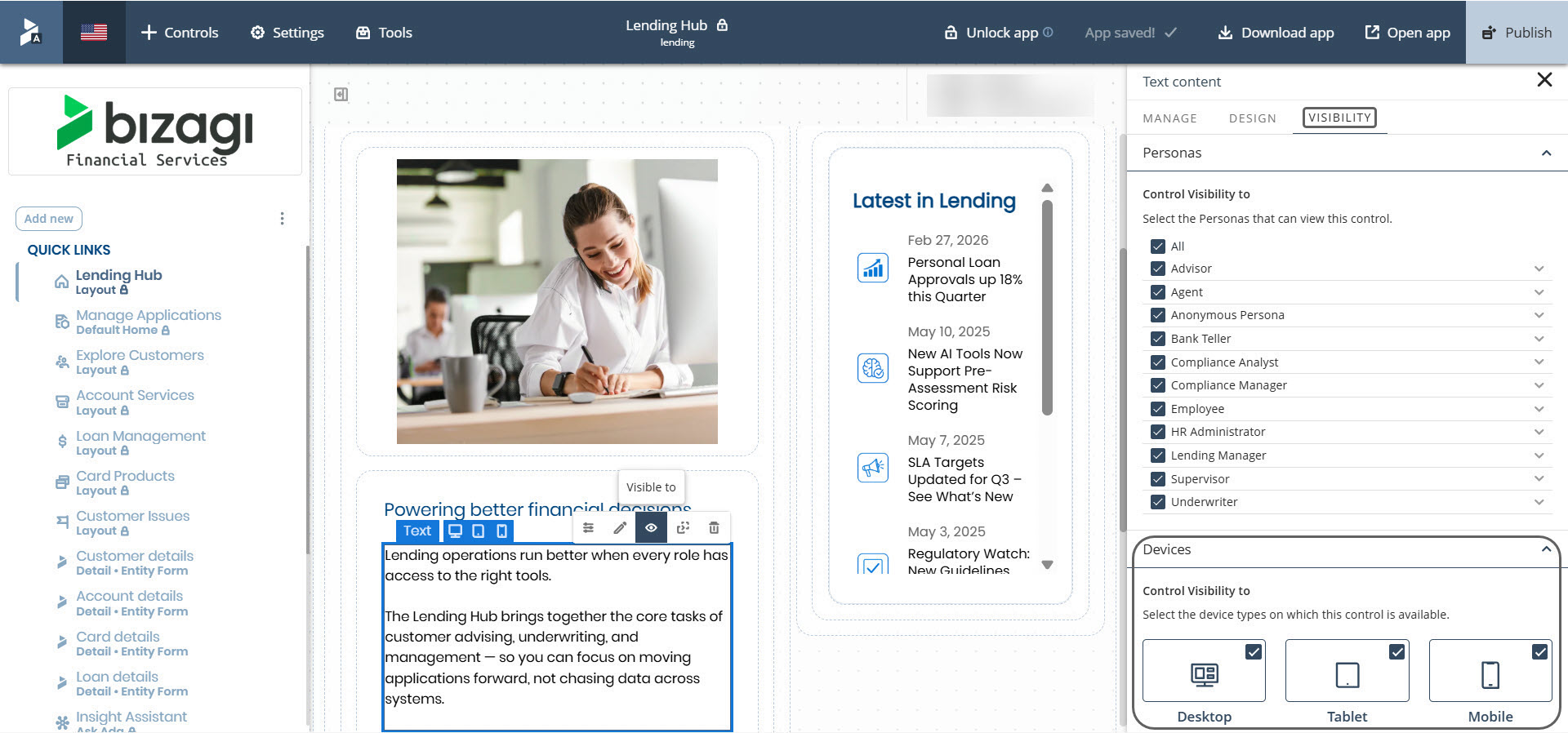
Configuring Control visibility by device
The Devices section contains three visibility options: Desktop, Tablet, and Mobile. Each option determines whether the control should be shown on that device category. The following table explains the behavior of each option:
Option |
Checked |
Unchecked |
|---|---|---|
Desktop |
The control is shown on Desktop |
The control is hidden on Desktop |
Tablet |
The control is shown on Tablet |
The control is hidden on Tablet |
Mobile |
The control is shown on Mobile |
The control is hidden on Mobile |
|
When you add a new control, all device types are enabled by default. |
You can adjust visibility at any moment by enabling or disabling the desired device types. Changes are saved automatically.
Identifying control visibility by device on the page
You can identify Control visibility by device directly on the page while editing. When you hover over a control or select it, device icons for Desktop, Tablet, and Mobile are displayed. Each icon represents whether the control is configured to be visible on that device.
The visibility state is indicated as follows:
•A highlighted device icon means the control is visible on that device.

•A non highlighted device icon means the control is hidden on that device.

These indicators reflect the configuration defined in VISIBILITY > Devices and provide a quick visual reference without opening the configuration panel.
Practical examples
The examples below illustrate how to apply Control visibility by device to common scenarios.
Showing a control only on Mobile
This configuration is useful when you want to present a simplified action or a compact control specifically for mobile users. To achieve this, follow these steps:
1.Select the control.
2.Open VISIBILITY > Devices.
3.Enable Mobile.
4.Disable Desktop and Tablet.
Hiding a control on Mobile
Some controls, such as tables or long paragraphs, may not display well on small screens. To hide a control on Mobile:
1.Select the control.
2.Go to VISIBILITY > Devices.
3.Disable Mobile.
4.Keep Desktop and Tablet enabled, if appropriate.
Displaying different controls per device
In some cases, you may want to show one control on Desktop and Tablet, and a different one on Mobile. The example below shows a common configuration:
Control |
Desktop |
Tablet |
Mobile |
|---|---|---|---|
Data table |
✅ |
✅ |
⛔ |
Small card |
⛔ |
⛔ |
✅ |
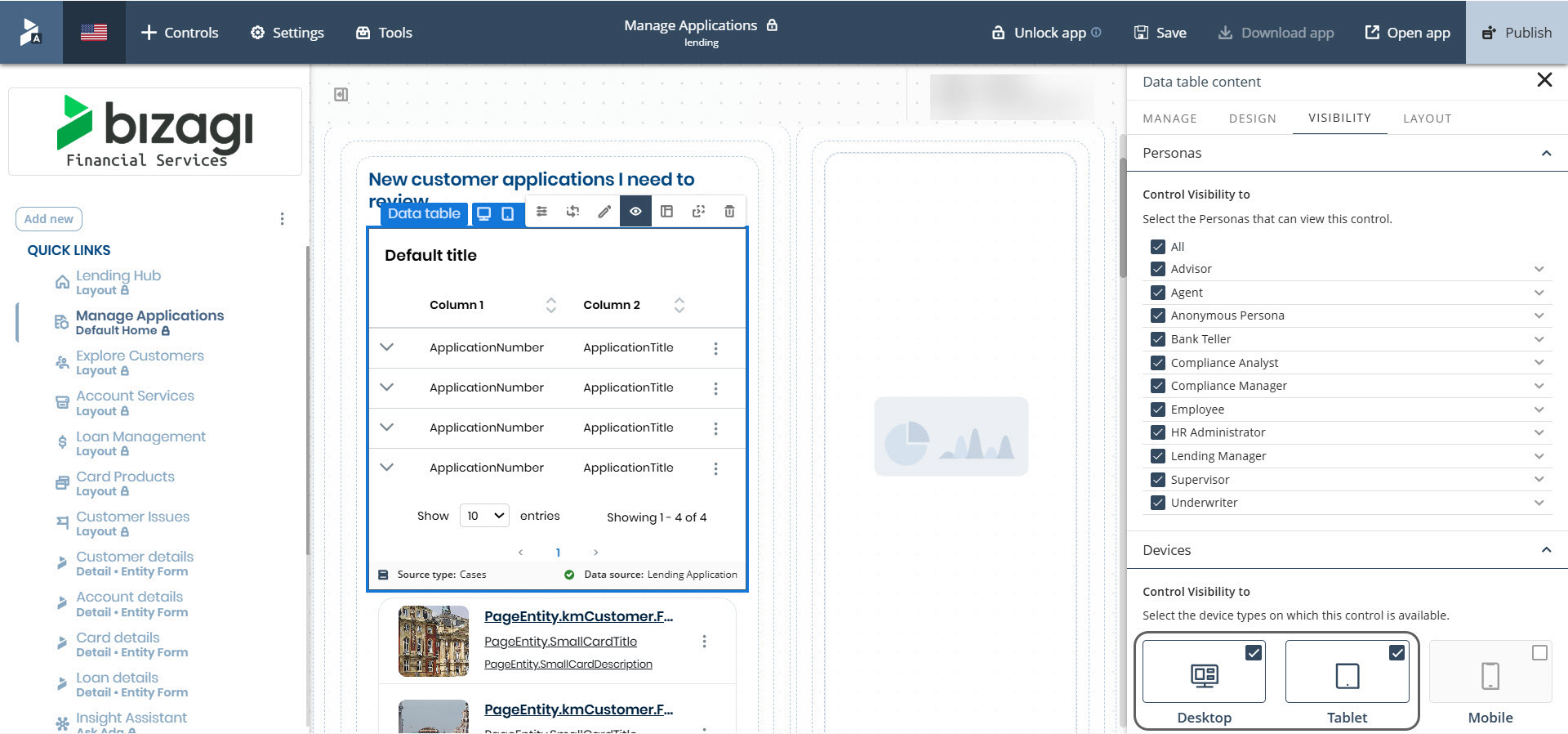
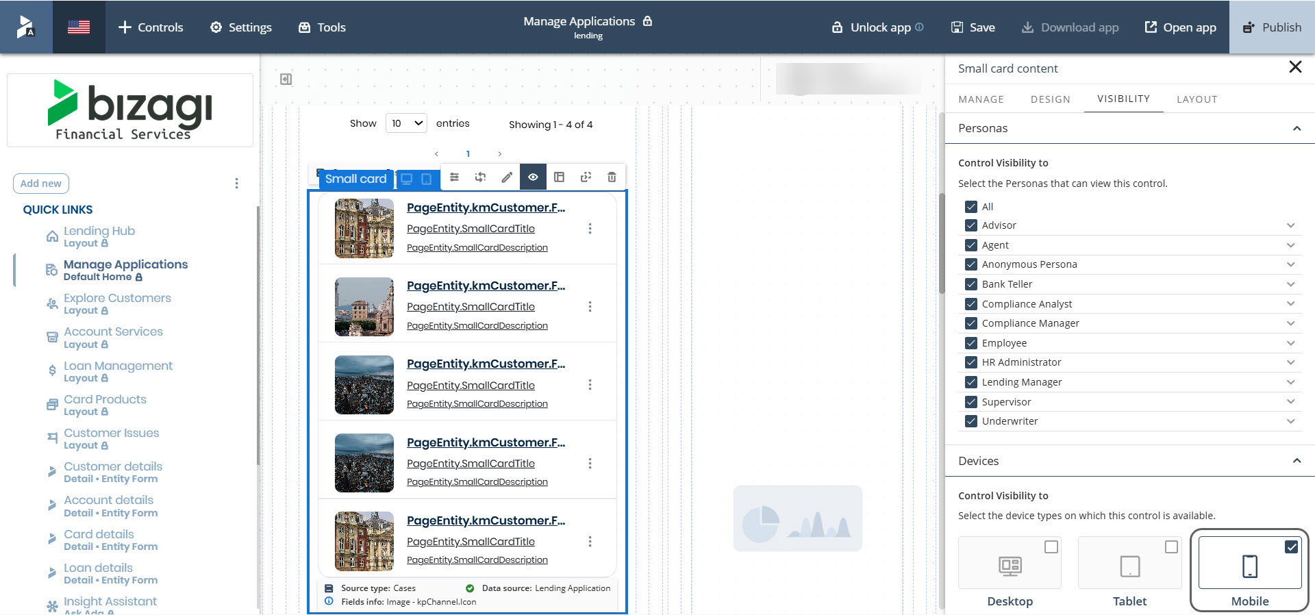
You can use this approach to present the same information in different formats depending on the device type.
Automatic behavior for Containers
Control visibility by device also affects containers such as rows, columns, and sections. If all controls inside a container are hidden for a specific device, the container is automatically hidden as well. This avoids empty spaces in the layout.
The same logic is applied recursively to nested containers.
Dynamic updates during resizing
When the end user interacts with a published page, visibility is updated automatically if the screen size crosses a device breakpoint. No manual refresh is required. Containers also update their visibility based on the resulting configuration. This behavior enables you to test how the layout adapts to each device directly from the browser.
Interaction with Personas visibility
Control visibility by device operates alongside Personas visibility. A control is displayed only if it is enabled for the current Persona and the current device. Both mechanisms are independent but complementary, and both are located in the VISIBILITY tab to centralize configuration.
Important notes
The configuration for Control visibility by device applies exclusively to published pages. In the App Designer editor, all controls remain visible so that you can configure their properties without restrictions.
Best practices
When designing for multiple devices, consider using concise content and simplified controls for Mobile layouts. Prefer compact visual elements, such as cards, instead of wide components like tables. If using different controls for different devices, organize them using clear and descriptive names. Always verify the end result using Desktop, Tablet, and Mobile previews.
Last Updated 7/16/2026 7:19:47 PM