Overview
In the App Designer editor, the Accordion control lets you group information into expandable sections called items, helping you organize content and reduce visual clutter on the page. Each item can contain controls such as text, buttons, media, or data components, allowing you to create rich, structured layouts inside collapsible panels.
You can customize the Accordion by adding items, defining their layout, configuring how they open and close, and adjusting the visual appearance of the entire control. All configurations made in the editor are applied in published pages, where end users interact with the Accordion to reveal or hide its content.
How to add the control
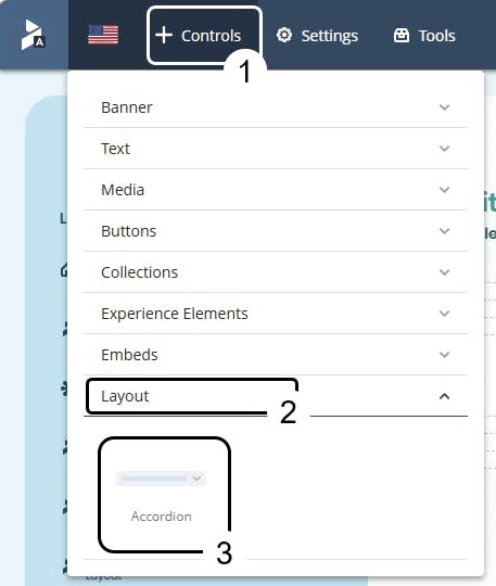
1.Open your app in the App Designer editor and click Controls.
2.Select Layout.
3.Drag the Accordion control and drop it on your page.
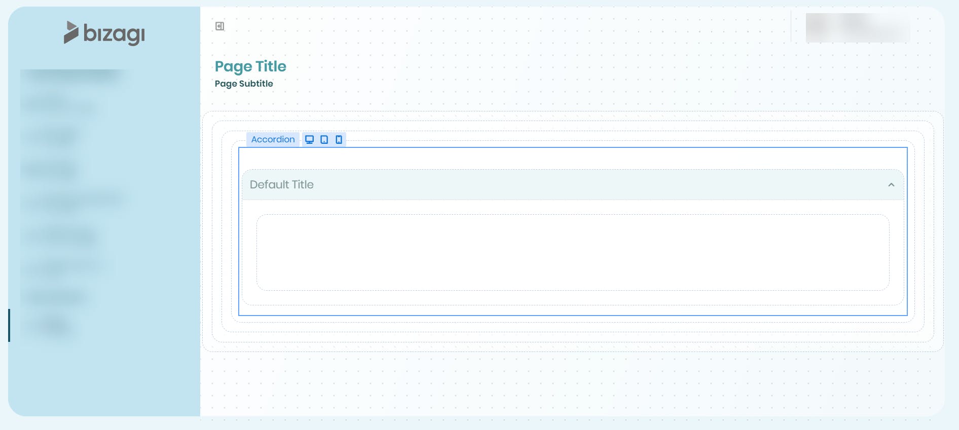
The control appears with one default item already created. Drag any controls you need into its content area.
Control configuration
Managing the Accordion control
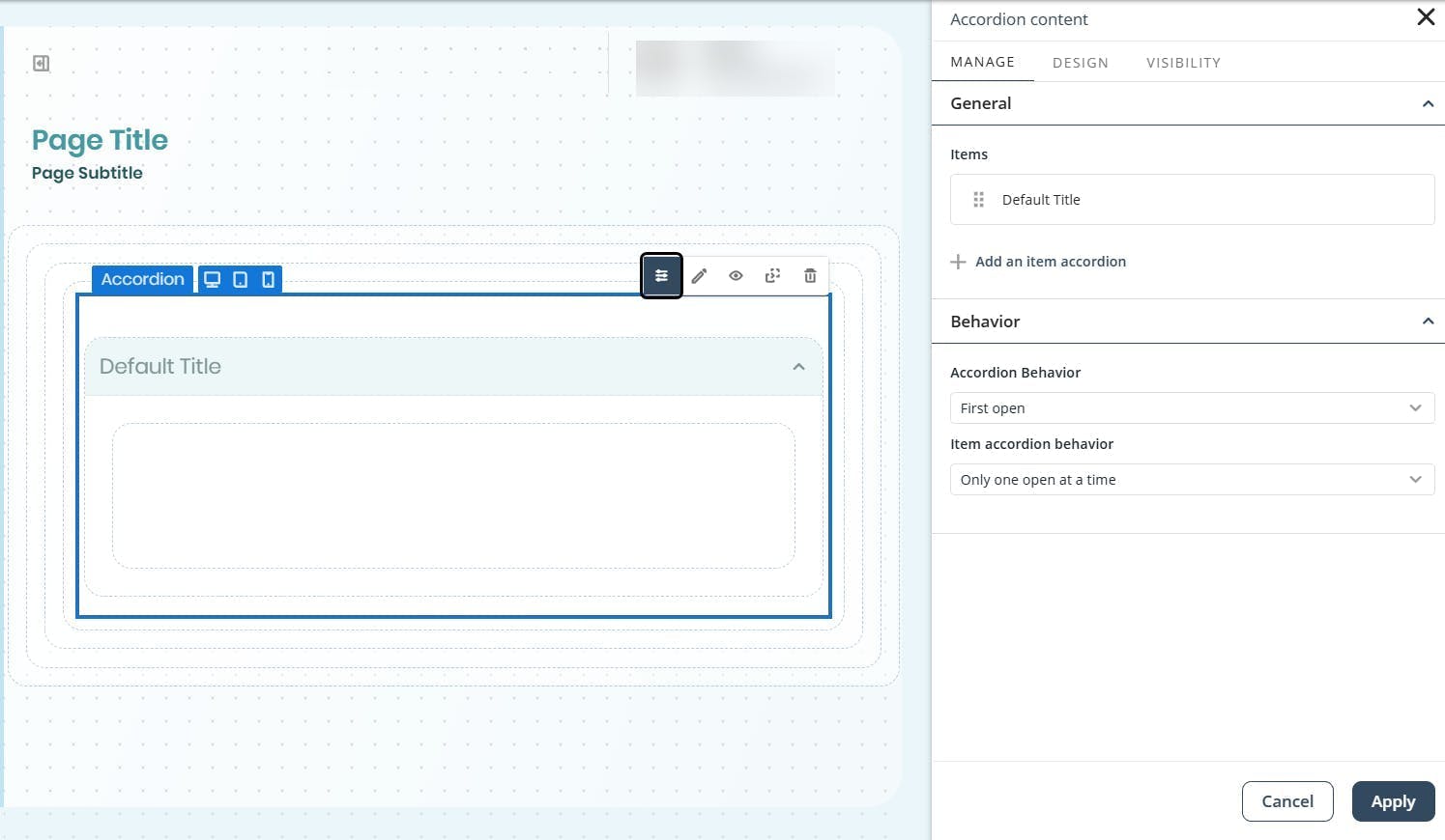
Select an Accordion control and click Manage to edit items and define the control behavior.
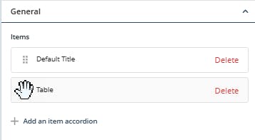
Use the Items section to reorder your Accordion layout, add a new item or delete existing ones.
•Add items: Click + Add an item accordion.
•Reorder items: Drag items using the ⠿ handle to rearrange their order.
•Delete items: Click Delete.
|
You cannot delete the last remaining item. |

Use the selectors in the Behavior section to define how the control opens and closes.
•Accordion behavior (initial state)
oFirst open: The first item appears expanded when the page loads.
oAll closed by default: All items start collapsed.
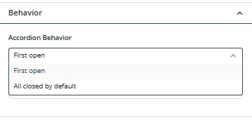
•Item accordion behavior
oOnly one open at a time (default): Opening one item collapses the others automatically.
oClose and open manually: Multiple items can remain open and be closed individually.
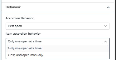
Click Apply to confirm changes.
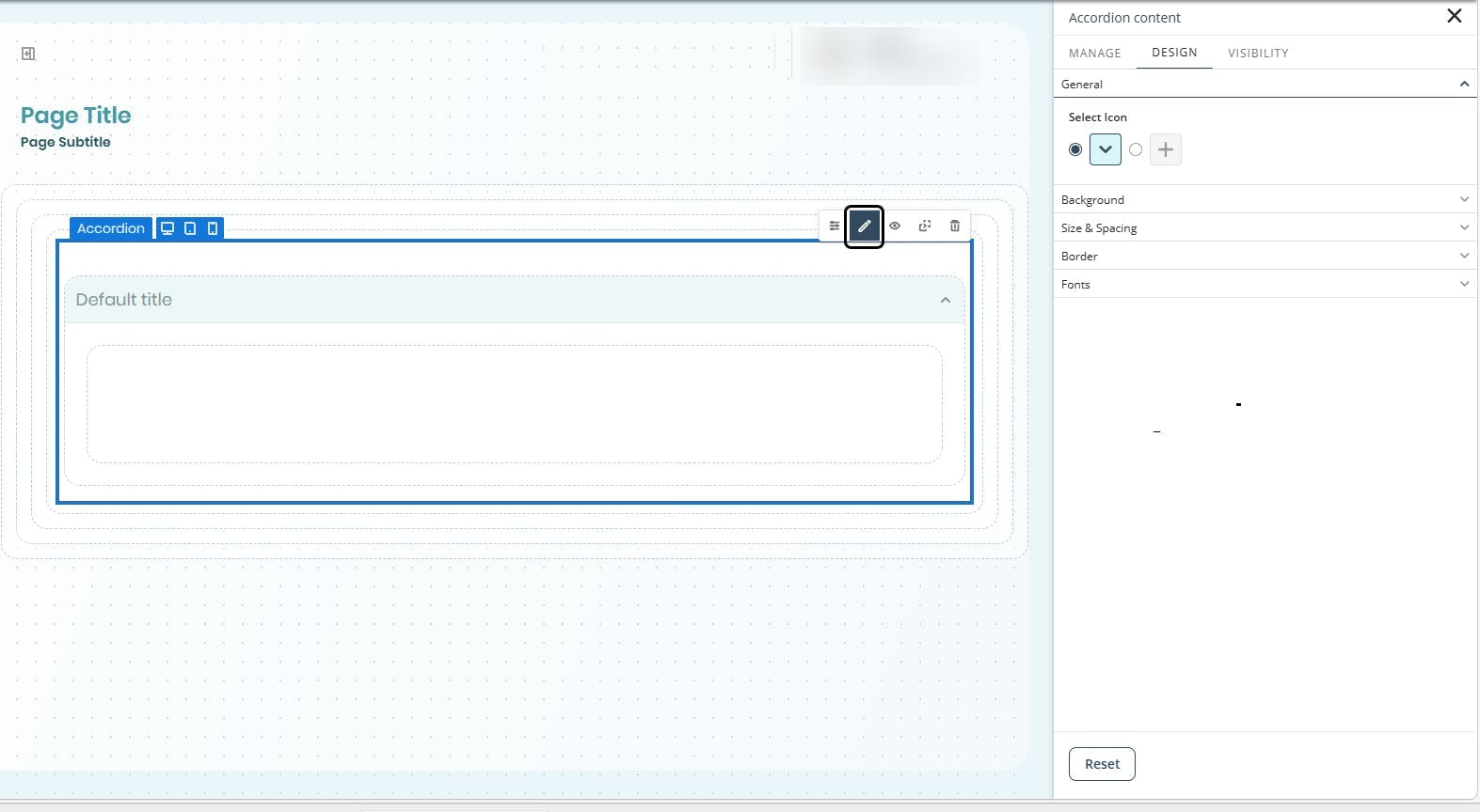
Design options
In the Design tab, you can configure the appearance of the control, including the icon type for Accordion items, background settings, size and spacing, borders, and fonts.
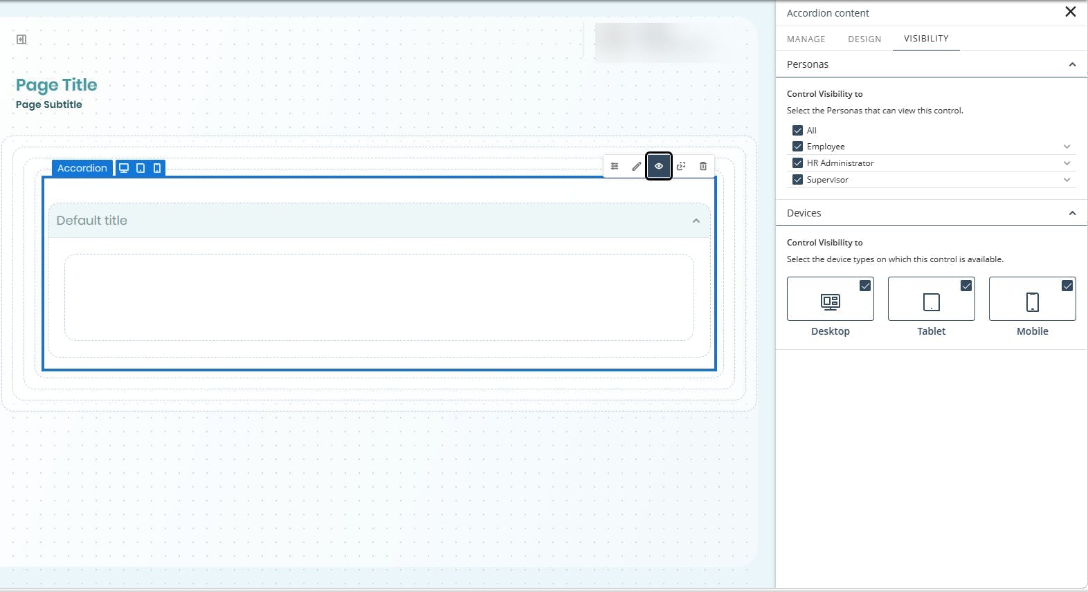
Visibility options
You can define which Personas can view the control in the app and specify the device types from which it can be accessed.
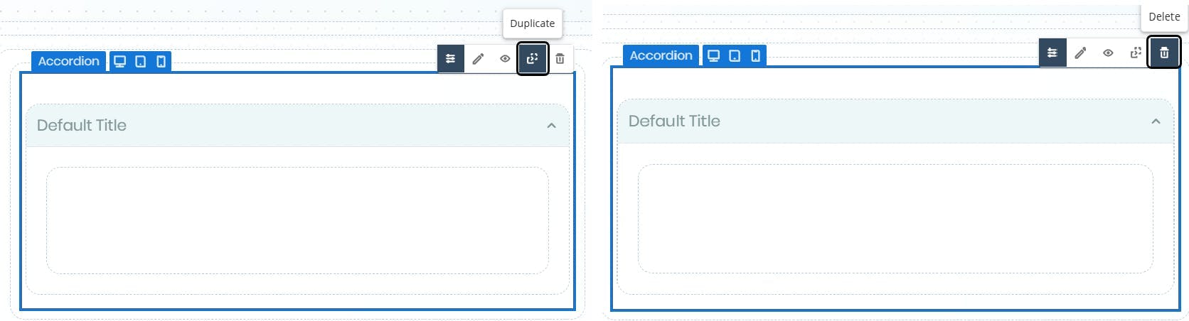
Duplicating and deleting
Use the option buttons to duplicate or delete your control.
All internal content, properties, and layouts are preserved in the duplicated version.
|
Once you save your changes, deletions cannot be undone. |
Item accordion management
Each item has its own configuration panel. Select an item and click Manage content to access it.
Manage tab
Use this tab to define the item's basic information.
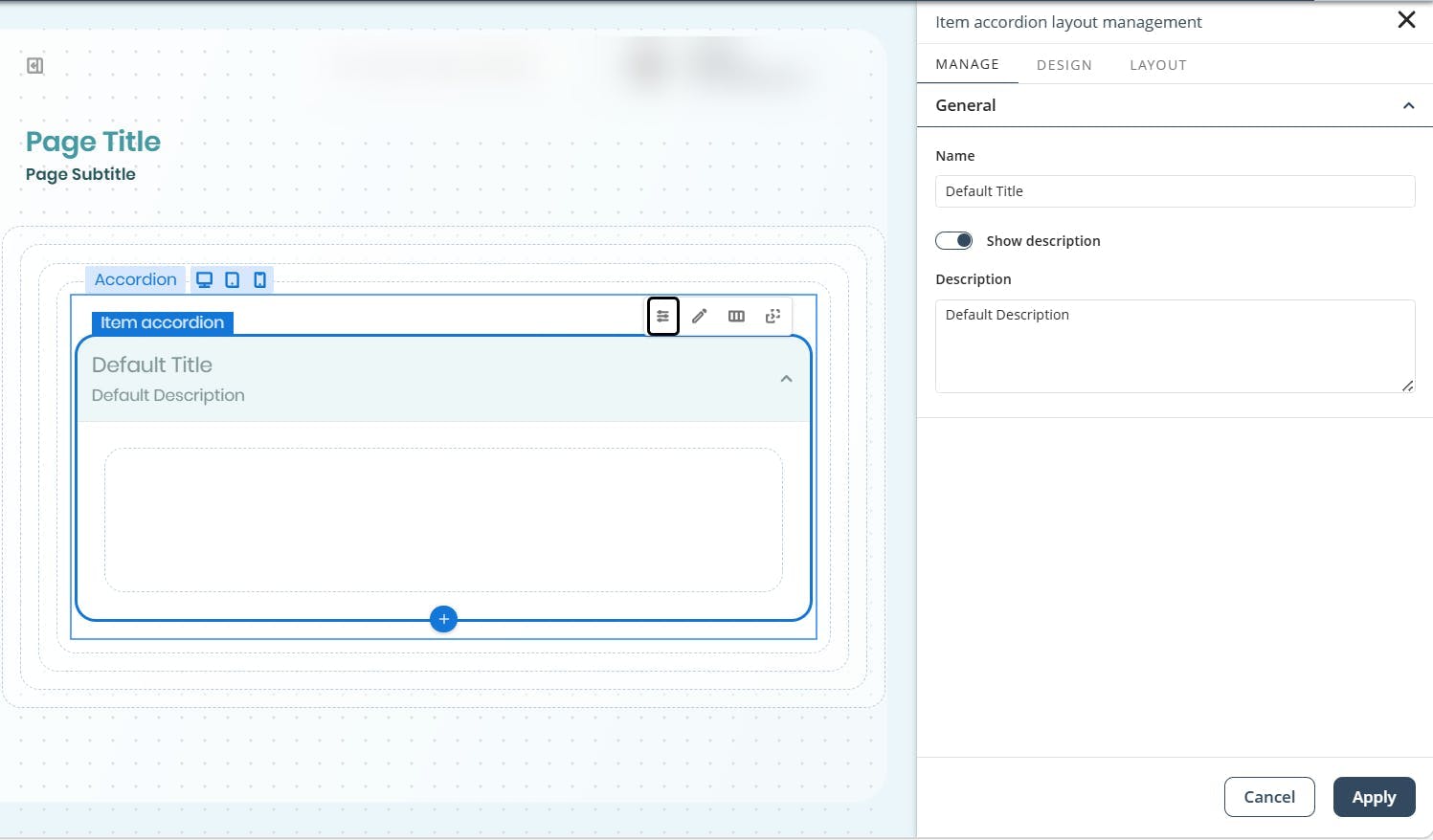
•Name: Title displayed in the item header.
•Show description: Toggle to show or hide a descriptive text.
•Description: Optional text displayed under the title when expanded, useful for guiding users or summarizing the section.
Click Apply to confirm changes.
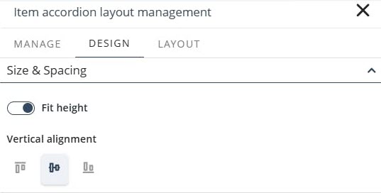
Design tab
In the Design tab, you can define whether the item content fits the available height. When this option is enabled, you can also set the vertical alignment of the content.
Layout tab
Use this tab to configure how controls inside the item are arranged.
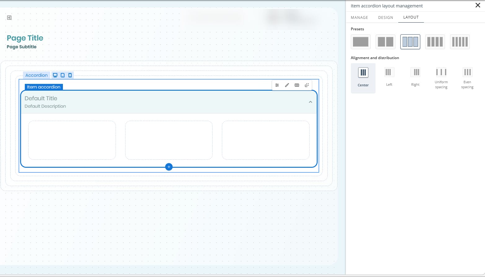
•Presets: Select a layout with 1 to 5 columns.
•Alignment and distribution: Define how columns align and occupy the available space.
oCenter
oLeft
oRight
oUniform spacing
oEven spacing
Duplicating and deleting an item
Use the option buttons to duplicate or delete your control.
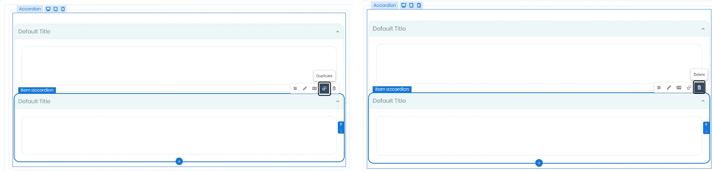
|
If the Accordion contains only one item, the delete option is not available.
|
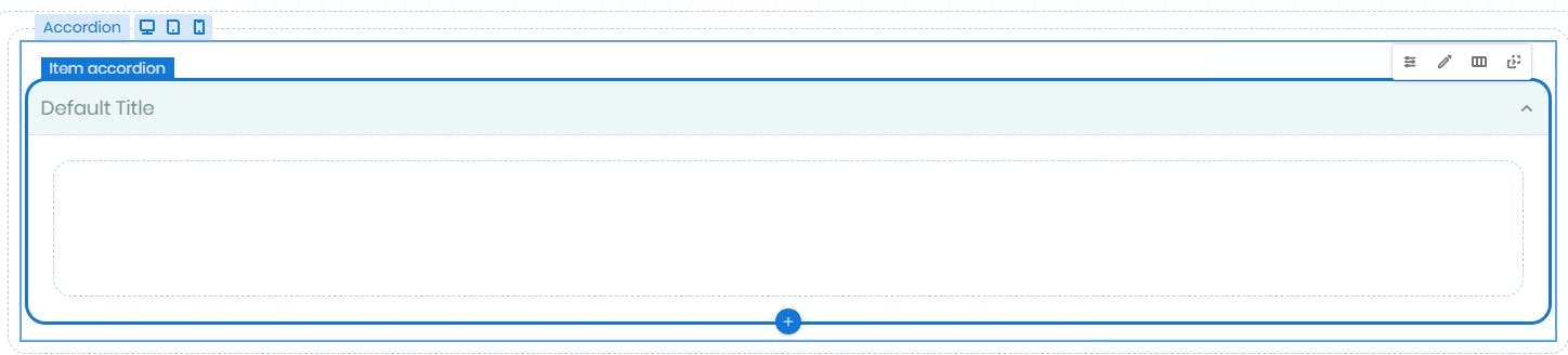
Duplicated items maintain their original layout, description visibility, and settings.
Adding controls inside items
You can add any control from the Controls panel to an item by dragging it into the item's content area. You can also drag existing controls from the page into the item area.
All standard control configuration options remain available inside the Accordion.
Quick actions
•Add items: Click the + icon to create new items.
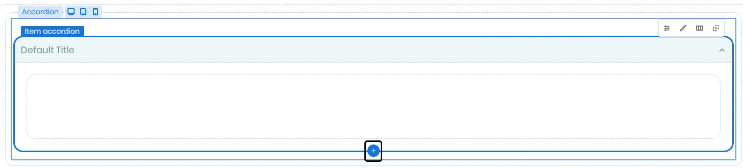
•Reorder items: Use the ↑ or ↓ icons to change the item order.
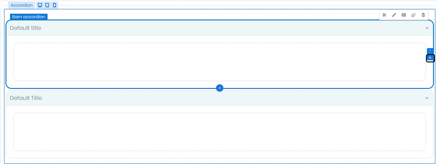
Behavior in published pages
In published pages, you can expand or collapse items by clicking the item header. The Accordion applies the behavior configured in its settings.
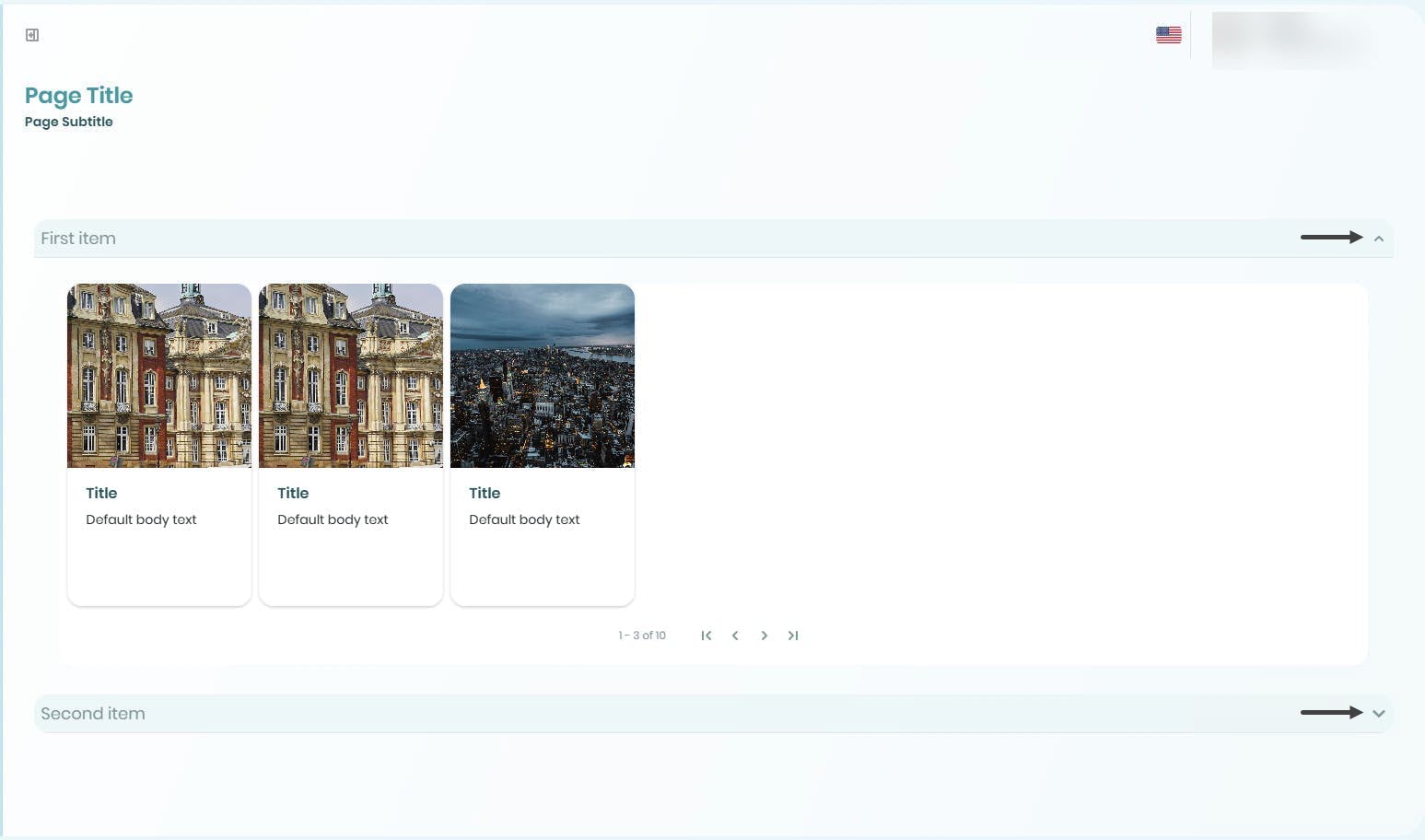
Items display their title, optional description, and all the controls added to them whenever they are expanded.
Last Updated 7/14/2026 10:26:25 AM