|
Considerations •This article is specifically designed for those people who understand CSS and HTML. •We strongly recommend using Google Chrome to facilitate the different taks related to this Feature. •Take into account that in this guide we are going to use Visual Studio Code to create the .css and .js, but you are free to use the tool you prefer. |
If you want to find the specific IDs of the elements you want to customize, refer to the Finding IDs in the Inspector article.
Overview
You can use the CSS file upload to redefine or extend the default visual appearance of the controls inside Bizagi forms. This file lets you modify typography, colors, spacing, alignment, borders, and layouts for every control that appears in a form. Through CSS, you can adapt the interface of each form to match your branding or any specific visual requirements of your application.
When you modify the global CSS file for form customizations, you are applying styles that affect every form inside the app. These rules apply automatically to all forms unless a more specific selector overrides them. Because of this, changes in this file can impact labels, inputs, tables, buttons, and any UI component across all forms unless additional CSS specificity prevents it.
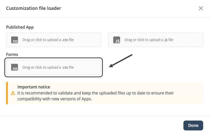
When you modify the body selector in the Forms customization CSS file, you are applying global styles to the entire Forms interface. The body selector defines the base visual properties of whole Forms, you can select to change certain Forms depending on the identification used.
Here is the list of the elements related to this feature:
•Body
•Text fields
•Required text label
•Number fields
•Invalid number fields
•Date pickers
•Combo boxes
•Combo Box Items
•Buttons
•Links
Body
General text color
Controls, labels, and general text inside the form inherit this color unless they define their own.
Example
This changes the general text color used in all controls inside the form.
body {
color: #333;
}
Text fields
Focus border highlight
Improves visibility by styling the border when the text field is selected.
Example
This styles the focused state of a text field so the border becomes blue when the user clicks on it.
input[type="text"]:focus {
border-color: #007bff;
box-shadow: 0 0 3px #007bff;
}
Required text label
Required field marker
Uses an asterisk to visually indicate mandatory fields.
Example
This highlights a required text field by adding a red asterisk.
label.required::after {
content: "*";
color: red;
margin-left: 4px;
}
Number fields
Larger font for readability
Improves visual clarity for longer numeric values.
Example
This formats number fields with a larger font size for long values.
input[type="number"] {
font-size: 1.1rem;
}
Invalid number fields
Invalid input highlight
Visually shows when the number entered does not meet validation rules.
Example
This changes the background color of number fields when the value is invalid.
input[type="number"]:invalid {
background-color: #ffe6e6;
}
Date pickers
Calendar icon styling
Improves visibility of the date picker icon.
Example
This styles the calendar icon inside a date picker.
input[type="date"]::-webkit-calendar-picker-indicator {
filter: brightness(0);
}
Combo boxes
Dropdown appearance
Applies branding to all dropdowns inside the form.
Example
This customizes the dropdown panel of a combo box.
select {
background-color: #f7f7f7;
border-radius: 6px;
}
Combo box items
Larger clickable area
Improves usability by increasing the padding of dropdown items.
Example
This increases the clickable area of combo box items.
select option {
padding: 10px;
}
Buttons
Hover grow effect
Emphasizes buttons on hover with a smooth scale animation.
Example
This creates a hover effect on buttons that slightly increases their size.
button:hover {
transform: scale(1.04);
}
Links
Visited link state
Helps users identify links they have previously opened.
Example
This changes the color of a link when visited.
a:visited {
color: purple;
}
|
Remember that for certain elements it is necessary to use the specific IDs of the elements you want to customize. Refer to the article Finding IDs in the Inspector if you have any questions. |
|
Note that you do not need to republish an app to see the changes made using this feature. Once a file is uploaded the app will show the desired customizations automatically. |
Last Updated 12/9/2025 10:28:30 AM