Overview
In the App Designer editor, you can navigate your app with ease from the Side menu.
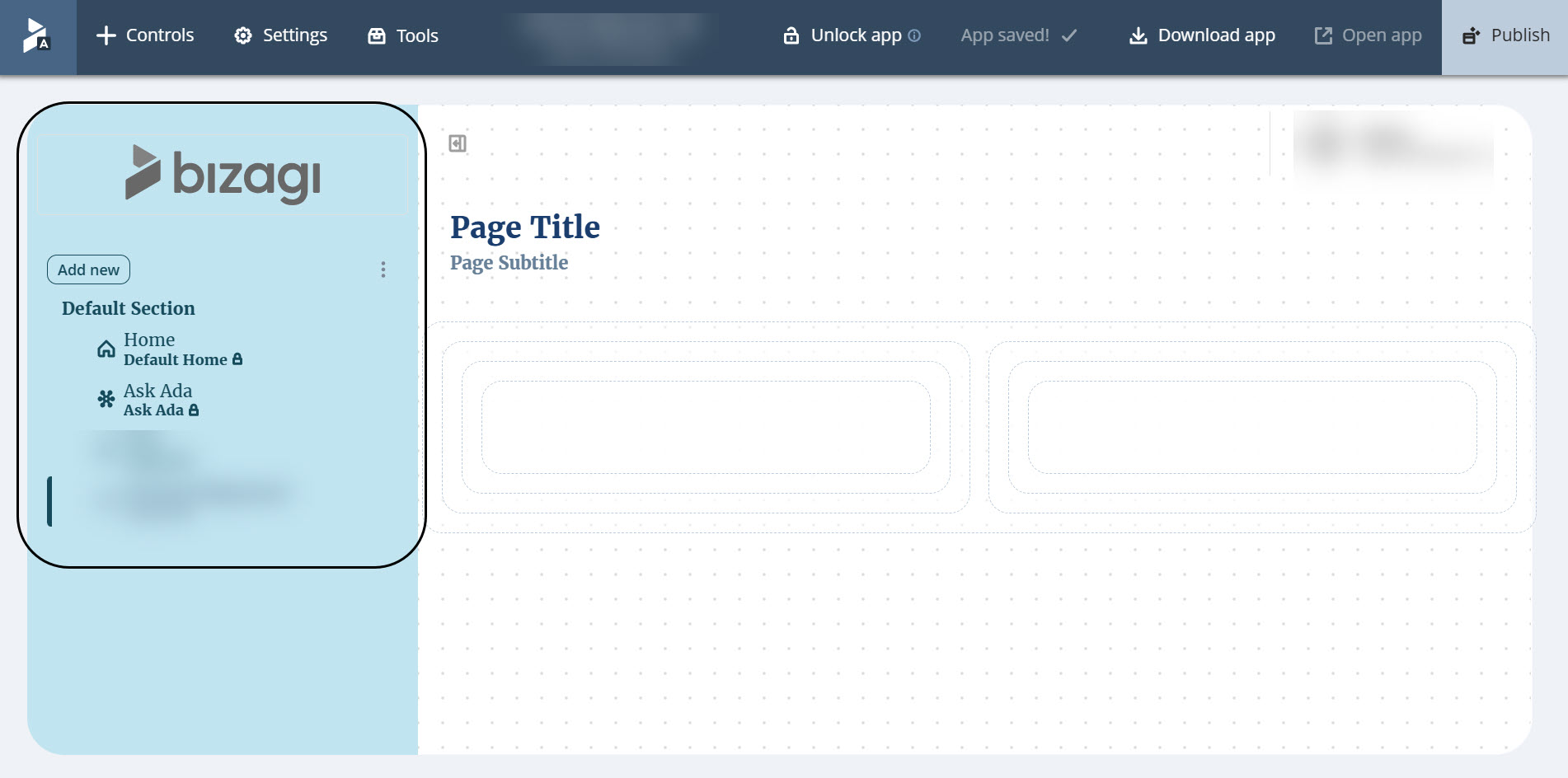
The Side menu is located on the left-hand side of the screen and allows you to organize your app's sections, pages, and links, displaying them as tabs.
Logo
The Side Menu options allow you to customize the sidebar with different logos for expanded and collapsed states, adding flexibility and personalization options to better suit various workflows and branding needs.
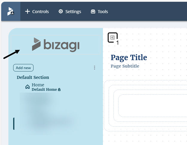
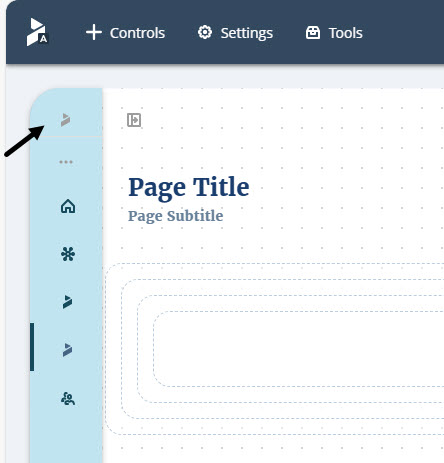
To open the Logo settings:
1.Click the logo box in the Side Menu.
2.Go to the Manage tab.
3.Open the Logo dropdown menu to view the settings.
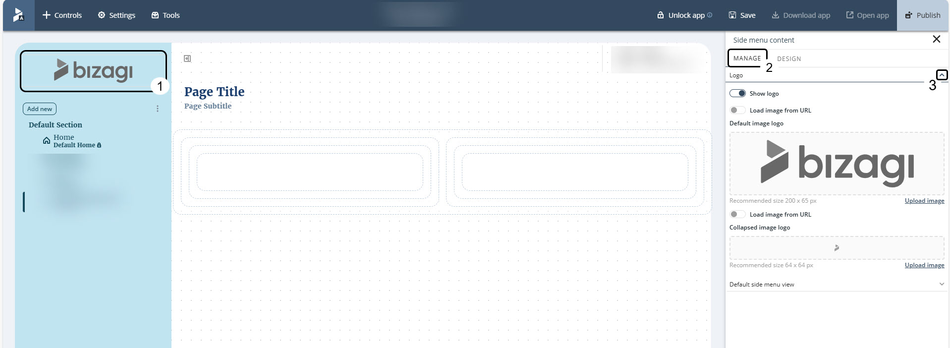
To hide the logo from the Side Menu, click the Show logo toggle button to disable it.

When enabled, this option lets you set the logo to display in the Side menu. To do so, you can either upload an image or specify a URL that contains the image to display as the logo.
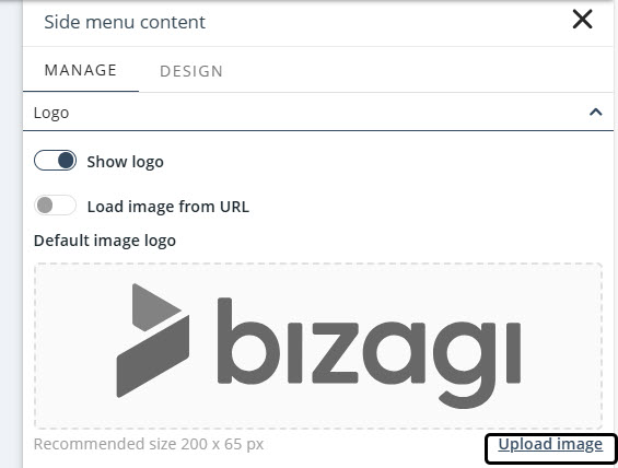
To upload an image, click Upload image to open the File Explorer and select the image to display as the logo.
|
The following formats are supported for images: .png, .jpg and .jpeg. |
If you prefer to specify a URL that contains your logo:
1.Enable the Load image from URL toggle button.
2.Enter the URL of the image you want to use as your logo.
3.Confirm the uploaded image in the field directly below.
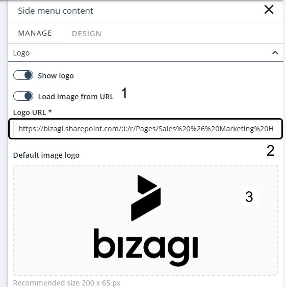
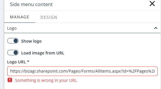
The entered URL must point directly to the image file and use a supported format.
If you enter the URL of an entire webpage or the image has an unsupported file extension, a warning will appear preventing you from saving the configuration.
You can configure the logo image for the collapsible Side Menu either by providing a URL or by uploading a file.
Follow the instructions above to complete this configuration.
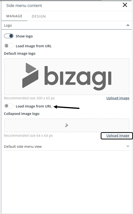
You can set the default view of the Side Menu to either Expanded or Collapsed.
If you select Collapsed, the sidebar will remain contracted each time the page is refreshed.
Sections
Sections is the Side menu's most important characteristic. Think of sections as containers of pages that allow you to organize and visualize your app content in a logical way. You can create as many sections as you need, and you can arrange any number of pages inside them.
When you create an app, the Side menu displays by default a section named Default Section, which contains the Home page.
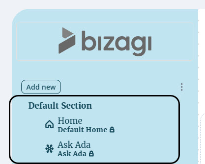
Add Sections
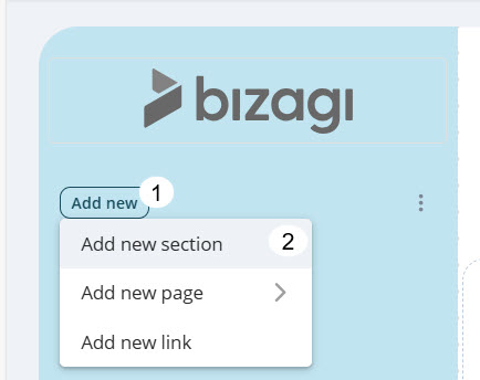
To add a section:
1.Click the Side menu's Add new button.
2.Select the Add new section option.
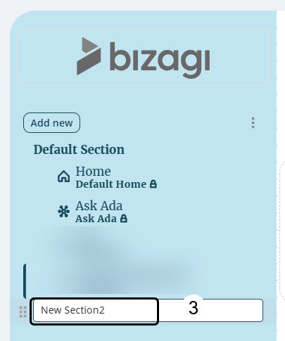
3.Give your section a name and press the Enter key to create the section.
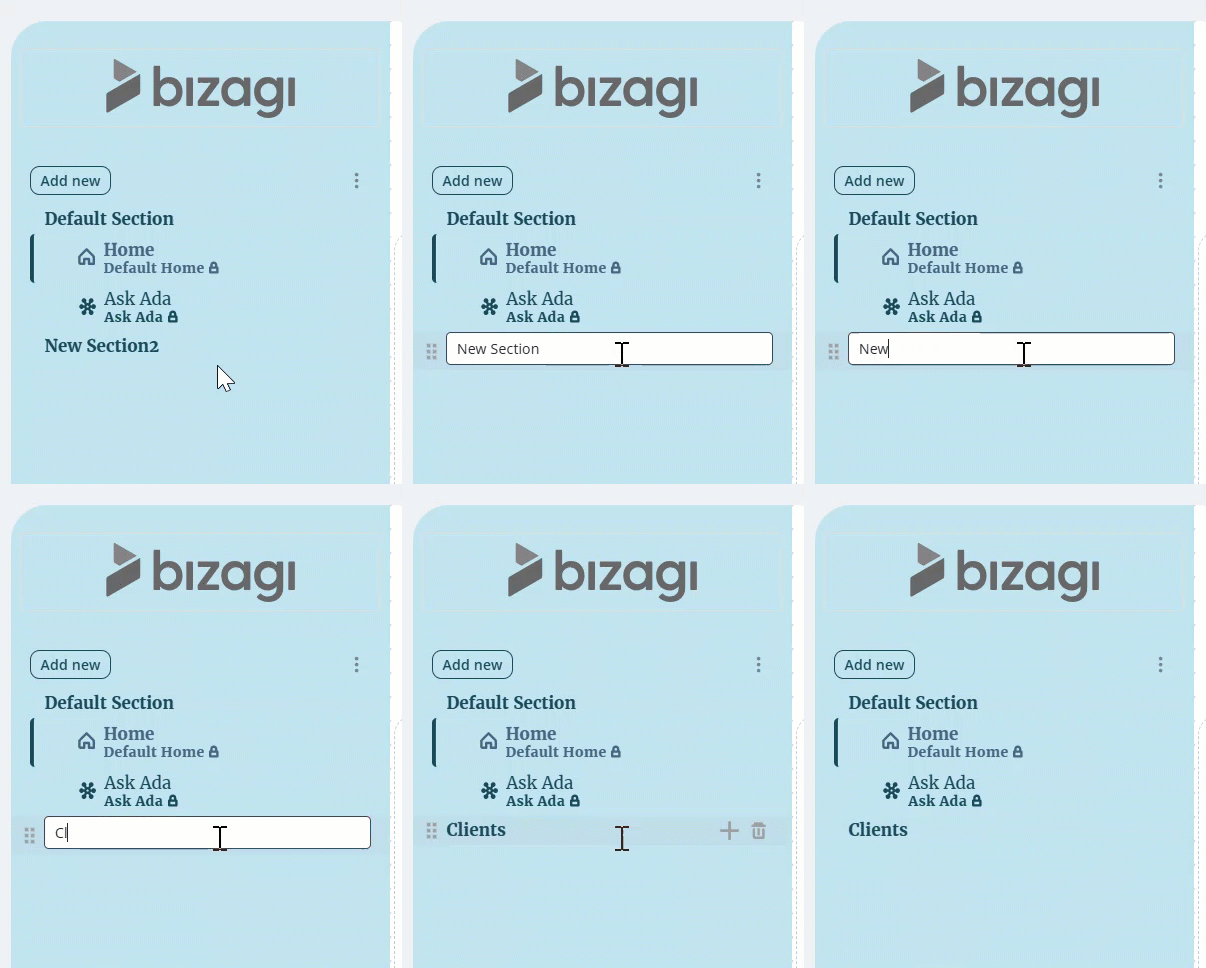
To change a section's name:
1.Double-click its name.
2.Define the new name
3.Press the Enter key to keep your changes.
Delete Sections
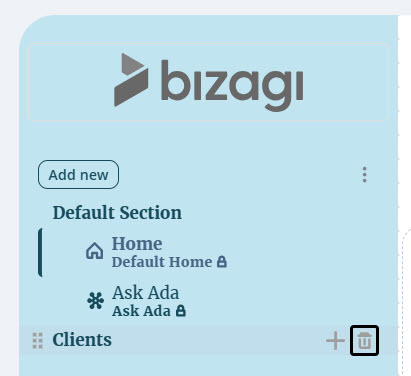
To delete a section:
1.Hover on top of the section you want to delete.
2.Click the ![]() icon.
icon.
3.If the section contains pages, these are moved to the last active section.
|
Keep in mind that you cannot delete the Default Section. |
Add pages in a Section
To add pages in a section:
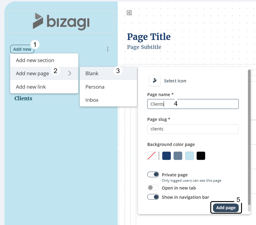
1.Click the Side menu's Add new button
2.Select the Add new page option.
3.Decide if you want to add a blank page, a Persona page or an inbox page.
4.Register the new page information in the page settings.
5.Click Add page to add the page in the Default Section.
You can also:
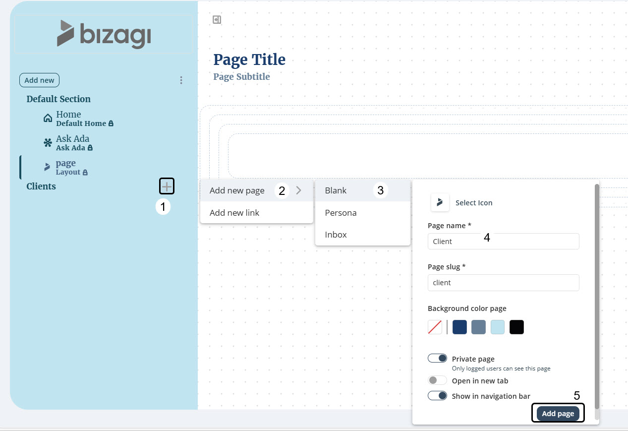
1.Hover on top of the section in which you want to add a page and click the ![]() icon.
icon.
2.Follow steps 2 to 5 from previous instructions to set your new page.
|
Keep in mind that you can create multiple pages with identical display names. |
Customizing the Side menu
To customize the Side menu, click the three-dot menu next to the Add new button.
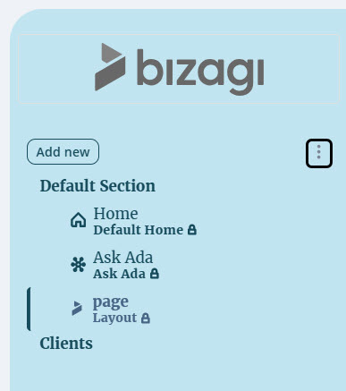
This option opens the Design tab of the Side menu content panel to the right of your screen.
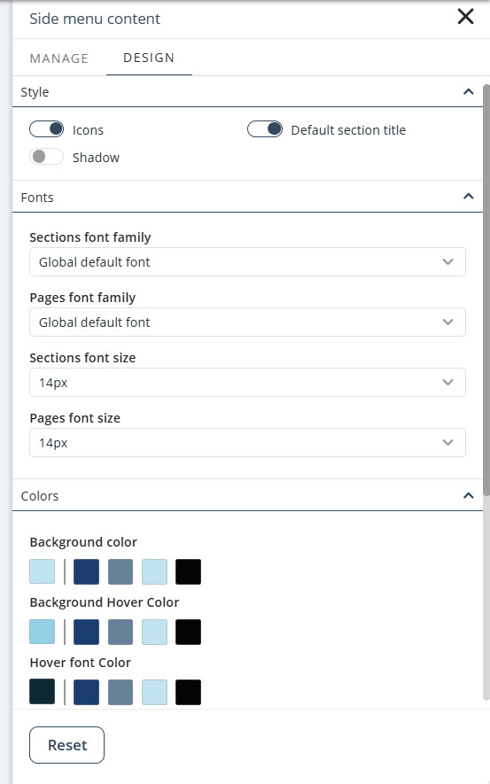
In the tab, you can configure the following properties to customize the Side menu:
•Style
oDefault section title: Enable this toggle switch to display the name of the section which contains the Home page, Default section.
oIcons: Enable this toggle switch to display icons in each of the Side menu's pages.
oShadow: Enable this toggle switch to display the Side menu's divider with a shadow.
•Fonts: Select the font family and size for the Side menu's sections and pages.
•Colors: Set the color of the Side menu's background, the section and pages fonts, and the icons. In addition, you can set the Hover color, which is the color shown in the Side menu when you hover the mouse on top of a page or when you select the page.
•Logo: Define the height of the logo (image displayed at the top of the Side menu) in pixels.
Last Updated 11/19/2025 4:45:12 PM