Overview
Bizagi Ltd offers a Widget Editor service that allows you to create your own Widgets in an assisted manner.
Through its features, you will be able to produce Widgets in no time, and fully extend the user interfaces of your Bizagi processes.
For more information about Widgets and what you need to create them, refer to Creating Widgets.
Through the example illustrated below and the guided steps, you will produce a basic Widget to present additional HTML fields.
Example
In this example, we will create a Password strength validator.
The objective of this Widget is to provide a password text field (hiding characters as asterisks), and to suggest if a password has been defined as weak, good or strong (in terms of how hard it would be to produce it randomly).

For this specific example, we define that:
•Its main purpose is to capture a password (an editable control in Bizagi). However we can choose that this control may be set as read-only to show the password's strength and hide characters as well.
•It will be available for all devices, all browsers, mainly because we would be using basic HTML elements (such as <input>, <span>, <div>).
•It won't be necessary to use any jQuery plugins or JS libraries.
•It will store the password into a string XPath of the data model (a string attribute). This is our most important configurable property in this Widget. However, we do want to use additional properties to allow localization and customization of messages involved in the Widget.
A simple Password strength validator will be implemented, while there is a slightly different implementation at the Widget Xchange.
Having defined the above, we move on by creating a new Widget through the Widget Editor (starting from its basic template).
We will be doing the Widget's implementation by carrying out the following:
1. Defining all relevant configurable properties.
In addition to the XPath to store information, we will use properties to customize the labels and messages: a "Password" label, "Type password" message, "Weak password" message, "Good password" message, and "Strong password" message.
2. Including the HTML elements that present a Password strength validator as read-only.
A Widget will be in the end, an HTML <div> element having any number of HTML elements inside.
3. Including the HTML elements that present a Password strength validator as editable.
Both as a best practice, and for controls which can be set as editable or non-editable, we need to create 2 different presentations of the HTML elements.
4. Implementing the behavior of the Widget.
This is mainly done to implement the behavior while enabling it to save and retrieve its temporary value.
5. Including CSS styles definitions for the HTML elements in the Widget.
Define styles in the CSS stylesheet for your HTML elements.
Hands on!
Access the Widget Editor at https://www.bizagi.com/widgeteditor/ and login with your bizagi.com account.
Create a new Widget:
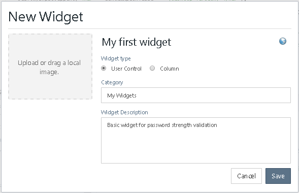
Then follow these steps to create your first Widget.
1. Defining all relevant configurable properties
Note that by default, the basic starting template provides a Widget already configured to use an XPath data binding of text type (incoming from a string attribute in your data model).
This is all we need to store the information in our Widget, because we will be saving a text having the actual password.
We can check on that the property called XPath that comes in the template, is already fit to use a string-type attribute of our data model:
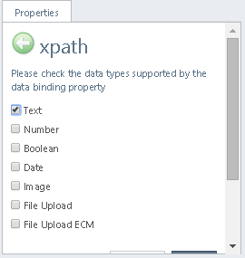
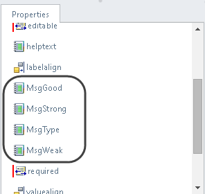
However, to have fully customizable and localized messages in our Widget, we create static 4 text properties:
For the "Type Password" label:
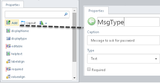
Notice we don't need to set it as Required, mainly because we can always use default values.
Similarly, one for each other messages such as the "Weak password", "Good password", and "Strong password".
In the end we have these properties:
2. Include the HTML elements that present a Password strength validator as read-only
We now get to the implementation file to code in the Widget's behavior.
For this, locate the desktop\MyFirstWidget.js file and double-click to edit it.
First, we include a basic implementation of the control when it is set as non-editable in Bizagi.
Basically, in this part, it just won't allow any action over it, so we edit the getReadonlyControl function to include HTML controls set as read-only.
Use to following code to replace the current one having "return this.getGenericControl();" in the blank template:
getReadonlyControl: function () {
//standard initialization
var self = this;
var control = self.getControl();
var properties = self.properties;
var extendedData = self.extendedData;
//self is our base. The Widget control is defined in this case, containing a <div> HTML element.
self.mydiv = $("<div>");
//we define a class for your element so that appearance is customizable from the CSS style sheet.
self.mydiv.addClass("MyFirstWidget_MainDivClass");
//we make sure that when no values are set, we can use default texts:
//since we will be needed these from another function, we can set them into the self object for "global" access
self.mydiv.typemsg = properties.MsgType || "Type a password";
self.mydiv.weakmsg = properties.MsgWeak || "Weak";
self.mydiv.goodmsg = properties.MsgGood || "Good";
self.mydiv.strongmsg = properties.MsgStrong || "Strong";
//we can add up any number of inner elements to the control
var myspan = $("<span id='MySpan'/>");
myspan.addClass("MyFirstWidget_SpanClass");
var myinput = $("<input type='password' disabled/>");
myinput.addClass("MyFirstWidget_InputClass");
myinput.appendTo(self.mydiv);
self.mydiv.myinput = myinput;
myspan.appendTo(self.mydiv);
self.mydiv.myspan = myspan;
//always return the control
return self.mydiv;
}
Notice that the HTML elements for the read-only implementation are set as disabled (or readOnly='readOnly').
This means that you may delete the getGenericControl() function as suggested by the blank template:
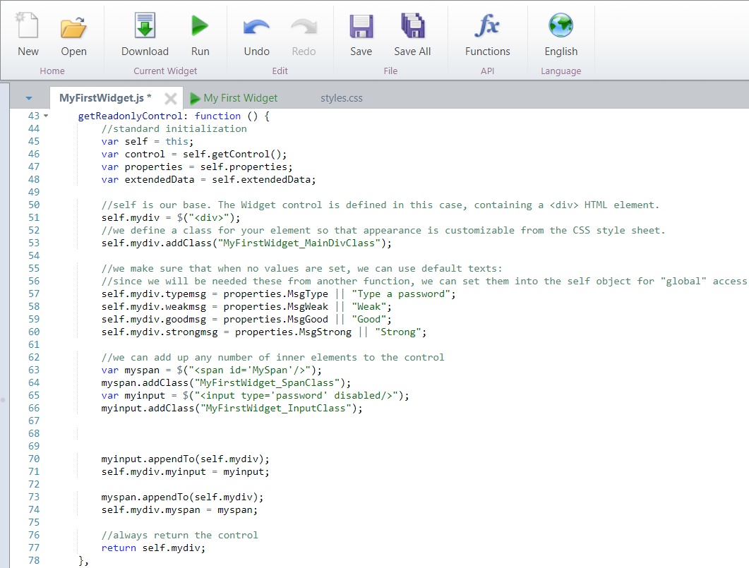
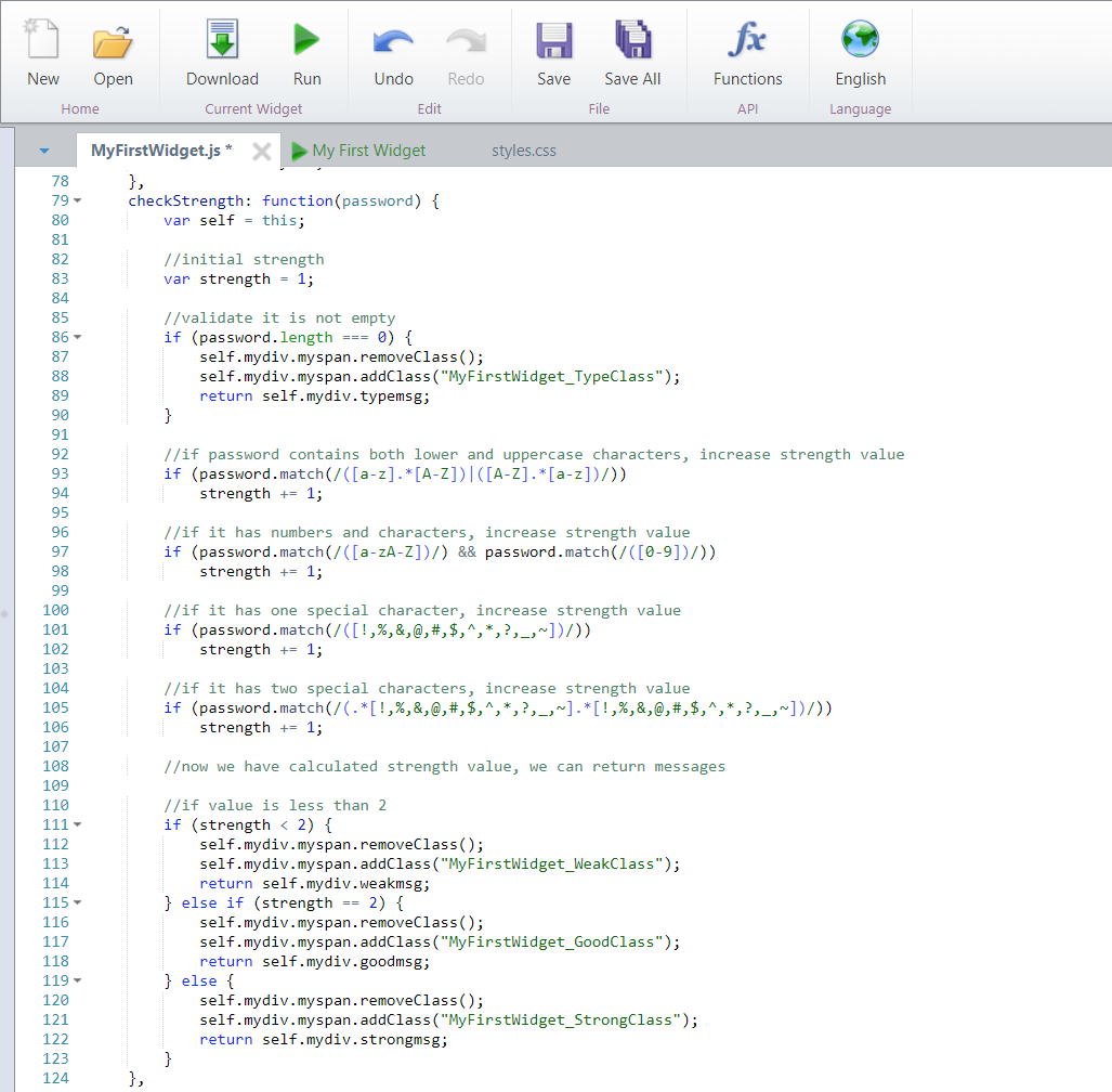
When having deleted the getGenericControl() function, you may replace it with another one called checkStrength().
Implement the checkStrength function in this same file with the following code:
checkStrength: function(password) {
var self = this;
//initial strength
var strength = 1;
//validate it is not empty
if (password.length === 0) {
self.mydiv.myspan.removeClass();
self.mydiv.myspan.addClass("MyFirstWidget_TypeClass");
return self.mydiv.typemsg;
}
//if password contains both lower and uppercase characters, increase strength value
if (password.match(/([a-z].*[A-Z])|([A-Z].*[a-z])/))
strength += 1;
//if it has numbers and characters, increase strength value
if (password.match(/([a-zA-Z])/) && password.match(/([0-9])/))
strength += 1;
//if it has one special character, increase strength value
if (password.match(/([!,%,&,@,#,$,^,*,?,_,~])/))
strength += 1;
//if it has two special characters, increase strength value
if (password.match(/(.*[!,%,&,@,#,$,^,*,?,_,~].*[!,%,&,@,#,$,^,*,?,_,~])/))
strength += 1;
//now we have calculated strength value, we can return messages
//if value is less than 2
if (strength < 2) {
self.mydiv.myspan.removeClass();
self.mydiv.myspan.addClass("MyFirstWidget_WeakClass");
return self.mydiv.weakmsg;
} else if (strength == 2) {
self.mydiv.myspan.removeClass();
self.mydiv.myspan.addClass("MyFirstWidget_GoodClass");
return self.mydiv.goodmsg;
} else {
self.mydiv.myspan.removeClass();
self.mydiv.myspan.addClass("MyFirstWidget_StrongClass");
return self.mydiv.strongmsg;
}
}
So that this file now looks like this:
|
Make sure each function defined is separated by a comma (,). |
3. Including the HTML elements that present a Password strength validator as editable
We can easily reuse the previous implementation to make sure that our Widget has an implementation when set as an editable control in Bizagi.
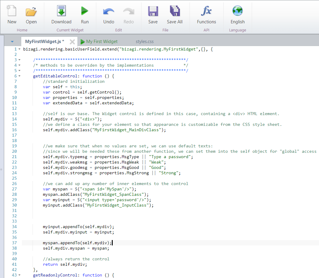
We start off by doing a copy/paste of this previous code, but this time we will need now to make sure the HTML controls inside are editable and that we properly handle how the Widget behaves when capturing information:
Code the following for the getEditableControl function:
getEditableControl: function () {
//standard initialization
var self = this;
var control = self.getControl();
var properties = self.properties;
var extendedData = self.extendedData;
//self is our base. The Widget control is defined in this case, containing a <div> HTML element.
self.mydiv = $("<div>");
//we define a class for your element so that appearance is customizable from the CSS style sheet.
self.mydiv.addClass("MyFirstWidget_MainDivClass");
//we make sure that when no values are set, we can use default texts:
//since we will be needed these from another function, we can set them into the self object for "global" access
self.mydiv.typemsg = properties.MsgType || "Type a password";
self.mydiv.weakmsg = properties.MsgWeak || "Weak";
self.mydiv.goodmsg = properties.MsgGood || "Good";
self.mydiv.strongmsg = properties.MsgStrong || "Strong";
//we can add up any number of inner elements to the control
var myspan = $("<span id='MySpan'/>");
myspan.addClass("MyFirstWidget_SpanClass");
var myinput = $("<input type='password'/>");
myinput.addClass("MyFirstWidget_InputClass");
myinput.appendTo(self.mydiv);
self.mydiv.myinput = myinput;
myspan.appendTo(self.mydiv);
self.mydiv.myspan = myspan;
//always return the control
return self.mydiv;
}
Notice this means replacing the current implementation having "return this.getGenericControl();" in the blank template:
At this point, you are encouraged to use the Run option to simulate and validate that both the editable and non-editable HTML is presented accordingly:
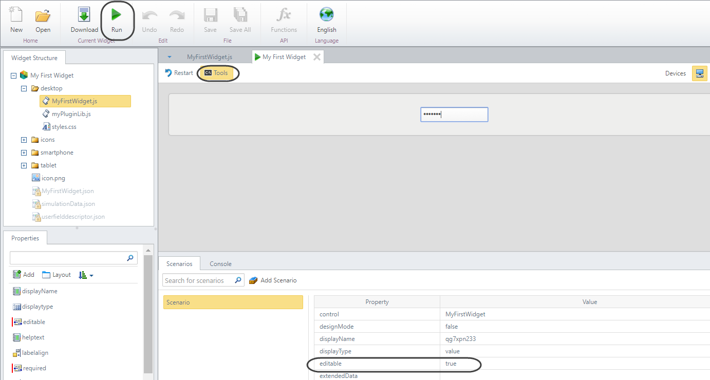
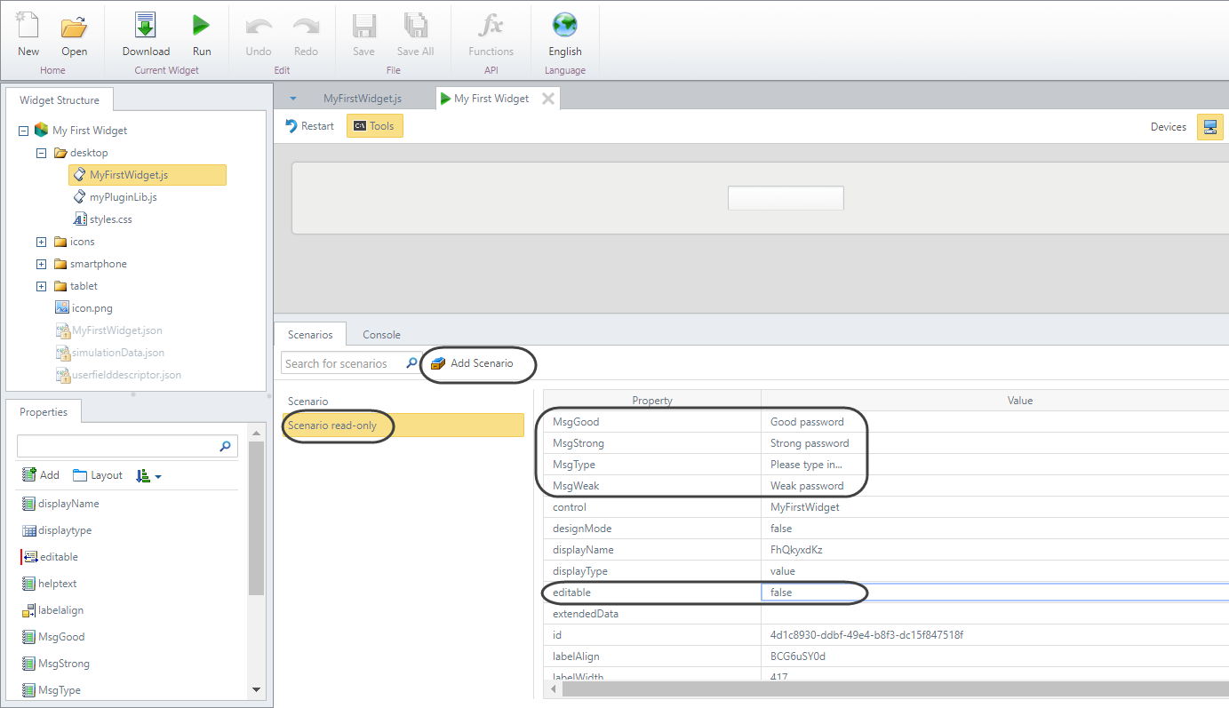
Notice that by default, the simulation data uses editable=true, so you may create an additional scenario to consider editable=false.
You may do this to simply check that your input is either editable or read-only accordingly.
You may also edit the simulation values (such as the incoming value for that XPath, MsgType, MsgWeak, MsgGood, and MsgStong) so that it is not using random texts (though these will still go unnoticed up until next step).
4. Implementing the behavior of the Widget
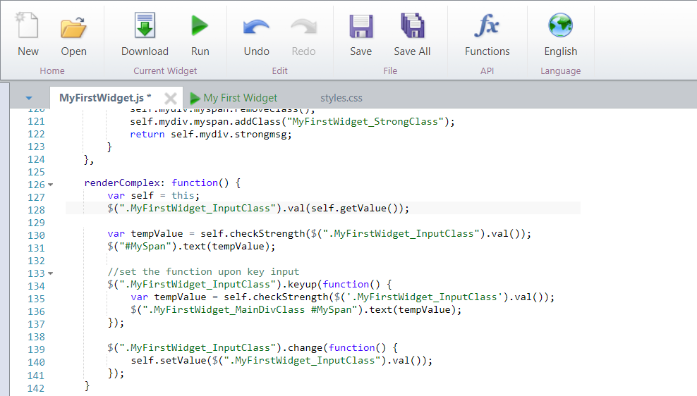
For this, we need to override the renderComplex() function which triggers once both the form and the Widget have completely loaded up.
renderComplex: function() {
var self = this;
$(".MyFirstWidget_InputClass").val(self.getValue());
var tempValue = self.checkStrength($(".MyFirstWidget_InputClass").val());
$("#MySpan").text(tempValue);
//set the function upon key input
$(".MyFirstWidget_InputClass").keyup(function() {
var tempValue = self.checkStrength($('.MyFirstWidget_InputClass').val());
$(".MyFirstWidget_MainDivClass #MySpan").text(tempValue);
});
$(".MyFirstWidget_InputClass").change(function() {
self.setValue($(".MyFirstWidget_InputClass").val());
});
}
Notice the first two lines are triggering the calculation of the password strength mainly for the case when there is already an existing value in the XPath (or when the control is set as read-only).
We also include a function for a key-up event so that its strength is calculated with every key stroke:
Now use the Run option again to simulate and validate that the Widget behaves as expected for your defined scenarios:
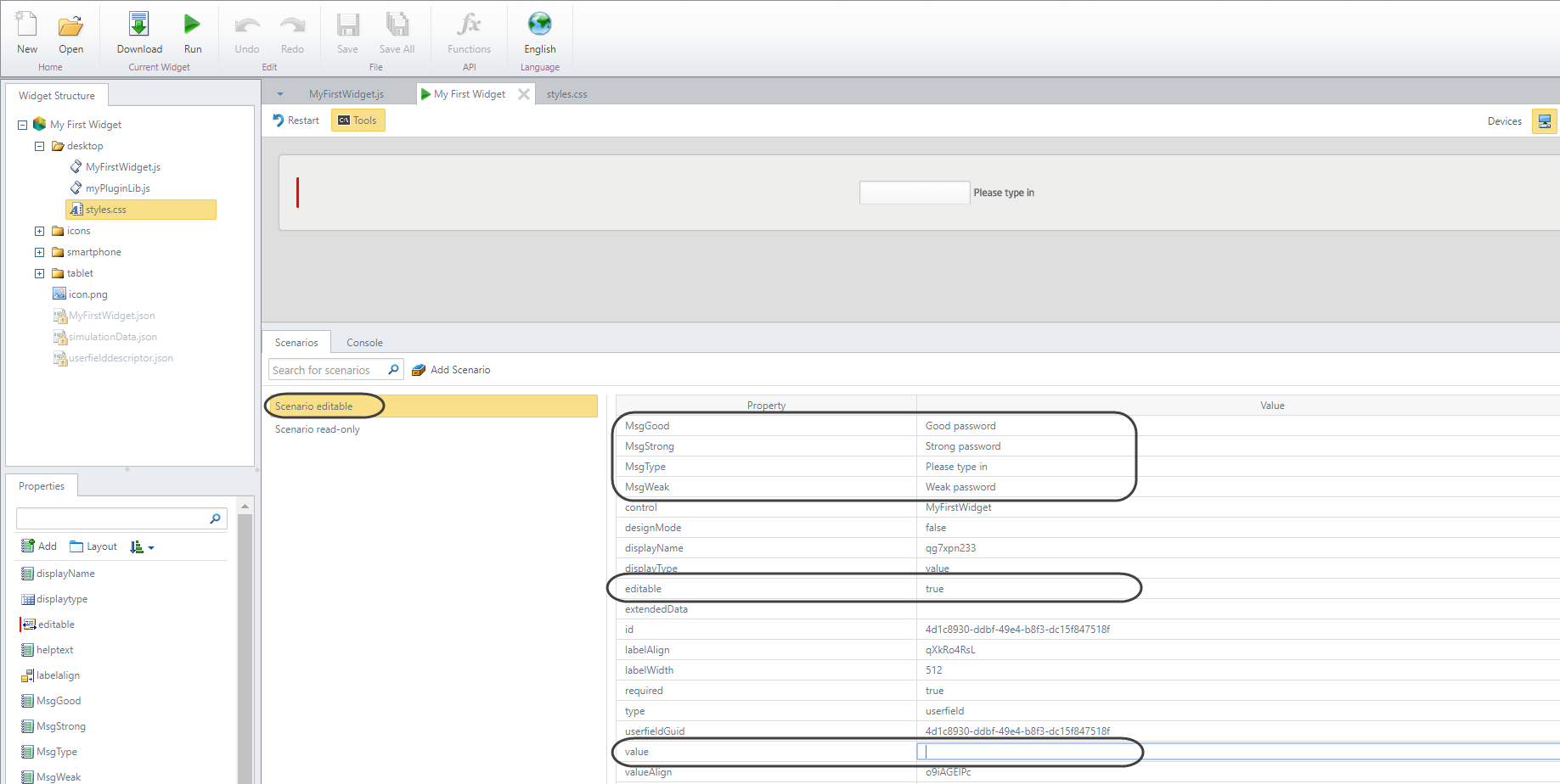
Notice that for the editable=true scenario, you should also edit the simulation values (such as the incoming value for that XPath, MsgType, MsgWeak, MsgGood, and MsgStong).
For instance, by leaving value as blank, you should be able to start up typing a new password.

5. Including CSS styles definitions for the HTML elements in the Widget
Since we guaranteed that our Widget's HTML elements have explicitly defined classes, we may assign appearance settings in our CSS file (at the styles.css):
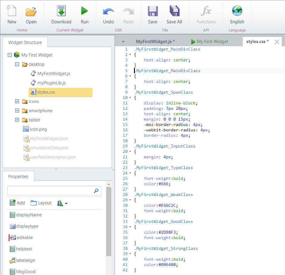
We include definitions for these classes:
.MyFirstWidget_MainDivClass
{
text-align: center;
}
.MyFirstWidget_SpanClass
{
display: inline-block;
padding: 3px 20px;
text-align: center;
margin: 0 0 0 15px;
-moz-border-radius: 4px;
-webkit-border-radius: 4px;
border-radius: 4px;
}
.MyFirstWidget_InputClass
{
margin: 4px;
}
.MyFirstWidget_TypeClass
{
font-weight:bold;
color:#666;
}
.MyFirstWidget_WeakClass
{
color:#E66C2C;
font-weight:bold;
}
.MyFirstWidget_GoodClass
{
color:#2D98F3;
font-weight:bold;
}
.MyFirstWidget_StrongClass
{
font-weight:bold;
color:#006400;
}
Furthermore, we may clone the implementation for our desktop\MyFirstWidget.js so that it applies the same to tablet\MyFirstWidget.js and smartphone\MyFirstWidget.js but we can differentiate them through their styles.
For this example, we can clone the styles file so that it applies the same to smartphones and tablets.
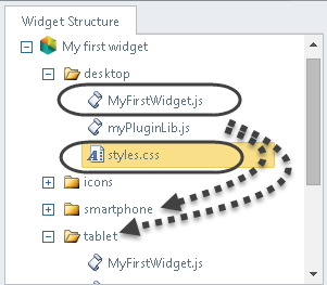
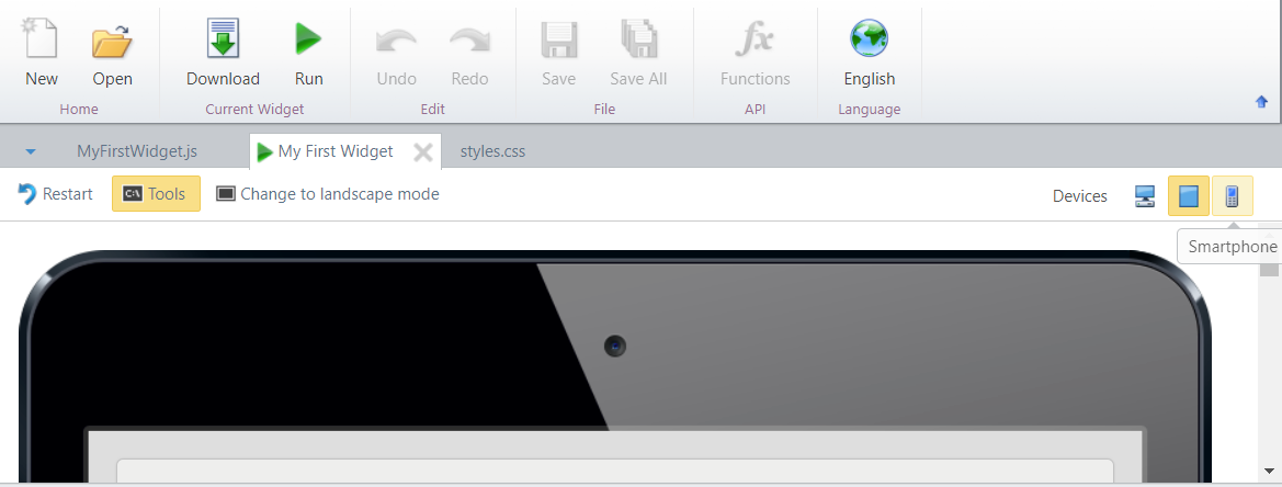
Recall that you may simulate the Widget for these other devices as well:
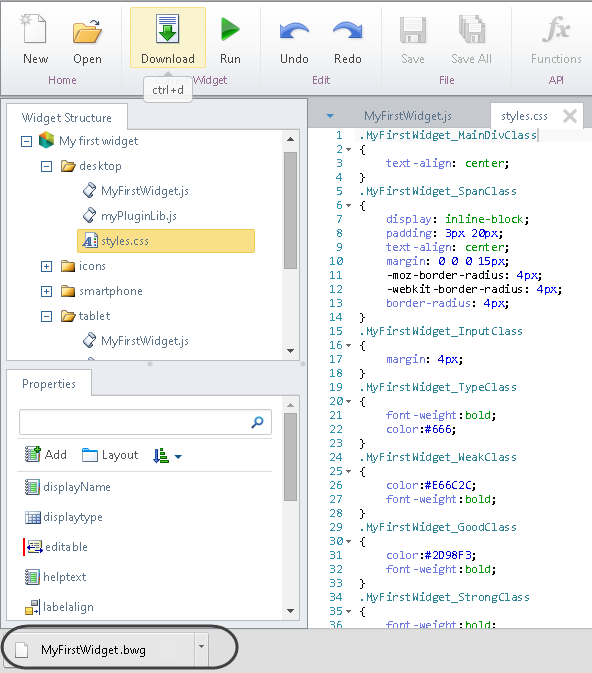
And that's it, use the Download option to save a local copy of your Widget!
Last Updated 1/6/2022 11:30:16 AM