Overview
Bizagi features a Web Analytics report which provides data analysis to match your business requirements. It enhances agility, traceability, and accountability so you get the best value from the data you gather as you use Bizagi Modeler. You can analyze information within a certain time frame and select events such as website visits, process diagram visits, or comments activity. The interface presents the data you choose in quantitative and graphical displays. Moreover, you can set and save reports for specific time-frames to tailor the report to your needs.
What you can do
You can generate graphical reports based on the information you select.
In the report customization panel, select how to divide the information in the report. Three drop down controls present a series of filters: select event(s), by options, and and options. These controls appears sequentially.

In the time frame panel, select the range of time that you wish your report to cover. You can select a preset time frame or customize your own.
![]()
A panel shows a graphical display of the information selected on the customization panel. You can change the display to be a bar or a line chart.


Select specific filters for the information selected on the report customization panel to present particular information in the graphical display.
Manage your reports: save, edit, delete or remove them.
Considerations
•Only the plan owner can access the report view.
•The customization panel presents three drop down controls that provide lists of choices: select event(s), by options, and and options. Take into account the following conditions regarding the customization panel options:
•For the graphical report to be available, select one or more items in the select event(s) control and one item in the by options control.
•If you select one item on the select event(s) control, the and options are available. If you select more than one item, the and options are not enabled.
•Depending on what you choose in the select event(s) control, the by/and controls display some of these options: job titles, location, date, device. browser, client app, process diagrams.
•If you only select one option in the select event(s) list, it appears as the Y axis of the report and the option selected from the by options list appears as the X axis. If you select one option in the and control the results appear grouped by colors.
•If you select more than one event on the select event(s) list the chosen items display grouped by colors and the by option selected appears as the X axis. The and options are not enabled.
•You can only select one item in the by options control.
•You can only select one item in the and options control.
How to create a report
Let’s suppose you want to create a bar chart report (business situation example) that shows the total portal visits by Job title and location for the last month for visitors from the United States and Australia. To create it, follow these steps:
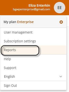
1. In the company Process Library click your profile icon. From the list of options, select Reports.
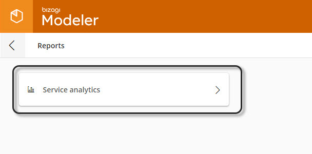
2. In the Reports window, click Service analytics.
3. Click Select event(s) and check the items that you want to consider in your report:
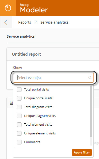
Select event(s) items |
|
|---|---|
Events |
Description |
Total portal visits |
Number of times that one or more users (recurrent visits are included) access the portal. |
Unique portal visits |
Number of individual users who access the portal (recurrent visits are not included). |
Total diagram visits |
Number of times that one or more users visualize diagrams (recurrent visits are included). |
Unique diagram visits |
Number of individual users who access diagrams (recurrent visits are not included). |
Total element visits |
Number of times that one or more users interacts with any shape (pool, lanes, activities, events, gateways, and other palette elements) of the diagram (recurrent visits are included). |
Unique element visits |
Number of individual users who interact with shapes (pool, lanes, activities, events, gateways, and other palette elements) on models (recurrent visits are not included). |
Comments |
Number of users who comment on diagrams either desktop or Process Library. |
Comment replies |
Number of users who respond to previous comments. |
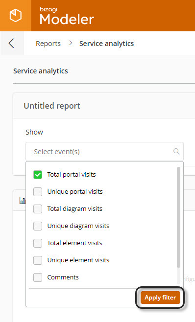
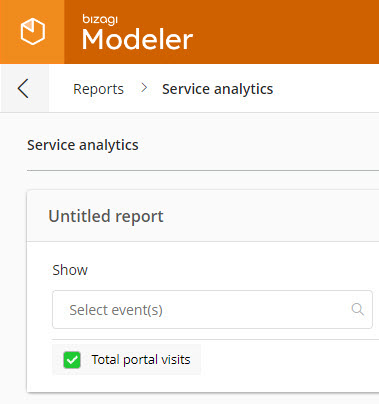
For the business situation example, select total portal visits event and click select Apply filter.
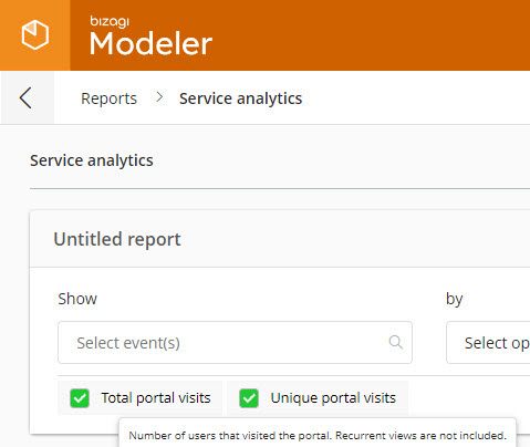
If you select more than one option, they are listed horizontally. When you hover the mouse pointer over one of the listed items, a brief description appears. Click an option on the horizontal layout if you want to remove it from the selection.
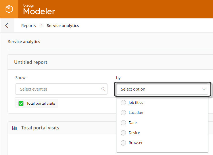
4. The by options control appears. Click Select option and select one of the options in the list:
By/and options |
||
|---|---|---|
Options |
Description |
Source |
Job titles |
Job title(s) of users that match the condition(s) selected on the select event(s) control. |
User management job title. |
Location |
Country, city and/or state of users that match the condition(s) selected on the select event(s) control. |
Contact information of each user account. |
Date |
Date when the users accomplish the condition(s) selected on the select event(s) control. |
Not applicable. |
Device |
Device used by users that matches the condition(s) selected on the show filter field. |
Can be either desktop (desktop computer) or mobile (tablet or smart-phone). |
Browser |
Browser used to accomplish the condition(s) selected on the select event(s) control. |
By default the system recognizes Chrome, Safari, Edge, and Firefox. However when a user acts in a different browser, it appears on the list. |
For the business situation example, select the job titles option.
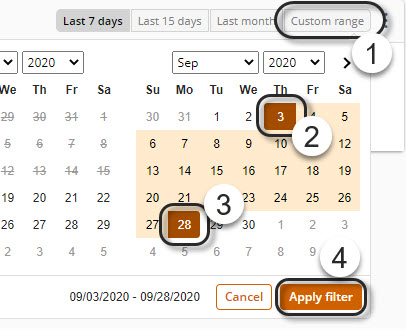
4. Select the time frame that you wish to analyze in the report. You can select either a preset time frame (last seven, fifteen, or thirty days) or customize your own. If you don't choose an option, the system selects the last seven days option.

For the business situation example, select the Last month option.
To customize your own time frame, select Custom range. A calendar window appears. Select the start and end dates, then click Apply.
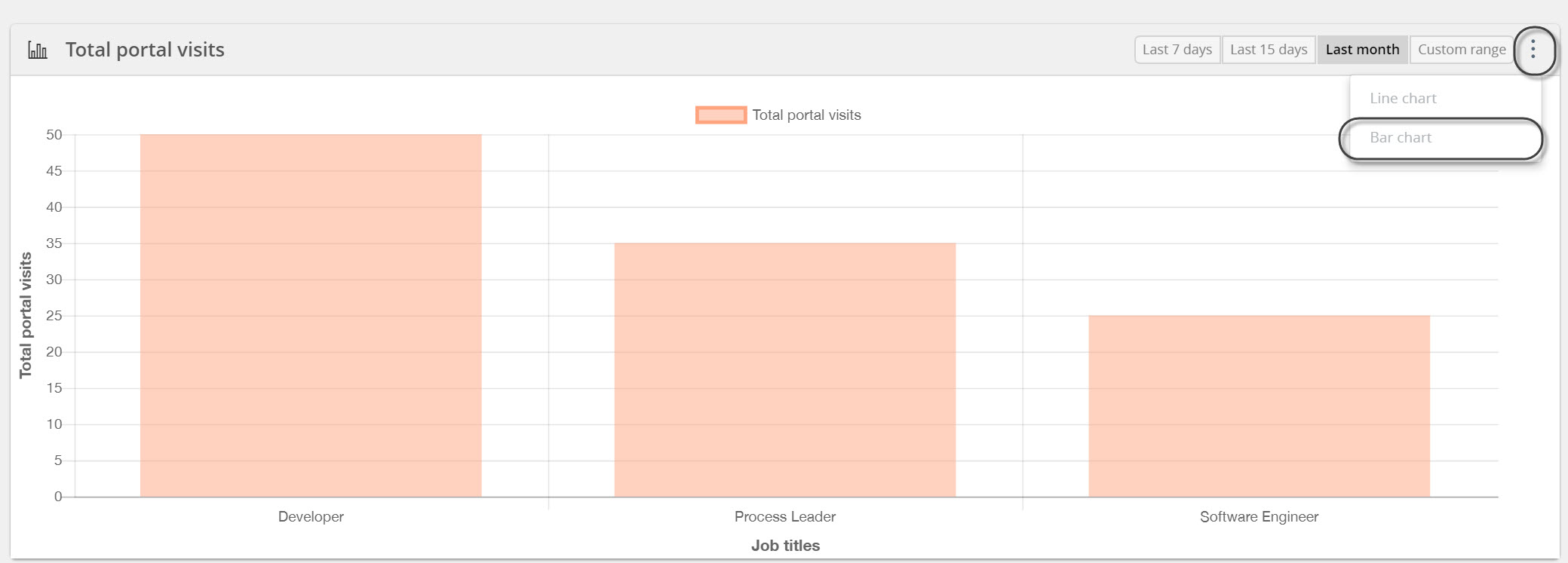
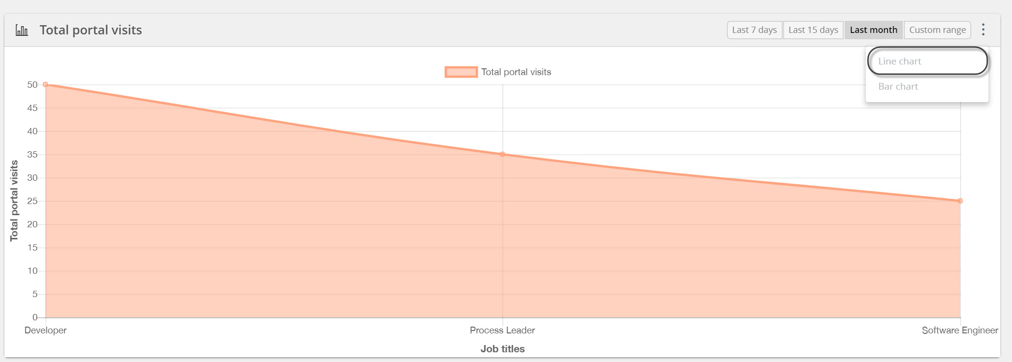
5. Visualize the graphical report with the selected options. You can view either bar or line charts, by default the system presents the graphical report on bar charts; To change the view, select the three vertical dots on the top right of the panel and click the chart you wish to visualize.
6. The and options control appears. Select it to enable more options which are available depending on the selection you already made in the customization panel.
For the business situation example, select the option location.

The graphical report automatically updates. It shows the selected items' information grouped by colors. The color conventions appear horizontally on top of the graphic chart. To remove filters, click the color convention.
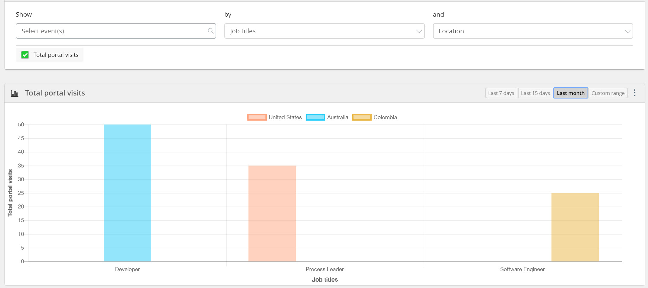
Nested filters
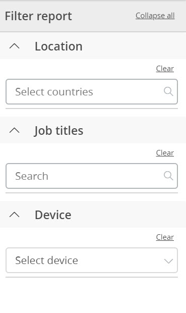
Find a panel on the right of the window with nested filters that enhance the specificity of the report. These filters are available depending on the customization options that you have previously defined. Select the filter(s) of your choice.
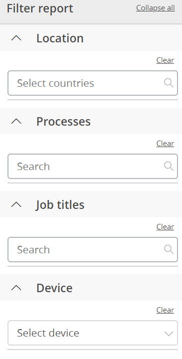
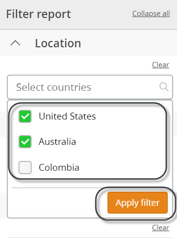
A drop-down list appears for each of the selected filters. Check the items that you want to use for your report.
For the business situation example, select United States and Australia. Then click Apply filter.
This action automatically updates the chart.
The report displays a bar chart that shows the total portal visits by Job title and location for the last month for site visitors from the United States and Australia.
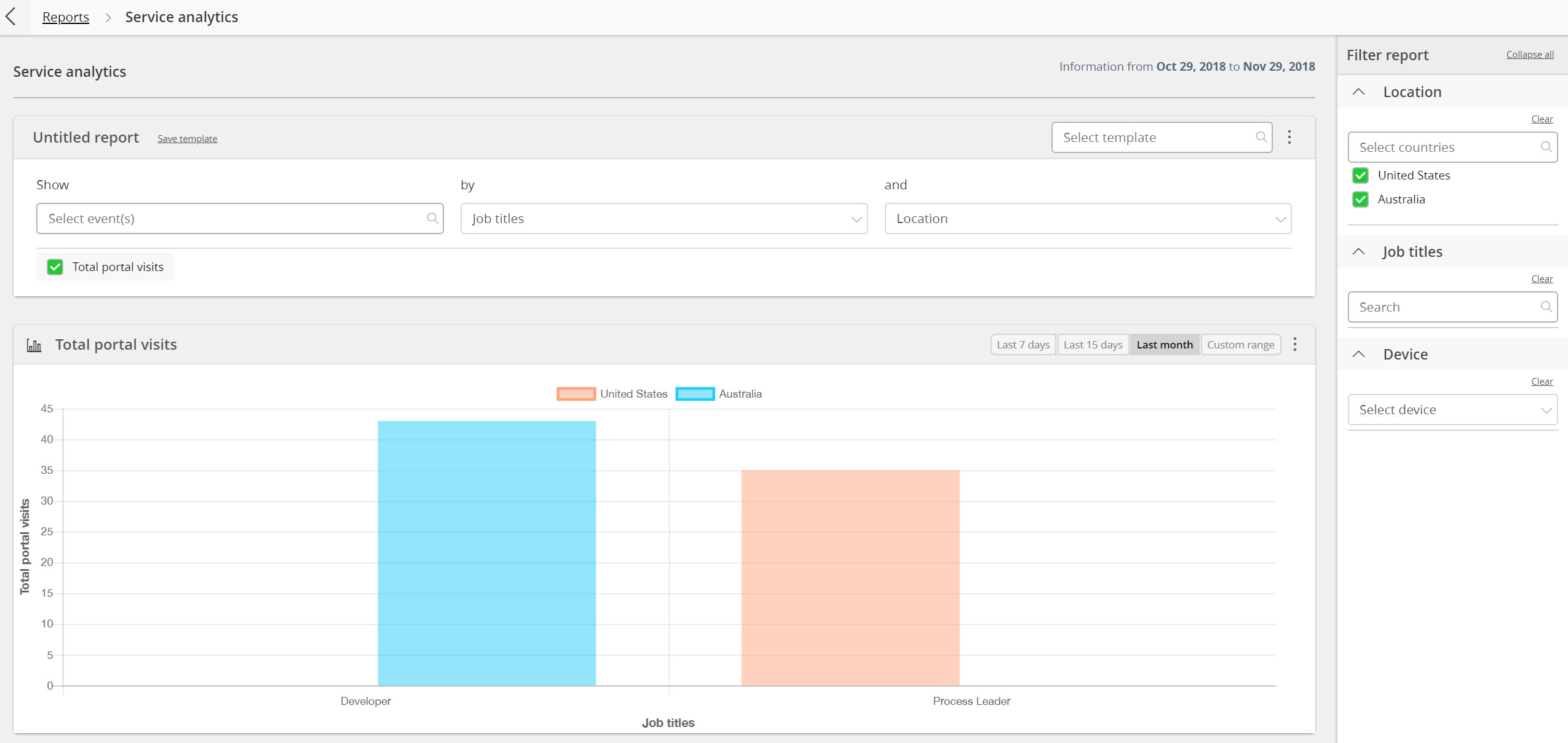
You can remove individual filters or the whole filter selection. To remove individual filters, click clear on the top right of each filter search box. To remove the whole filters, click clear all on the top right of the panel.
Manage reports
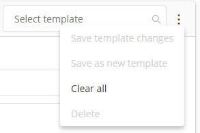
Click the three dot menu at the top right of the filters panel to display the options shown on the image below.
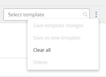
Option |
Description |
|---|---|
Save template changes |
Overwrite previous saved templates with the versions in the current report and save them. |
Save as new template |
Create and save a new report template. |
Clear all |
Remove all the information for the current template. |
Delete |
Delete the saved templates. |
|
•If you save a report that uses a preset timeframe (seven, fifteen or thirty days), each time you open the report it displays the information from the day you open the report and not from the report creation date. •If you save a report using a customized time frame, the timeframe shown in the report is always the same. |
Last Updated 2/16/2022 5:07:19 PM