Use
The Text box control displays string-type attributes in the Form.
Considerations
By default, the maximum length allowed for the text entered will be equivalent to the maximum length defined for the associated attribute. If there is also a maximum length defined in the Text box control's properties, the true length allowed will be the lesser amount of the attribute's property or the control's property.
The number of lines displayed in an extended text control is not related to the number of characters allowed in such control.
Related to attribute types
This control is related to string-type attributes or extended text attributes.
Extended text attributes hold an unlimited number or characters.
Properties
Every control has a set of properties that allow to customize its behavior in the Work Portal. However, some properties are exclusive to a specific control. The following properties are restricted to the Text box control:
Basic tab
PROPERTY |
DESCRIPTION |
|---|---|
Is extended |
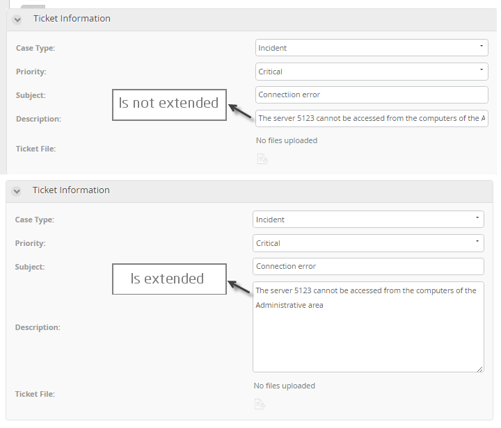
The property, if enabled, expands the height (number of lines) of the text area and displays a vertical scroll bar. Bizagi will control the inclusion of special characters such as < and > to avoid end users from including malicious strings to the platform. |
Auto-extend |
If enabled, expands the height (number of lines) of the text area by demand, every time the number of lines is reached, an additional line is added and hides the vertical scroll bar. This property is hidden when the property Is extended is disabled. |
Lines to display |
Sets the number of lines that will be displayed for an Extended text control. This property affects the height of the text area. It is very useful for Extended texts in Tables. By default the number of lines is 6. If number of characters exceeds the space, a scroll bar will display. This property is available when the property Is extended is enabled. |
Maximum length |
Defines the maximum number of text characters that can be entered into the Control and the maximum number of characters that can be displayed in a read-only control. |
Is extended property example
Advanced tab
PROPERTY |
DESCRIPTION |
|---|---|
Re-type |
Forces the user to re-enter the value to make sure they entered it correctly. These values are compared on clicking the Next button. If there is no match the values must be re-entered. The verification value can be configured for entry in one of two ways: •Duplicate: Displays two Number Controls. Both controls must contain the exact same information to continue. •Double: Requires end users to type the same number twice in the same Control. If the values do not match a validation message will display. |
Automatically sets a value when the Form opens for the first time. As soon as a value is chosen by the user the default will be replaced. If the associated attribute is valued by means of an expression, the default value of the Text box control will be ignored. The default value can also be set using an expression. |
|
Regular Expression |
A regular expression is a special text (with a defined syntax) for identifying a pattern of characters or a particular character in order to validate the content that is entered in a text box control. This functionality is not meant to replace the text entered; if the text does not satisfy the regular expression, the control is left empty. •Expression: defines the expression that validates the content entered in the Text box Control. For further information please refer to Regular expressions. Clicking the Set to default value icon will reset the properties. •Validation message: defines the validation message that will be shown if the entered text does not comply with the expression condition. |
|
Clicking the Set to default value icon will reset the properties. |
Re-type property example (Duplicate method)

Example
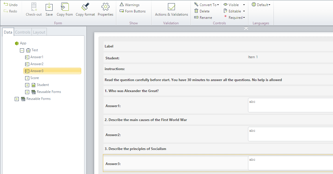
A school has implemented a Process in Bizagi to execute history tests. The answers to each test question are stored in Parameter entities. Suppose the test has three questions and answers; so, three parameter entities must be created.
In order to answer these questions, Text box Controls must be inserted onto the Form.
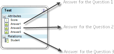
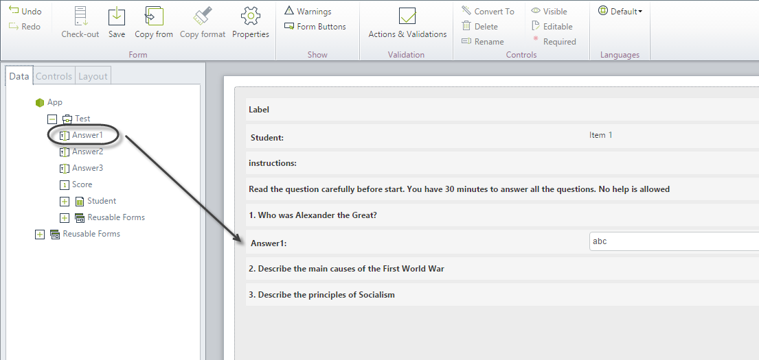
1. Drag and drop the Answer1 attribute from the data model onto the Display area. This will be interpreted automatically in the Form as a Text box Control.
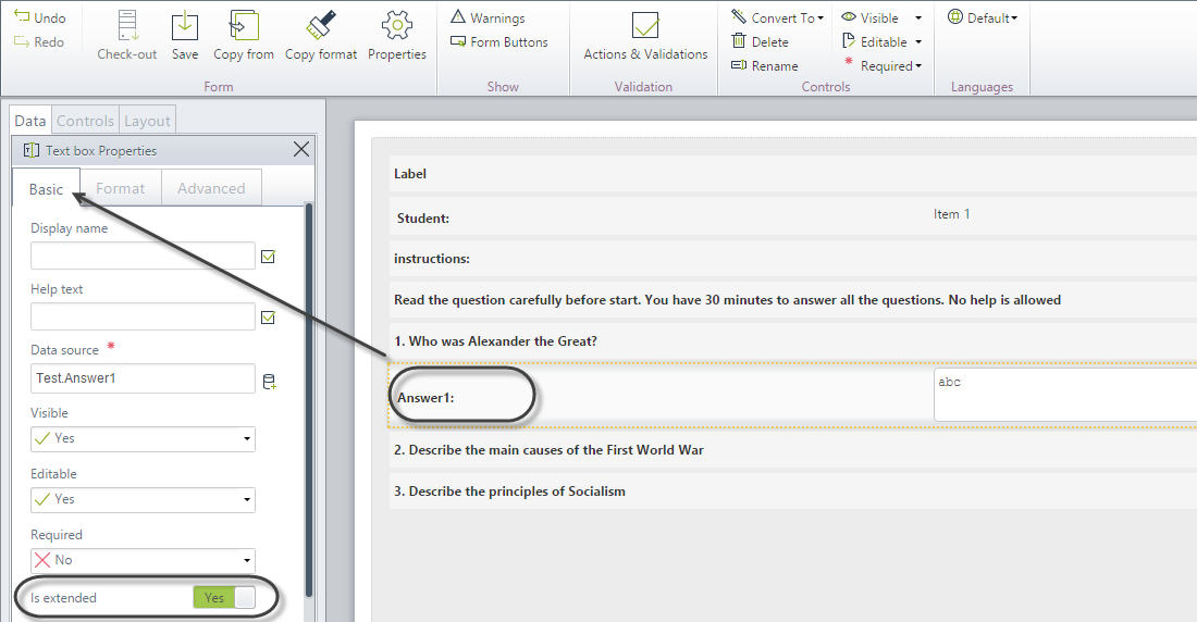
2. Enable Is extended in the Basic tab of the Text box Properties.
3. Repeat the previous steps for the other two Text box controls pertaining to questions two and three.
Save the form.
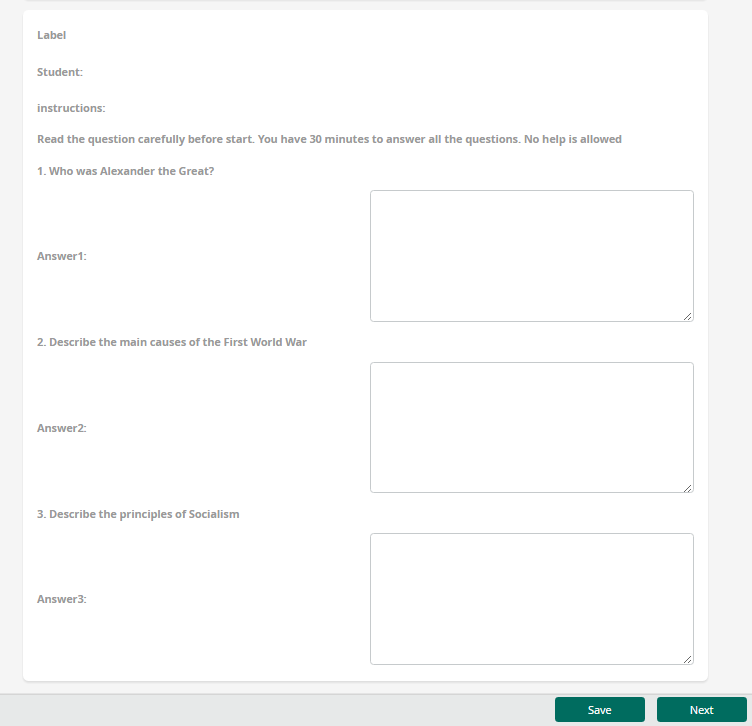
4. Go to the Work Portal to test the controls.
Last Updated 7/26/2023 4:35:17 PM