Each control has a set of properties that allow you to manipulate their behavior and visual presentation in the Work Portal.
To display a control's properties, click the control or select the Properties icon ( ) located on its upper boundary. The properties will display in the Left panel.

The Properties are contained in three tabs: Basic, Format and Advanced.
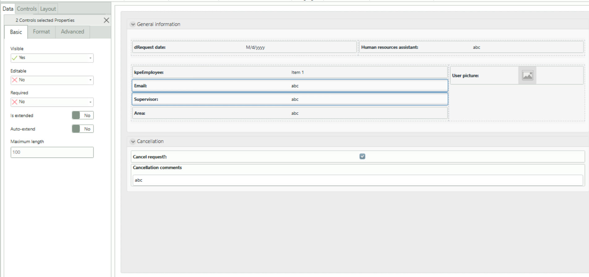
Multi select property editing in Forms Designer
When selecting multiple controls in the Forms Designer:
•Only shared properties across the selected controls are displayed.
•Control specific properties (for example, Display name) are not shown, even if available on all controls.
•The list of available properties changes depending on the selected control types.
•Changes are applied uniformly to all selected controls.
Supported controls
Applies to controls such as: Boolean, Button, Cascading combo, Currency, Date, File, Form link, Grouped table, Image, Label, Link, List, Number, Radio, Record viewer, Search list, Suggest, Table, Text, and also structural elements like Group, Tab, and Tab item.
Exclusions
Does not apply to:
•Table columns
•Hidden controls
•Widgets
|
•A single value per property is applied to all selected controls. •Properties must be compatible across all selected controls to be available |

Basic tab
Display a list of the core properties of the control.
Properties highlighted with a red asterisk are mandatory.
Setting the Basic properties alone, will result in the default behavior of the control in the Work Portal.
PROPERTY |
DESCRIPTION |
|---|---|
Display name |
This is the name of the attribute that will be shown in the Work Portal. |
Help text |
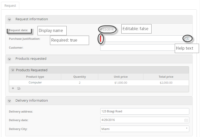
Contains the help text for this control. This context help is activated by the Help ( |
Data source |
Relates the control to an attribute of the data model. |
Visible |
Sets the visibility of the control. This can be determined by an expression. |
Editable |
Determines if the control is editable or read-only and can be set by an expression. |
Required |
Defines if the control is mandatory or optional and can be determined by an expression. |
 ) icon on the control's upper boundary.
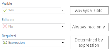
The Visible, Editable and Required properties allow you to either define if a control ALWAYS exhibits the same behavior or evaluate an expression (or business rule) to determine the behavior. To learn more about evaluating expressions for these properties please refer to Manage properties with expressions.
IMPORTANT: You can select multiple controls to edit their properties simultaneously. For details about this behavior, see Multi select property editing in Forms Designer.
Format tab
Apply to most of the form controls and enable you to customize the appearance of the Control in the Form.
PROPERTY |
DESCRIPTION |
|---|---|
Display type |
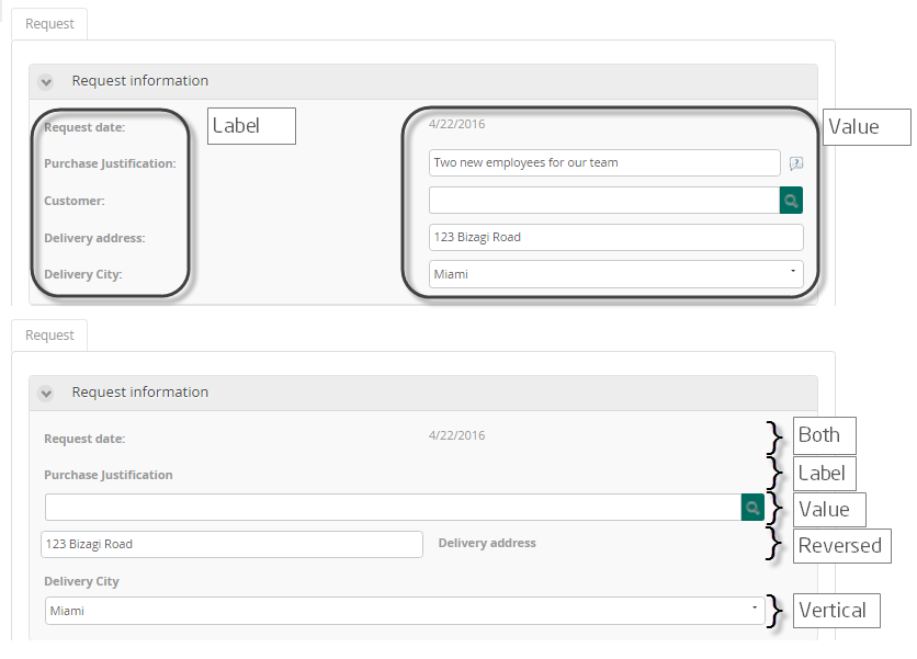
Enables different visual formats in respect to the text (label) and the control (value). This includes hiding either the label or the value. |
Label and value horizontal align |
Aligns the label and value of the control within the space available in the Form. |
Orientation |
Defines if the text should be written from left to right or vice versa. The Inherited option indicates the property will be set according to the language selected in the Work Portal. |
Format options |
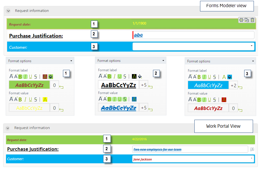
Changes the look of the control value or of the control label by customizing the size and formatting; for example font type, font style and background color. •Format label: changes the look of the control label, this format also controls the background color. •Format value: changes the look of the control value. |
Layout |
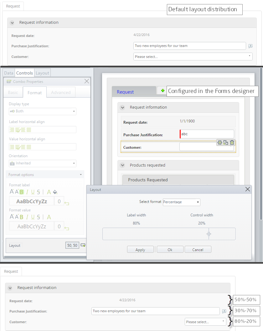
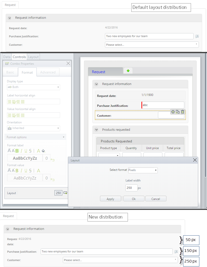
This property defines the percentage to distribute the control in the space available in the work area. When the value for Select format is Percentage, it splits the space into different width columns based on a percentage ratio. When the value for Select format is Pixels, Bizagi sets a fixed label width in pixels, the maximum value that can be set is 999 pixels. By default, it is a two-column split with a 50/50 width distribution. |
IMPORTANT: You can edit properties across multiple controls at the same time. Available properties depend on the selected controls. For more information, see Multi select property editing in Forms Designer.
Visual examples
Display type
Format
The following image shows three controls (Request Date, Purchase justification, and Customer), the format for both, the value and the label are shown as they look in the Forms Modeler and in Work Portal.
Layout
Using percentage distribution
Using fixed pixels
|
Advanced tab contains the properties that are exclusive to the control to allow advanced configuration and customize its behavior. |
Last Updated 7/17/2026 1:39:45 PM