Overview
Web Parts share common properties that handle their appearance, layout and advanced characteristics. These properties are available when you edit a Web Part.

This section explains the available properties that you can edit from this menu.
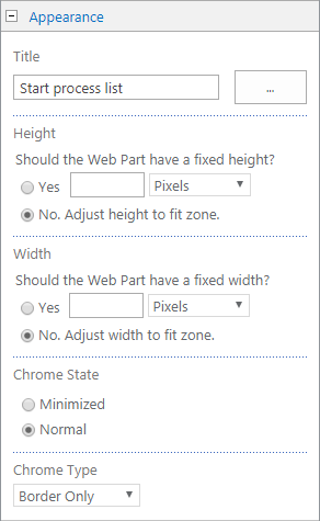
Appearance

Property |
Description |
|---|---|
Title |
Specify the title of the Web Part that appears in the Web Part title bar. |
Height |
Specify the height of the Web Part. |
Width |
Specify the width of the Web Part. |
Chrome State |
Specify whether the entire Web Part appears on the page when a user opens the page. By default, the chrome state is set to Normal and the entire Web Part appears. Only the title bar appears when the state is set to Minimized. |
Chrome Type |
Specify whether the title bar and border of the Web Part frame are displayed. |
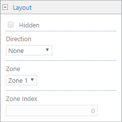
Layout

Property |
Description |
|---|---|
Hidden |
Specify whether the Web Part is visible when a user opens the page. If the check box is selected, the Web Part is visible only when you are designing the page and has the suffix (Hidden) appended to the title. You can hide a Web Part if you want to use it to provide data to another Web Part through a Web Part connection, but you don't want to display the Web Part. |
Direction |
Specify the direction of the text in the Web Part content. For example, Arabic is a right-to-left language; English and most other European languages are left-to-right languages. |
Zone |
Specify the zone on the Web Part page where the Web Part appears.
Note: Zones on the Web Part page are not listed in the list box when you do not have permission to modify the zone. |
Zone Index |
Specify the position of the Web Part in a zone when the zone contains more than one Web Part. To specify the order, type a positive integer in the text box. If the Web Parts in the zone are ordered from top to bottom, a value of 0 means that the Web Part appears at the top of the zone. If the Web Parts in the zone are ordered from left to right, a value of 1 means that the Web Part appears furthest the left in the zone.
For example, when you add a Web Part to an empty zone that is ordered from top to bottom, the Zone Index is 0. When you add a second Web Part to the bottom of the zone, its Zone Index is 1. To move the second Web Part to the top of the zone, type 0for its Zone index, and then type 1 for the first Web Part.
Note: Each Web Part in the zone must have a unique Zone Index value. Therefore, changing the Zone Index value for the current Web Part can also change the Zone Index value for other Web Parts in the zone |
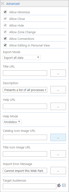
Advanced

Property |
Description |
|---|---|
Allow Minimize |
Specify whether the Web Part can be minimized. |
Allow Close |
Specify whether the Web Part can be removed from the Web Part Page. |
Allow Hide |
Specify whether the Web Part can be hidden. |
Allow Zone Change |
Specify whether the Web Part can be moved to a different zone. |
Allow Connections |
Specify whether the Web Part can participate in connections with other Web Parts. |
Allow Editing in Personal View |
Specify whether the Web Part properties can be modified in a personal view. |
Export Mode |
Specify the level of data that this Web Part can export. Depending on your configuration, this setting may not be available. |
Title URL |
Specify the URL of a file containing additional information about the Web Part. The file appears in a separate browser window when you click the Web Part title. |
Description |
Specify the ScreenTip that appears when you hover the mouse pointer on the Web Part title or Web Part icon. |
Help URL |
Specify the location of a file containing Help information about the Web Part. The Help information appears in a separate browser window when you click the Help command on the Web Part menu. |
Help Mode |
Specify how a browser will display Help content for a Web Part. These are the available options: •Modal: Opens a separate browser window, if the browser has this capability. A user must close the window before returning to the Web page. •Modeless: Opens a separate browser window, if the browser has this capability. A user does not have to close the window before returning to the Web page. This is the default value. •Navigate: Opens the Web page in the current browser window.
Note: Even though custom Microsoft ASP.NET Web Parts support this property, default Help topics open only in a separate browser window. |
Catalog Icon Image URL |
Specify the location of a file containing an image to be used as the Web Part icon in the Web Part List. The image size must be 16 by 16 pixels. |
Title Icon Image URL |
Specify the location of a file containing an image to be used in the Web Part title bar. The image size must be 16 by 16 pixels. |
Import Error Message |
Specify a message that appears if there is a problem importing the Web Part. |
Last Updated 1/6/2022 5:15:17 PM