Overview
The Monitoring Center Home provides a high-level overview of your Bizagi platform's health and performance. It's designed for quick identification of potential issues and trends, in all projects and all environments.
Navigation
The top panel of the Monitoring Center provides quick access to key tools, such as Configuration Management and filtering options, allowing you to tailor the Home view by project, environment, and time range.

1.Project and Environment: The Monitoring Center Home allows you to select the specific project and environment you wish to monitor. On the top-left corner, choose the project and environment you want to analyze.
2.Configuration Management: Provides a centralized view of version history, changes, and updates applied to customer environments and related components, enabling traceability and configuration control across subscriptions. Refer to the Configuration Management documentation for more details.
3.Time range: You can customize the time range displayed on the dashboards by selecting from a list of pre-defined quick ranges or by manually entering a specific From - To range. Additionally, you can change the time zone settings by adjusting the time zone at the bottom of the time range window. This flexibility allows you to focus on the exact period they need for their analysis. Most graphics in the dashboard are subject to the time range set on the top. However there are some that explicitly mention "30 days" or other time ranges. For those, the time range does not apply and they have their own internal setting that is not subject to change.
4.Auto Refresh Interval: The Monitoring Center can be set to refresh automatically, ensuring real-time information is displayed. Users can configure the auto-refresh options, choosing intervals ranging from 5 seconds to 1 day, depending on their needs.
Monitoring Center Pillars
The Monitoring Center Home is organized into four pillars: Metrics, AI Metrics, Performance, and Uptime. You can click any of the icons on the left of these four pillars to navigate to a detailed dashboard for each category.
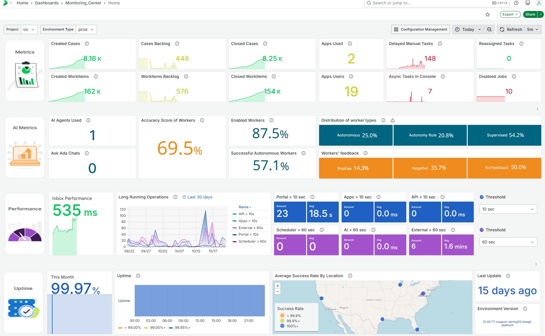
This section provides at-a-glance metrics on case creation/closure, Workitem execution, Apps usage, delayed, disabled, and pending tasks. It includes trend analysis to show usage over time and key figures are displayed, with links to detailed dashboards for deeper analysis.
This section provides an overview of AI operations, including usage statistics for AI Agents, Ask Ada, and AI Workers. It tracks effectiveness through user interactions—such as accepted or modified Form fields—and collects feedback ratings. Additionally, it shows how AI Workers are distributed and implemented across tasks, segmented by type (Autonomous, Execution Rule, and Supervised) it also includes information on AI - Operations Per Hour.
This section highlights long-running operations exceeding predefined thresholds that can be chosen on the top of the portal. Performance identifies long-running operations from the Portal, Apps, APIs and Scheduler.
The displayed dashboards help identify root causes, potentially highlighting implementation issues (e.g., infinite loops).
This section shows the real-time uptime of key platform components, geographically distributed for latency and reachability analysis. It provides customers with minute-by-minute app uptime data or the main service components: Work Portal and Apps. It uses a visual representation of uptime percentage and latency. A map displays the geographic distribution of health checks and latency. Additionally, it displays the environment version, which shows the most recent release configured in the selected environment, and last update, indicating the time elapsed since the last applied update.
Widget Options
Each tile or widget containing a metric has three options:
1.View: Opens the widget in full screen for a more detailed review, allowing you to closely examine the metric.
•Tip: Hover over a graph and press "v" on your keyboard to expand it to full view. Press "v" on your keyboard again to return to the normal view.
2.Share: Provides a link to share the widget with others who have access to the Monitoring Center. This option also includes the ability to embed the widget and access the library panel.
3.Inspect: Allows you to explore the data behind the widget, offering insights into the underlying metrics. When using the Inspect option, you can download the data in CSV format and also access a JSON file containing detailed configuration information about the widget.
Last Updated 11/19/2025 12:27:36 PM