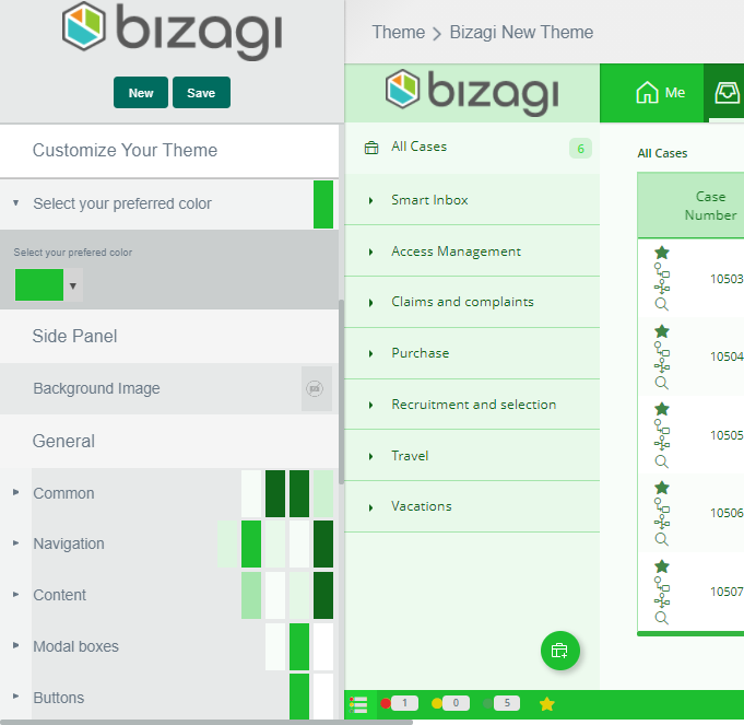
The Theme Builder offers further options to make your most demanding themes possible. You can define the configuration of colors for each singular Work Portal component.
To customize specific components just select a base theme and change the properties of the different components as you desire.
The following are the components that can be customized. These are found under the Customize your theme options.

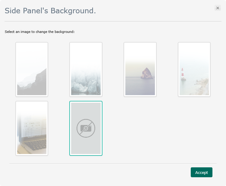
Side Panel
•Background Image: Available background images for the side panel.

General
•Common: Areas that are always displayed.
•Navigation: Search fields and links.
•Content: General content.
•Menu: Menu bar.
•Inbox: Inbox bar.
•Footer: Work Portal Footer.
•Widgets: Form's Widgets.
•Buttons: Work Portal buttons.
Forms
•Common: Global containers and form's text.
•Groups: Groups containers.
•Tabs: Tabs containers.
•Grids: Form's grids.
•Inputs: Editable fields.
Fonts
•Font family: Font type of Work Portal texts.
Special Effects
•Text shadow: Shadows of titles, page numbers and options of the Work Portal.
•Box shadow: Shadows of boxes in the Work Portal.
•Border radius: Smoothing of boxes and fields borders.
Vertical Space
Text line spacing; it can be normal or minimum.
•Normal

•Minimum

Last Updated 1/6/2022 5:28:06 PM