Bizagi offers Graphical Analysis of the search results returned by Queries that presents the information in a flexible manner allowing for easy and quick comprehension. Graphical analysis enables access to accurate up-to-date data to identify tendencies, problems and improvement opportunities in real time.
Perform Graphical Queries from the Work Portal
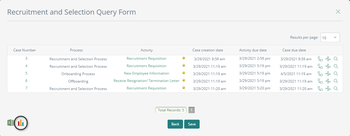
1. Once a Query has been executed, its results are presented.
Click on the Graphical analysis icon that appears at the bottom of the search results.
2. The Graphic Analysis Wizard will display,
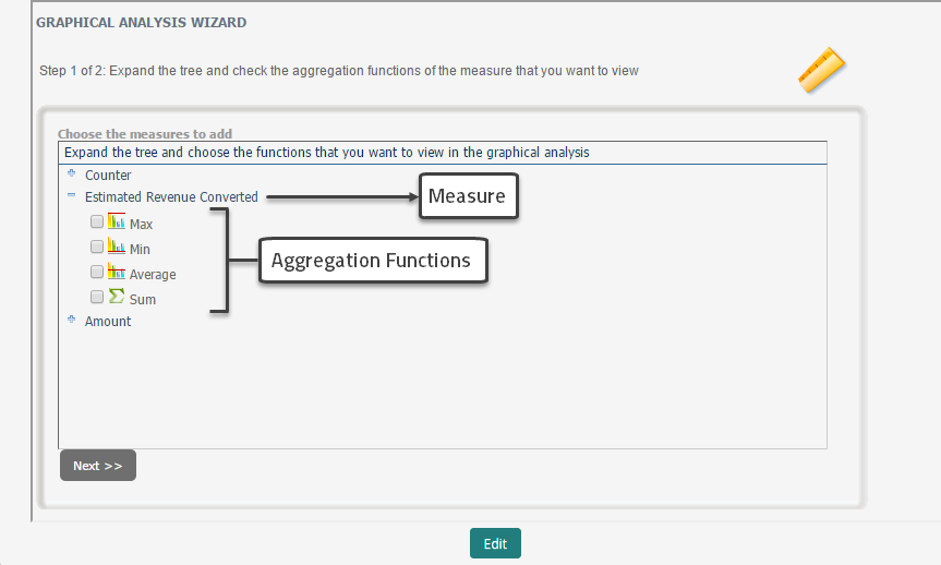
In Step 1 you must define the Measures. These measures represent any quantifiable or measurable aspect of the Query.
For the measures at least one aggregate function must be selected to be applied. When selected click Next.
•Count: Returns the total number of measures.
•Max: Returns the maximum value of the measures.
•Min: Returns the minimum value of the measures.
•Average : Returns the average value of the measures.
•Sum: Returns the total value of the measures.
|
Each column of the Query results is automatically classified in accordance with the type of data. The numerical attribute columns (integers, currency, etc.) are defined as measures. Remember that only the fields that were checked in the query to be displayed as results will appear on the list. |
3. In Step 2 you must define the dimensions that you would like to display.
Dimensions are the data to be measured. They are the fields that were checked in the query to be displayed in the results that are not numerical; they are usually descriptive data such as name, city, region, dates.
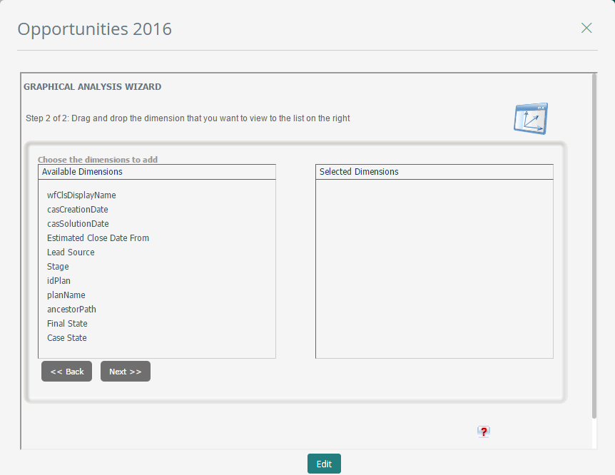
To select dimensions, drag and drop the dimensions from the Available list to the Selected Dimensions area on the right.

|
For the Graphic Analysis of the Application Queries there are additional measures and dimensions of process data such as: case creation date, case solution date, final status, amount. |
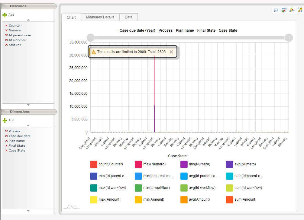
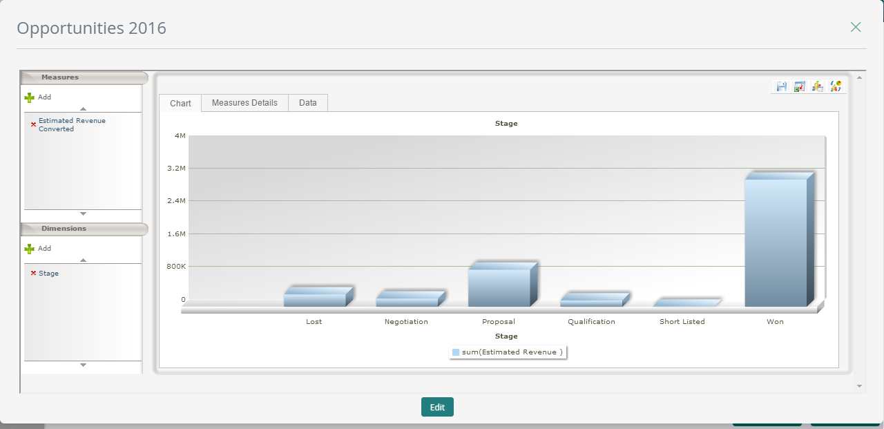
4. The result of the graphical analysis is presented as the image below:
|
Consider that to avoid performance issues, the graphical analysis will take into account maximum 2000 records. If the query has more than 2000 results, a message appears indicating the number of results used in the graphical analysis versus the total number of results.
You can change the maximum number of records to display in the following path: C:\Bizagi\Projects\[YourProject]\WebApplication\js\GraphicAnalysis\overrides.js. |
Chart Menu
This menu is divided into three sections. Each section will allow you to configure and visualize different features of the Graphical Analysis:
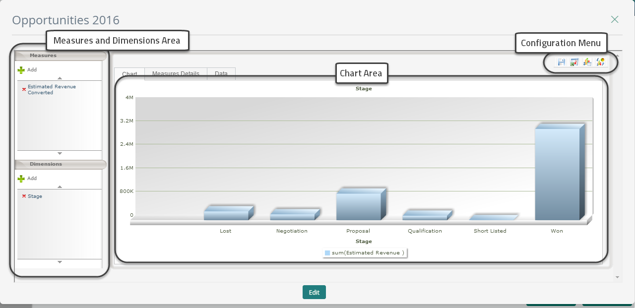
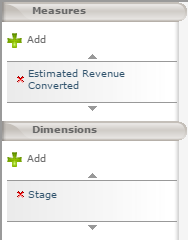
Dimensions and Measures area
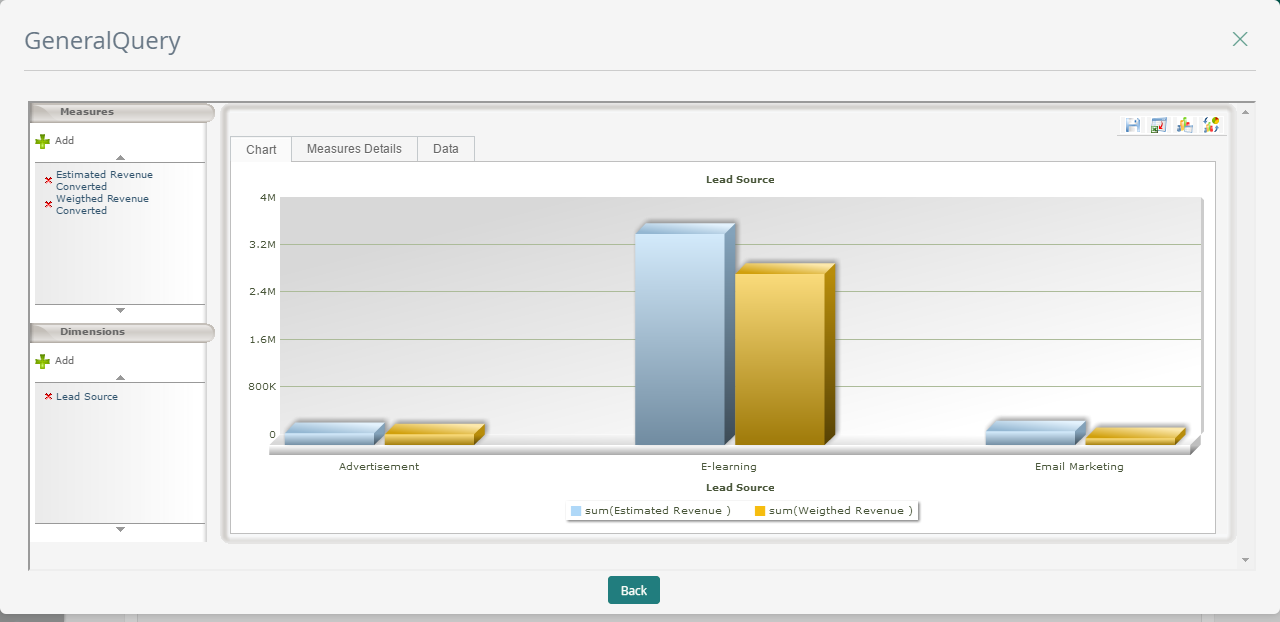
In this section you can add and remove measures and dimensions to the current chart.
Mark or Unmark New Aggregate Functions to the Measures
1. In the Measures element of the graphic analysis, select the measure that has already been added and the aggregate functions available are displayed.
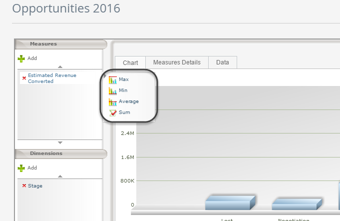
2. The functions applied appear on the list of functions with a check symbol. When you select a function, the function is applied for the analysis. Likewise, when you uncheck the functions that have been applied, they are no longer applied for the analysis.
Add Measures to Carry Out the Graphic Analysis
1. In the dimensions element of the graphic analysis, click the Add option. The Add Measures window is displayed.
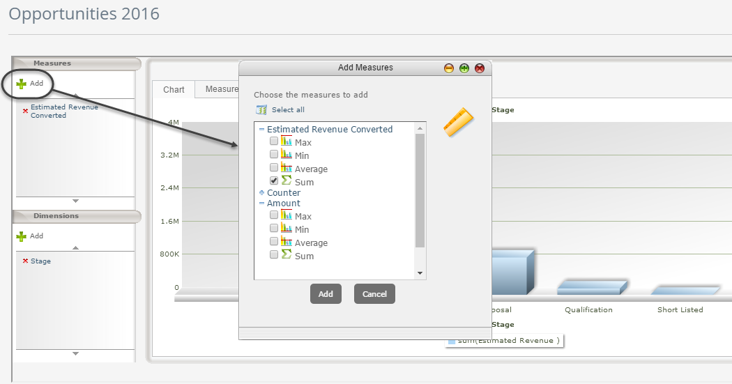
2. In the Add Measures window, you will see the list of fields that were checked in the query to be displayed in the results that are numerical.
When the tree of each measure is displayed, the aggregate functions are shown. You can select the functions of the measures you want to apply for the analysis.
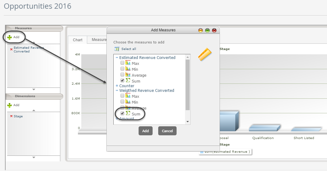
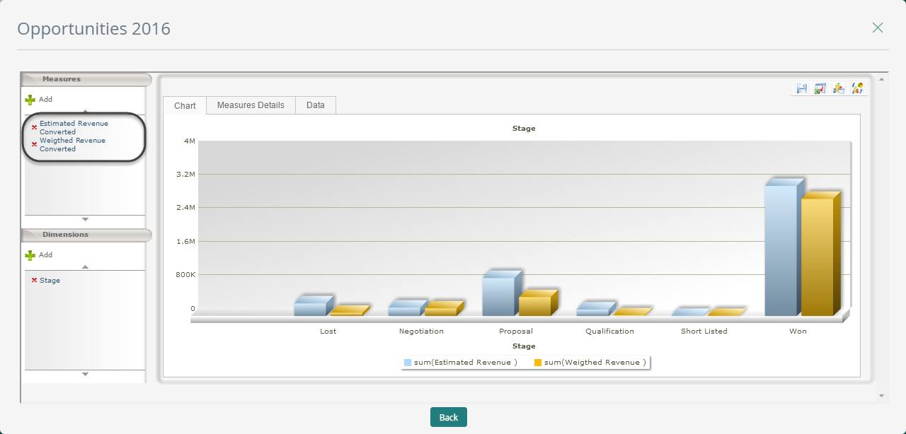
3. Click on the Add button. The information is updated automatically.
Add Dimensions to Carry Out the Graphic Analysis
1. In the dimensions element of the graphic analysis, click the Add button. The Add Dimensions window is displayed.
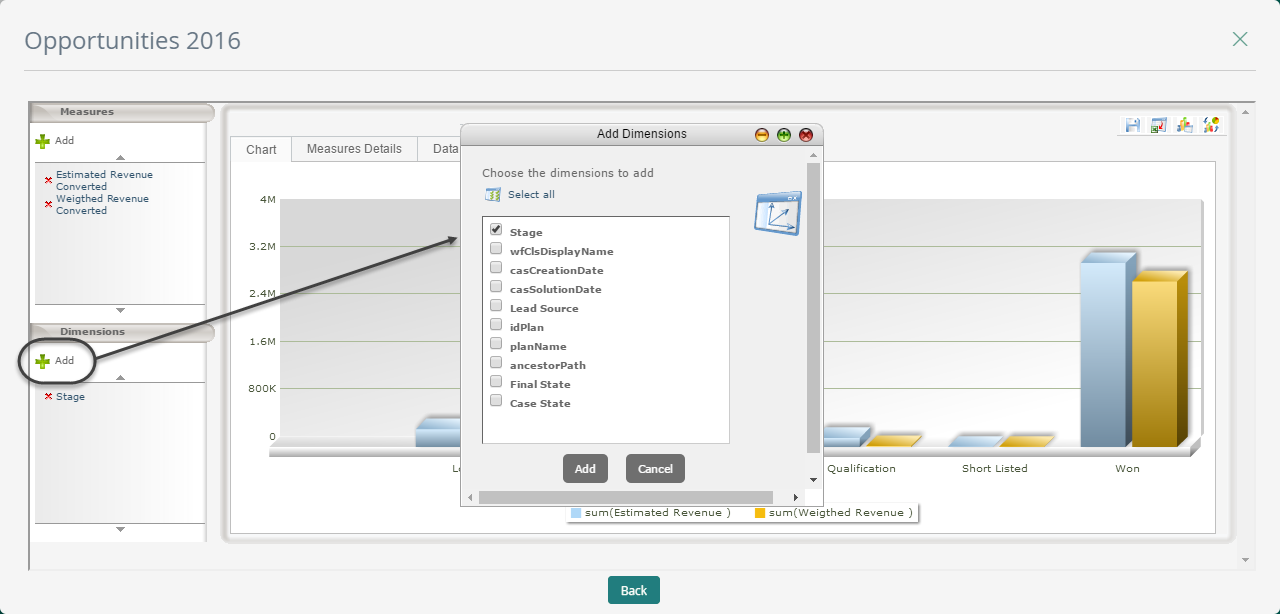
2. In the Add Dimensions window, you will see the list of fields that were checked in the query to be displayed in the results that are NOT numerical. The user can select all the dimensions by making use of the Select All link or select dimensions individually by ticking the checkbox to the left of each dimension.
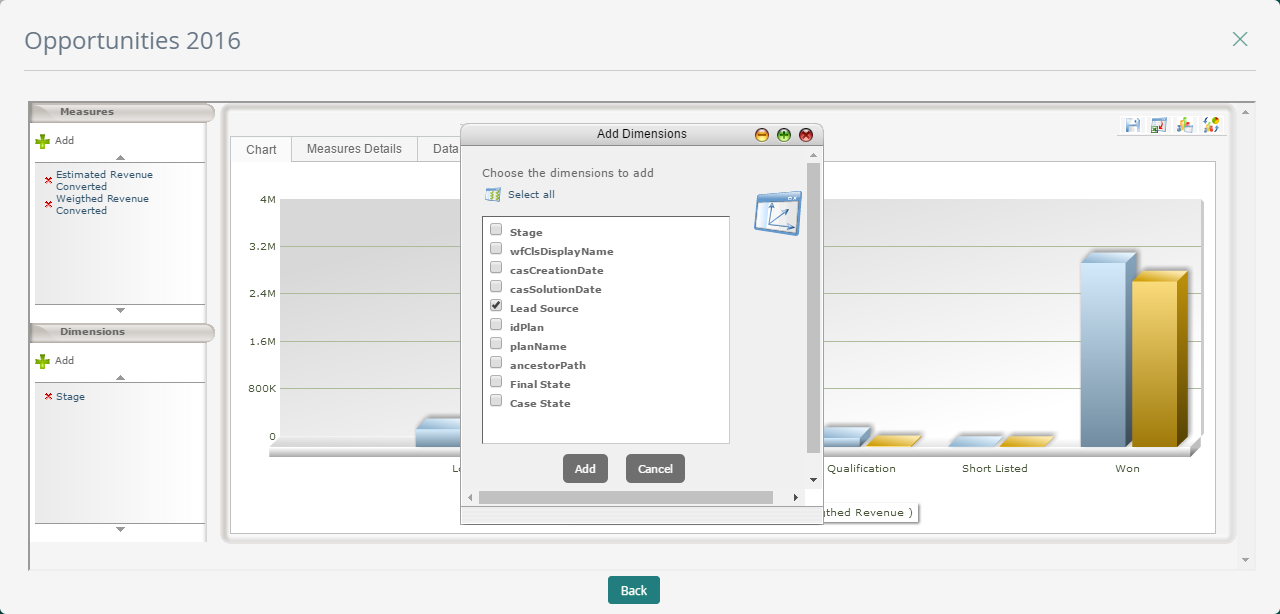
3. Click on the Add button. The information is updated automatically.
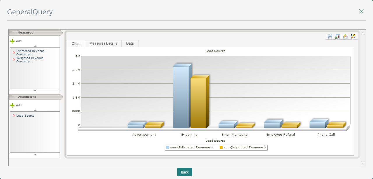
|
The last dimension on the list is going to represent the X-axis on the graphics. When you select the columns or the markers of the lines on the graphics, a label appears with the information of the dimensions and the calculation of the aggregate function of the measure it represents. |
Filter Dimensions in the Graphical Analysis
If you wish to display only specific values of a dimension in the graphical analysis, you can filter them.
1. In the dimensions element of the graphic analysis, click over the dimension to be filtered. Click the filter icon that will appear.
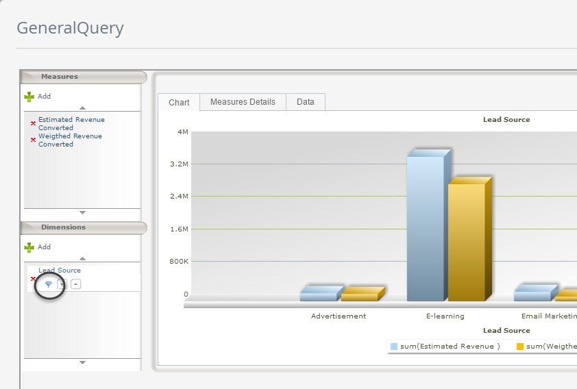
2. A new window will pop up. In this you will find all the possible values for the dimension.
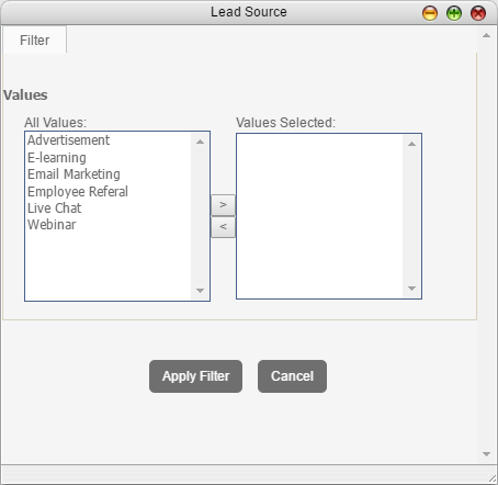
3. Add the values to be displayed by selecting them and clicking the ">" button.
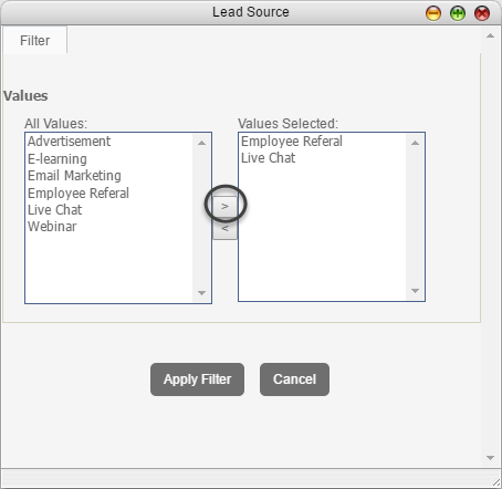
4. Finally click the Apply Filter button. The information is updated automatically.
Configuration menu
This menu provides functions to: save the analysis, export to Excel, display the result tables and graphics.
![]()
•Save Graphical Analysis: This option saves the graphical analysis generated.
•Export to Excel: Enables the user to export the result tables to excel.
•View chart and data: This functionality enables you to view the data presented in tables in the graphic tab at the bottom of the graphics.
•Group chart by: This option enables you to show the graphics in accordance with the existing dimensions and it is represented with division lines that group together the result of the query for the dimension that has been defined.
•Chart Type: This functionality enables you to select the type of graphics to be displayed. Line 2D, Columns 2D, Columns 3D, Stacked columns 2D, Stacked columns 3D, Area 2D, Pie 2d, Pie 3d, Doughnut 2d, Doughnut 3d.
Chart Area
In this area you can visualize the chart in different ways as well as summary of the data plotted. It contains three tabs:
•Chart tab
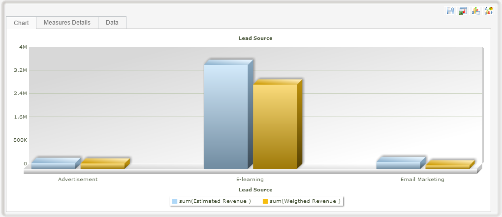
This tab presents the query results in a graphic fashion. The types of graphics displayed on this tab are Line 2D, Columns 2D, Columns 3D, Stacked columns 2D, Stacked columns 3D, Area 2D.
The graphics are constructed taking into account the dimensions and measures selected. The data that are not quantifiable or dimensions that characterize the information constitute the X-axis (horizontal line), which are used to arrange and group together the values. In addition, the values calculated for the measures depending on the aggregate function used constitute the Y-axis.
|
Depending on the type of dimension, the type of graphics is defined automatically. Bar-type graphics are normally used, but if a dimension has been selected and it is Date type, a linear graphic is used to represent the timeline. |
•Measures Details tab
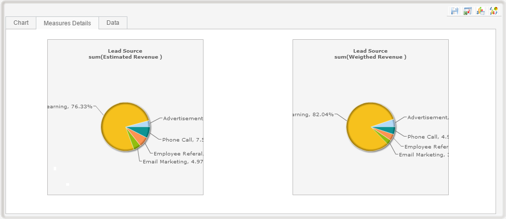
This element presents the query results graphically, for each aggregate function of the measures that were selected. They types of graphics displayed on this tab are Pie 2D, Pie 3D, Doughnut 2D, Doughnut 3D.
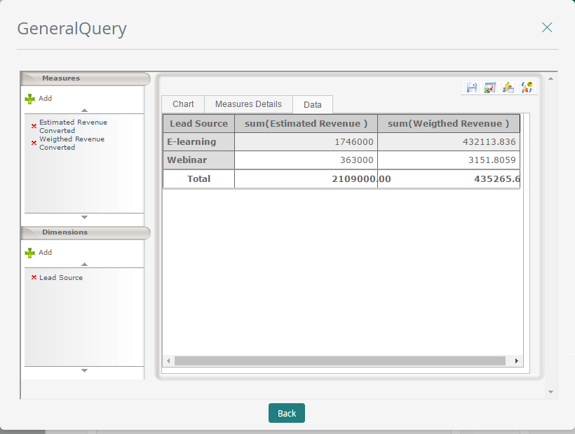
•Data tab
Result tables arrange the information depending on the dimensions selected and display the resulting values of the measurements in accordance with the aggregation functions defined in the columns.
Considerations
•For a better user experience do not include dimensions with more than 32 values. If the dimensions selected have more than 32 values, use filters to show the diagram in smaller intervals.
•Never use a unique value (such as the case number) as dimension. This may affect the performance of the graphical analysis. When using unique values as a dimension, you will have as many columns or slices as ongoing and closed cases the query returns.
Last Updated 1/23/2023 12:05:12 PM
